An Updated Traditional Home Office Refresh
If you’ve been following along with my blog for the last few years, you already know that my decorating style has DRASTICALLY changed over the years!
Our previous home was filled with heavy furniture and dark colors and definitely leaned toward a Tuscan style. I was more than ready for change by the time we moved into this house, seven years ago.
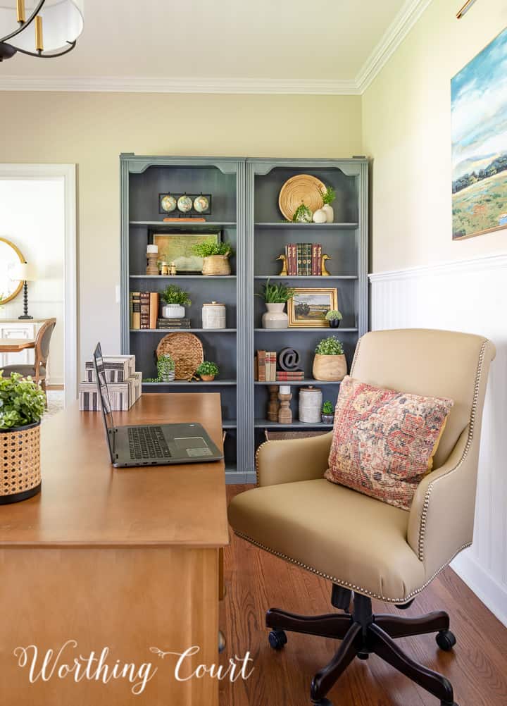
When we moved here, farmhouse style was all the rage and I fully embraced it! After living with gold, green and red in our former house for so many years, I loved the soft neutral colors in our new-to-us home and how easy the farmhouse style look was to achieve.
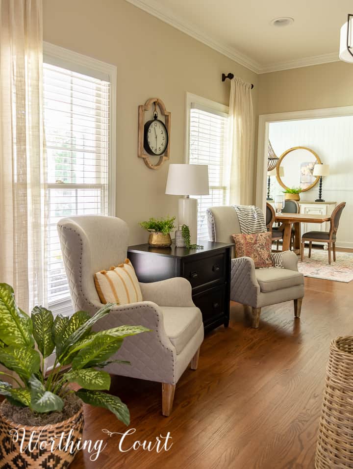
With all of that said, I’ve been s-l-o-w-y making my way through several rooms in my house to give them more of a simplified, updated traditional style with a little cottage style thrown in. You may have noticed a bit of a shift in my decorating style when I started our master bedroom and master bathroom makeovers.
BEFORE I GO ANY FURTHER THOUGH let me clarify one thing – guys, you do you! Decorate your home with what YOU love and don’t feel like you have to constantly redecorate. Styles and trends will always continue to evolve. Noone that I know of (including myself) wants to spend the time or money to constantly redecorate.
BUT – this is my job. It’s what I’ve been passionate about since I was a little kid playing with Barbie dolls and “decorating” their homes. I love, love, love doing things around my home that hopefully inspire you!
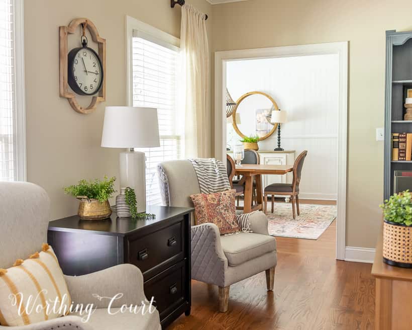
I’m currently working on six different rooms in my house, but as you’ve probably figured out by now, the room that I want to share with you today is our updated and refreshed home office. I consider it to be “done”, but honestly there are still some small changes I’d like to make.
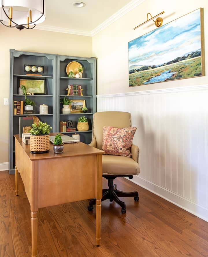
For example, I still want to work on our bookcases. I’ve already edited them and removed several things, but they’re still looking a bit too cluttered and farmhouse’ish for me. I’m considering painting them, but I’m unsure of what color. White??? Navy???
I think it would help if I can remove the arched trim along the top of each bookcase too.
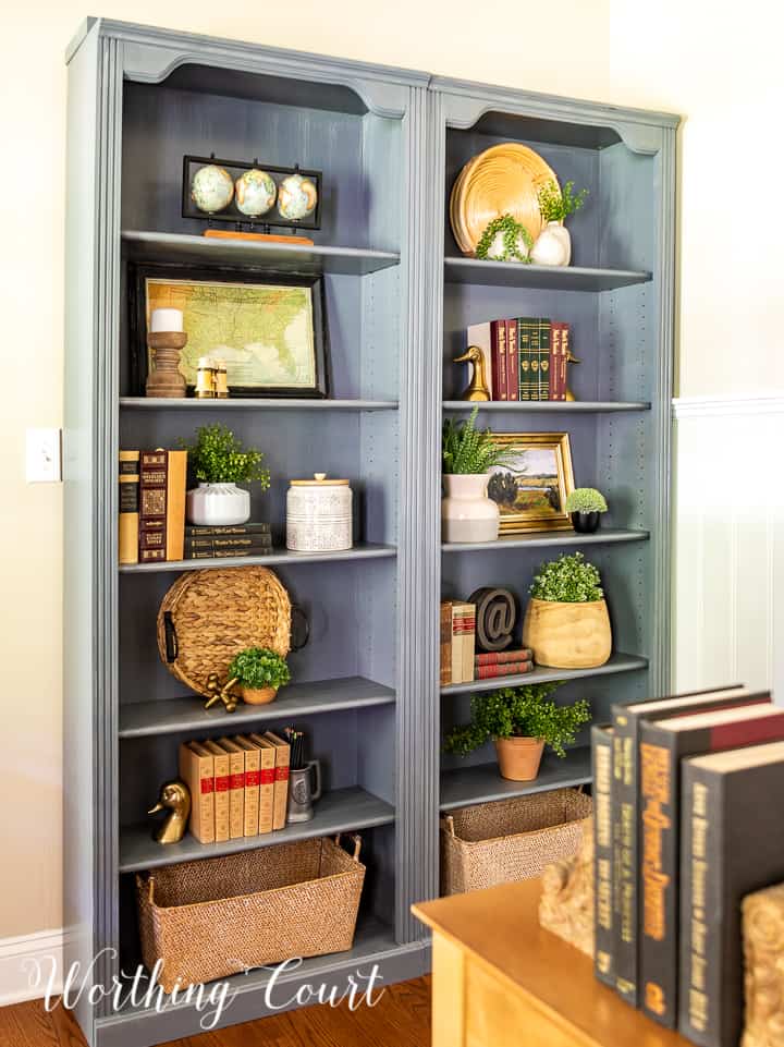
I’m not a minimalist by any stretch of the imagination, but even I think these could do with a bit more editing. The problem is that I love everything that I have displayed here and can’t decide what to give up! Can you relate???
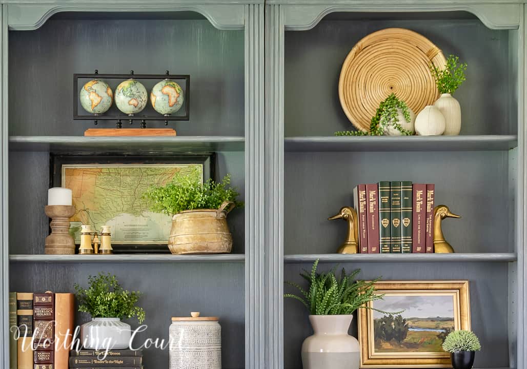
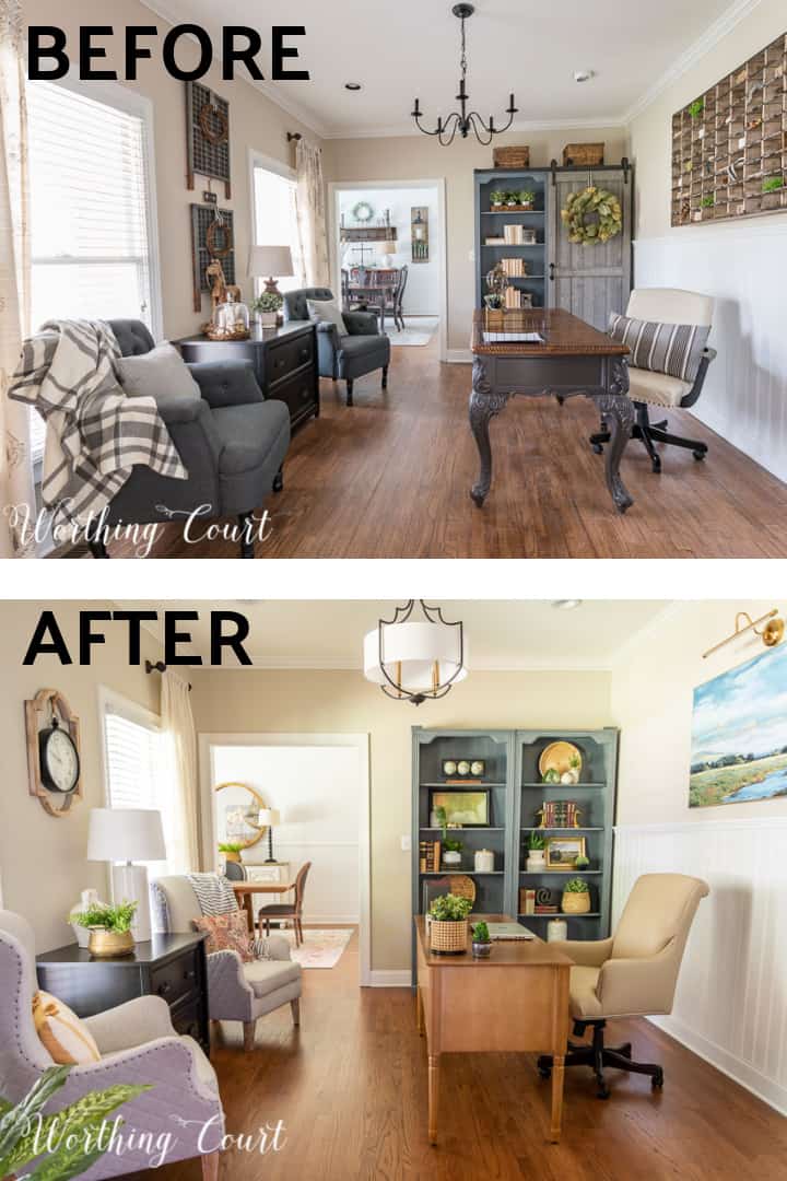
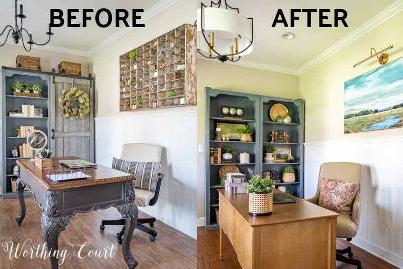
Let me give you a rundown of all of the things that I’ve changed to update this room:
- replaced our desk, desk chair and arm chairs
- removed the barn door from the bookcases
- replaced the light fixture, draperies and lamp
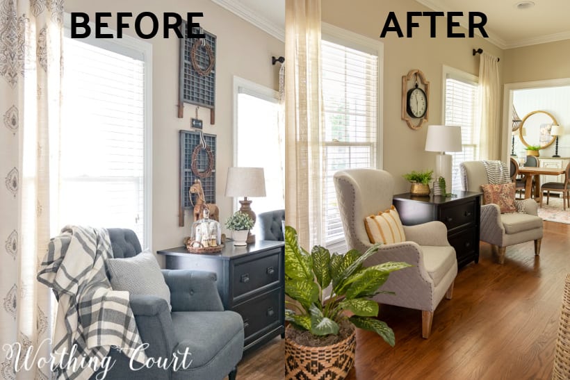
- replaced the oh-so-popular post office cubbies with art and a portrait light
- replaced the chalkboard with planters, added a new clock, new pillows.
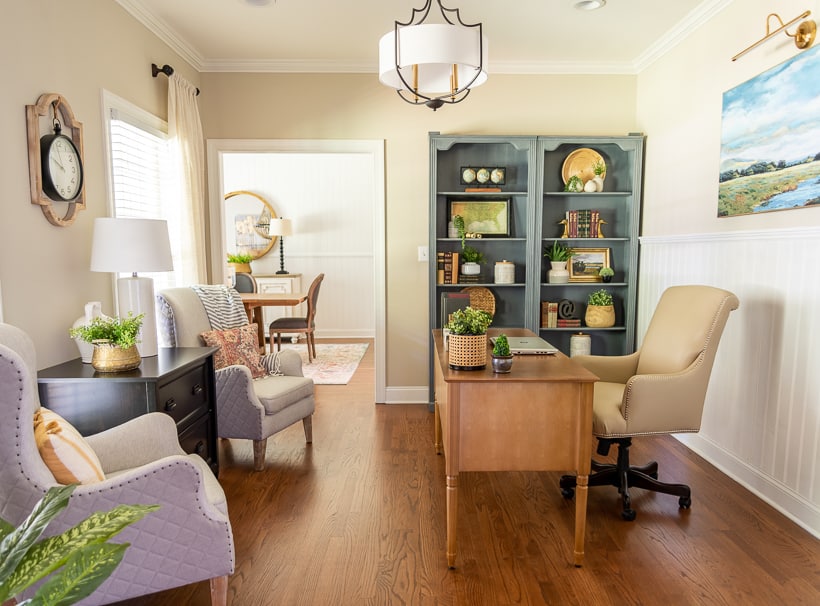
I did my best to keep expenses down, but to get the updated traditional style that I was after, I felt that I really needed to replace a few pieces of furniture, but I made sure that I shopped for good quality at a good price. Everything new was purchased over the course of a year though so that I could pay as I went.
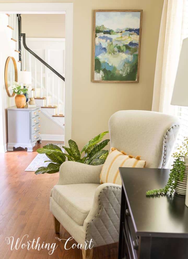
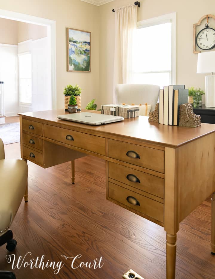
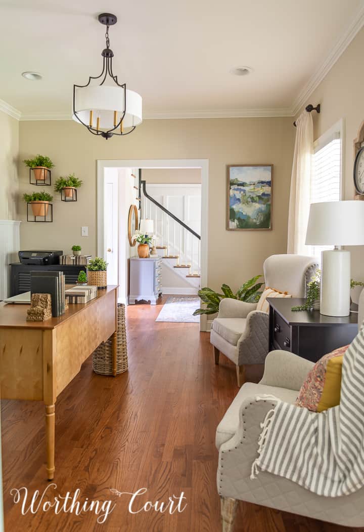
I know I’ll get this question, but I opted not to put an area rug in here for two reasons: 1) it would have interferred with the rolling desk chair and 2) I think it would have been too much since this room opens to the foyer on one side and the dining room on the other, each of which have an area rug that’s visible from the office.
To give you a better idea of the changes, here are a few before and after photos for you. And no, I didn’t repaint the walls – unfortunately, there was weird lighting the day that I took the new pictures, which throws the wall color off. 🙁
I love the new look. I am slowly trying to do exactly what you have accomplished! Where did you find the beautiful desk?
Thank you so much! Here’s the link to the desk: https://rstyle.me/+aK9z0Wkwu8rbcsddvOSfwg
Love the new vibe in your office. The canvas print seems too pastoral. Maybe wallpaper in the bookcase backgrounds? Does the clock come with the frame?
Seems everywhere I look the decorating trend is toward a bit of simplification. I think your new office decor is lovely but think you should leave the bookcases as you have them. If you love everything in them it will make you happy. Change will come naturally with each season and I find we know when it is the right time. I do my bookcase shelves then just edit till they feel right. Right now I still have coastal items but find myself getting itchy for changeover to fall. Right now it is back to hot and humid in N.C. so I will wait till mid September.
You’re absolutely right about leaving things if you love them! I’m in NC too, so I know exactly what you mean about hot and humid weather. 😀
Yes – the clock comes with the frame.
I LOVE the new look! Updated traditional best describes my taste, so I look forward to learning more from you. Thank you for sharing with us!
P.S. I really like the art by the door opening to the foyer!
I love the before look…it seems more cozy..
Susie this look is so restful and simple. I really like the change. Thank you for sharing !
Love the new look! Looks so fresh, warm and homey rather than the trendy stark look. I like the bookcase as it is, maybe with a few seasonal tweaks. You have given me inspiration to continue with the personal look rather than a department store look. Thanks!
I really like how you styled your bookshelves. I would leave them as is.
Everything looks lovely! Congratulations!
The new look is beautiful, but I hated to see that gorgeous desk go away! Bookcases look very nice.
Looks nice. I would leave the interesting molding on top of the bookcases — it adds a nice curvy detail that nods to the traditional look and softens all the hard lines in the cased furniture.
I really like what you have done to update your office. Great job. I love the chairs across from desk. Could you tell me where you found them? I love the side details.
I found those chairs at HomeGoods quite a white ago. Wish I could give you a link for them. :/
It is lovely. I have those same Duck Head bookends in our home. A 6 dollar thrift store find which delighted this bookworm. My home style is still traditional. Needs some freshening and updating, but until the last son finishes college we are keeping things simple. Love your wall color and the curtains. I am really enjoying your curtain and shade tutorials because I have used to to create long panels for my sitting/library room and an working on new curtains for the kitchen and family. You taught me the professional way to make them without the high cost of custom curtains. Thank you for your wonderful blog.
Suzy,
Love the new look for the office. I would paint the bookcases and I would move the beautiful print between the windows/chairs and move the clock somewhere else. I would want to see the print. Not sure what to put behind the desk. I’ll think about that for awhile. As always, I love anything you create/change. I noticed the dining room has a change as well. I love the round mirror but I also loved how you created such a “polished” farmhouse look for your dining room. I’m trying to edit some of the farmhouse look as well; it’s hard to put everything together to make a cohesive look. Thanks for sharing and looking forward to what you show us next. It’s also HOT in SC; not far from you.
your blog friend,
jean
Loving the new look. Can’t go wrong with traditional style. What color did you get for the drapes? Thanks for sharing sources………..Marjorie
Thank you! The draperies are an off white/cream color. Found them at HomeGoods a while back.
Both rooms were inviting ,but I love the new wing chairs. would you share your source?
The chairs came from HomeGoods quite a while back. They actually lived in my bedroom for a while. 😀
Thank you for the quick reply. I will keep my eyes open, but I do not think I will have much success. Really like them.
I’ve enjoyed your style in both your last home and this one. Traditional is my own preferred style. The bookcases are very nice,, not cluttered. I wouldn’t paint them. And I like looking at all my lovelies too. Otherwise why have them? I would try the baskets from the bottom shelves to on top of the bookcases. If the trim bothers you that would distract from it. I like the trim because it makes the piece traditional IMO. I think what bothers you might be the varied heights so creating a straighter line from the lighted art across the top of the bookcases would feel more comfortable and I’d add something over the wall clock too, to continue that line to the drapery hardware and then over the clock. Plus the baskets will play nicely with the other natural grass accessories in the room. I love how the art speaks to each other and the view into the foyer. Like the bare floor. The new lighting is wonderful and really grounds the updated traditional look yet doesn’t boss the room around. Great space.
I really like the updated Traditional look you are switching to. I get the cleaner lines. And I really appreciated all the befores and afters…that really helped me see all the farmhouse you did have. I’ve never gone to a type of decorating. I just buy and use (inherited) what I love, and it all goes together in an eclectic way. You mentioned you thought the bookcase still looked a bit farmhouse’ish….could you elaborate? It looks just fine to me, which indicates to me, that I still don’t understand farmhouse design…lol.
Enjoy your day! 😉
I’m really glad you like the new look! It’s kind of hard for me to explain about the bookcases, but I think what’s bothering me are the arched pieces at the top and the color. I’d like to remove the arched looking pieces and repaint the bookcases – maybe a shade of dark gray’ish blue. I also think they’re still a little cluttered looking.
I really like the new look…..it seems warmer and much more inviting to me than the gray look you had before. A beautiful update! Maybe step away from the room for a week or so and then see if you really want to tweak anything. I think it looks incredible just as you have it.
Hi!
I love the office redo.
I wouldn’t take the arch away on the bookcases. A little detail Is eye catching.
I agree with you, painting the bookcases would make a nice change. Maybe paint the
back of the cubbies a different hue would be attractive.
Wallpaper might look too busy.
Suzy, this is lovely. What is the wall color?