Entryway Makeover Reveal – How To Work With What You Have
Find out how to work within the space that you have to give a small, awkwardly shaped entryway a fresh and inviting new look.
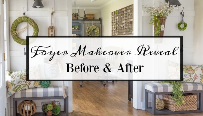
I feel like the end of the makeover of my entryway has been such a long time coming! And it has – I was flabbergasted when I looked back in my archives and realized that it has been more than a whole year since I first posted about the plans. This will be a complete tour, so settle back with your favorite snack and enjoy this before and after look at our entryway. I’ll have a full resource list at the bottom of the post.
Entryway Makeover
Before we move on to the final result, let’s take a look back at the beginning. This is what the small foyer looked like when first toured our house. You can’t tell it in this photo, but the walls are actually pale lavender. Of course the furnishings would change when we moved in, but the wall color and all of the brown trim and the color of the floors just wasn’t our taste at all. What you can’t see in this photo is the ginormous, very outdated glass and verdigris green chandelier hanging from the two story ceiling in this space.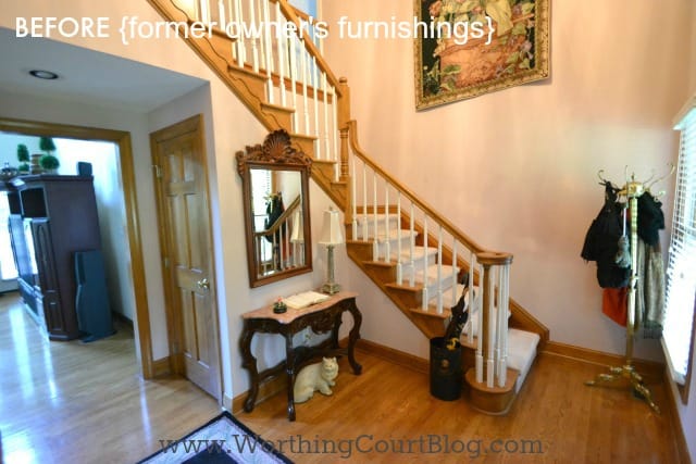
Before we actually moved into the house, we had the hardwood floors refinished, replaced the carpet runner on the stairs, painted the walls, trim and stairway banister. At this point, I really hadn’t decided the direction that I wanted to go with the decor in this house, so until I was ready to give the space its full makeover, we made use of what we already owned and lived with it like this until a little over a year ago.
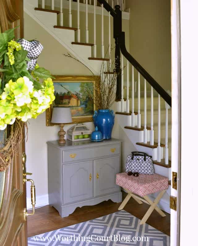
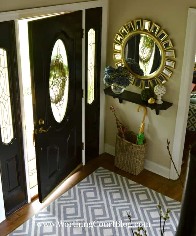
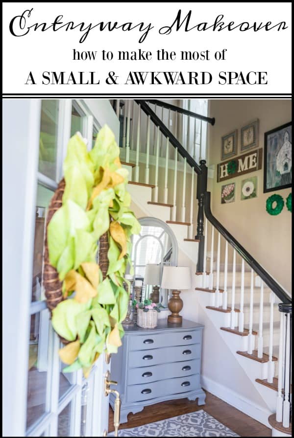
Even though our entry has a two story ceiling, it’s small, is an awkward L shape, and is broken up by multiple doors, a window and the staircase, all which made it tough to create a functional, yet inviting pretty space. In this birds eye view of the completed makeover, you can get a sense of the space, but what you can’t see is the part of the foyer that extends back into the entry of our family room, hence the L shape. 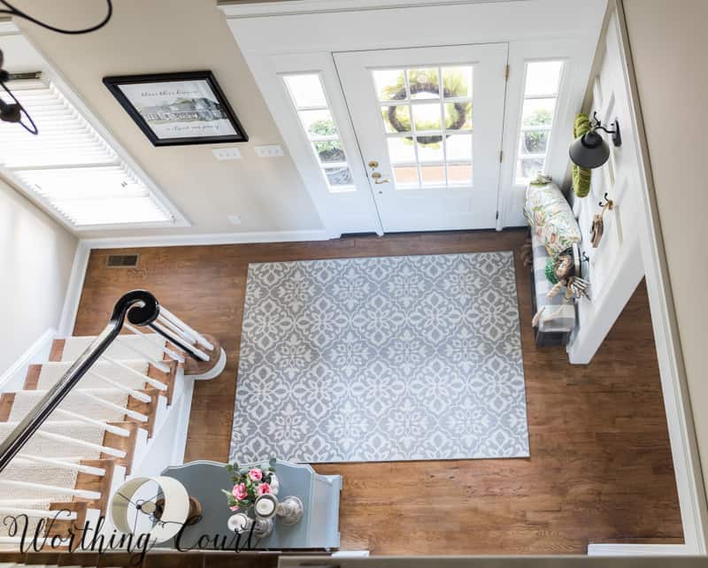
Come on in and have a look around at our much brighter, lighterand much more welcoming entryway!
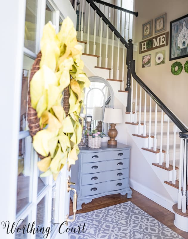
I guess you could say that the first project to be completed was the replacement of the heavy mahogany front door with a new door with glass panes and sidelights. Replacing that one element alone brightened the entire space immensely! But, technically the first true entryway project to be completed was the addition of a board and batten wall on either side of the opening into our office and the addition of larger trim above our front door and the window at the foot of the steps. The lovely board and batten wall adds instant character and the larger, beefier trim above the door and window helps to keep your eye from getting lost on the two story walls.
Board And Batten Walls
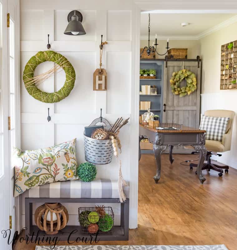
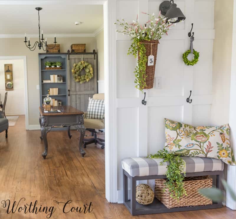
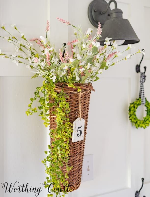
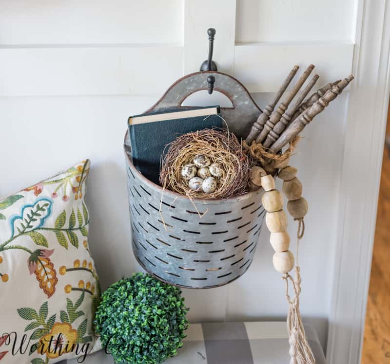
I added numerous hooks to the board and batten wall, thinking that I’d use it for overflow for coats when we have company, but in truth, it has become a favorite place to decorate for the holidays and different seasons. If you’re looking for an easy and inexpensive way to add seasonal character and texture to a space, you might want to consider adding a wall similar to this one. I’ve added it to my hallway, to my guest room and to the dining room in our beach condo and the difference it makes is amazing!
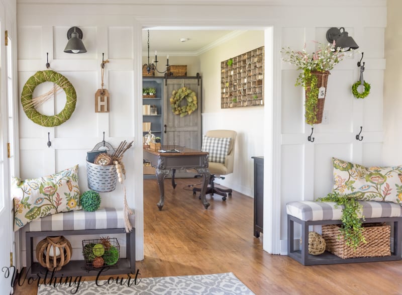
To cozy the space up a bit and to actually have a place to sit, I made two benches to flank the opening into our office. They were super easy and you can find the tutorial for making your own HERE.
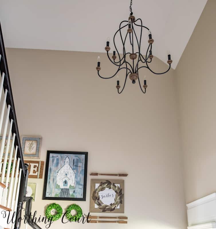
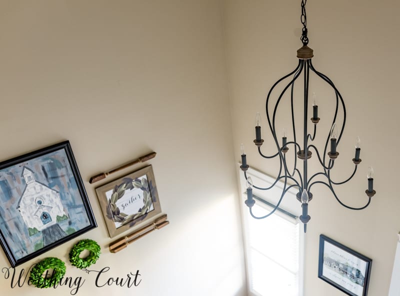
Next came the lighting. I don’t have a picture of it, but the original light fixture was verdigris green with thick glass panels. I was taken aback when my electrician removed the old light fixture and found that its weight wasn’t properly supported and looked like it was on the verge of crashing down on us. Yikes! I did a blog post with several lighting options, seeking your opinions, and this is what I settled on. It’s just the right combination of metal and wood and has an open and airy feeling.
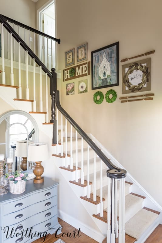
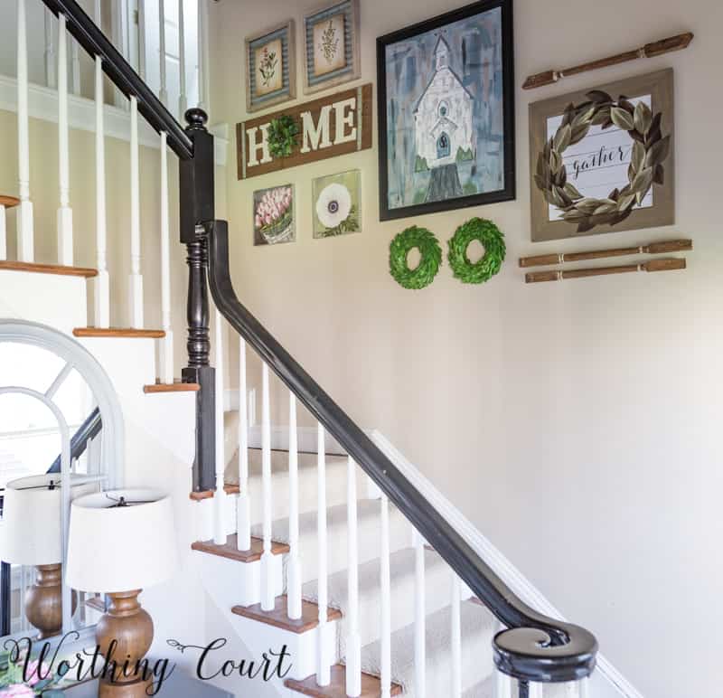
The final project to be completed in the foyer was the gallery wall going up the staircase. And this is where I stalled – like stalled since last April. Oh, I planned the layout (and showed you how too) and had all of the frames hung, but what I didn’t have was anything to put in the frames. My intention was to paint my own artwork to fill the frames, but I never seemed to get around to it. But, during what turned out to be a fortuitous quick stop at Kirkland’s, I found just what I needed to complete the artistic wall.
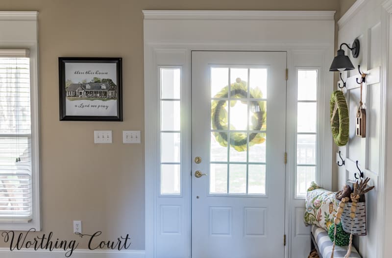
At the last minute, I decided that I needed a little something to place on the wall between the front door and the window at the foot of the steps. Sorry about all that glare coming through the glass!
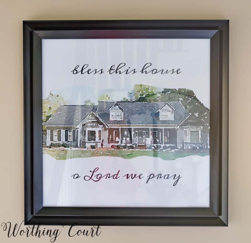
And what I came up with was a faux watercolor of the exterior of our house. It was super easy to do and seems so appropriate for this spot. Let me know in the comments if you’re interested in a step-by-step tutorial for how you can make one of your own. You’ll have to overlook the reflection in the glass – there just wasn’t any way for me to get rid of it.
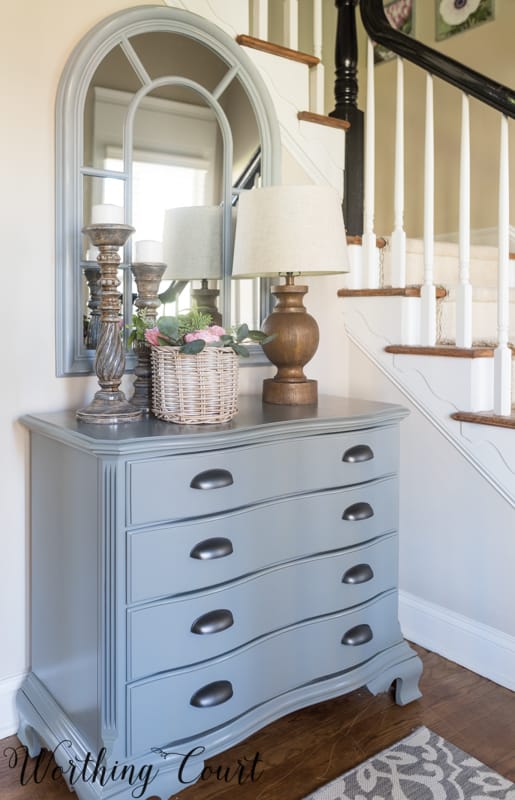
Finally, after alllll that time, with the addition of a few pretties the makeover of my entryway is complete!
Here’s a last look at my original to-do list and what I decided not to do.
- Caulk and paint the board and batten wall white, to match the trim.
- Replace the chandelier, replace the can light in front of the coat closet with a flush mount fixture and add a matching flush mount in the hallway at the top of the stairs. I wound up not replacing the can light.
- Replace the area rug. The current one just isn’t working well with two dogs.
- Add hooks to the board and batten wall to the left of the office opening.
- What am I going to do on the board and batten wall to the right of the office opening???
- Build (maybe) two benches – one for each side of the office opening.
- Do something on the big honkin’ wall going up the steps. Gallery wall???
- Made a decision about whether or not to add sconces to either side of the mirror above the gray chest. I nixed this idea as I thought it would be too much.
- Add an outlet inside of the coat closet. That’s where our modem and router are located.
- Add some sort of drapery or shade to the window at the bottom of the steps. I nixed this idea too.
- Add accessories!
RESOURCES:
I’ve added links to the same product where possible, otherwise I’ve linked to a similar product. This list contains affiliate links, which allows me to make a small commission from your purchase, but at no additional cost to you. See my full disclosure HERE.
Paint Colors: Walls – Sherwin Williams Accessible Beige, Trim – Sherwin Williams Extra White, Bannister – Sherwin Williams Black Enamel (oil base)
Black Wall Sconces (on board and batten wall) – Home Depot
Chandelier – Home Depot
Gray Chest – Wayfair (similar)
Arched Mirror – Wayfair (similar)
Lamp – Wayfair (similar)
Indoor/Outdoor Rug – Target (similar)
Anemone Floral Square Art – Kirkland’s
Tulips Floral Square Art – Kirkland’s
Magnolia Wreath Gather Framed Art – Kirkland’s
HOME Sign with Wreath – Kirkland’s
Floral Pillows – Target (similar)
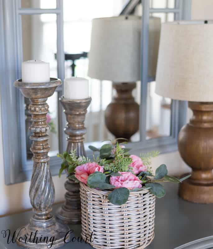
Gray Candlesticks – Wayfair (similar)
Artificial Flowers – Michael’s
Benches – DIY Project – Tutorial HERE
Church Painting – DIY Project
Watercolor-Look House Picture – Tutorial coming soon!
Love the makeover!! I would be very interested in a future how-to post on the beautiful faux watercolor.
wow Suzy, your entryway is just stunning. can’t wait for the water color tutorial. once again, you are such a great source of inspiration!
I like your watercolor too and am interested in learning how to create on of my own home. Thank you!!! Blessings!!!
OMG! I have to know how you did the watercolor of the exterior of your home. I am an avid follower of your blog and love everything you do! I am on the finishing touches of building my own home (I designed every square inch with inspiration from you!) and starting my life completely over! This would be a perfect way to symbolize how far I’ve come.
Blessings,
Ginny
Your foyer looks great! And I love your front door! I’ve been trying to talk my husband into replacing our front door with one similar. The watercolor you did is perfect! I have no artistic talent, but I’d love to see how you did it.
I love the gallery wall. It’s given me some great ideas for my stairway wall. I’d love a tutorial on the church painting and house watercolor.
I love it Suzy! And, your entry way’s features are similar to mine. I love the black sconce light. Where did you find that size? love the look. love, love, love it all! great job! laura
Hi Laura. I can’t believe that I didn’t include those in the resource list! Anyway, I’ve added a link to those scones in the blog post now.
Wow! It is beautiful! Great job! Love the watercolor of your home! Really finishes off the space! Cheers to finishing!
I love everything about your makeover. I know how hard making over a foyer can be. I’ve been staining and painting our railings, spindles, risers and trim for about a month now. The end result is near and I’m so happy I didn’t back down from this project. I would love a tutorial on the house watercolor.
I would be interested in your tutorial too!
Amazing job, Suzy! So much more inviting with the softer colors and decor. Lookiing forward to your watercolor tutorial.
Stunning! I love you sense of color and style. Every square inch of your home is an inspiration! Thanks so much for doing what you do!! Also very interested in the water color tutorial.
Your entry looks great! I especially like the new door and trim work, as well as all the beautiful molding. I can’t believe the before and after pictures. Yes, I would love to learn how to do the watercolor print.
Your entry is quite inviting. What fun to make it the way you want. I would LOVE to know how to do the faux watercolor – such a personal and sweet piece in your foyer. Thanks.
So pretty!!
Suzy, Beautiful job! Can you please source the basket with the #5 on it for us? Thanks!
Hi Lori. I found the basket at a local shop, but here’s a link to a similar one: http://www.acottageinthecity.com/ragon-house-en/grey-washed-narrow-willow-wall-basket.html?limit=75
I would love to have the tutorial on how to do the watercolor.
Beautiful makeover! Please share the information about how to do the watercolor.
???
Well done. Love the “watercolor” of your home!
It’s just beautiful! I love your decorating style. I especially love idea of the hooks you use to decorate on inside the front doors.