Small Dining Room Makeover Reveal – Bringing A Mood Board To Life
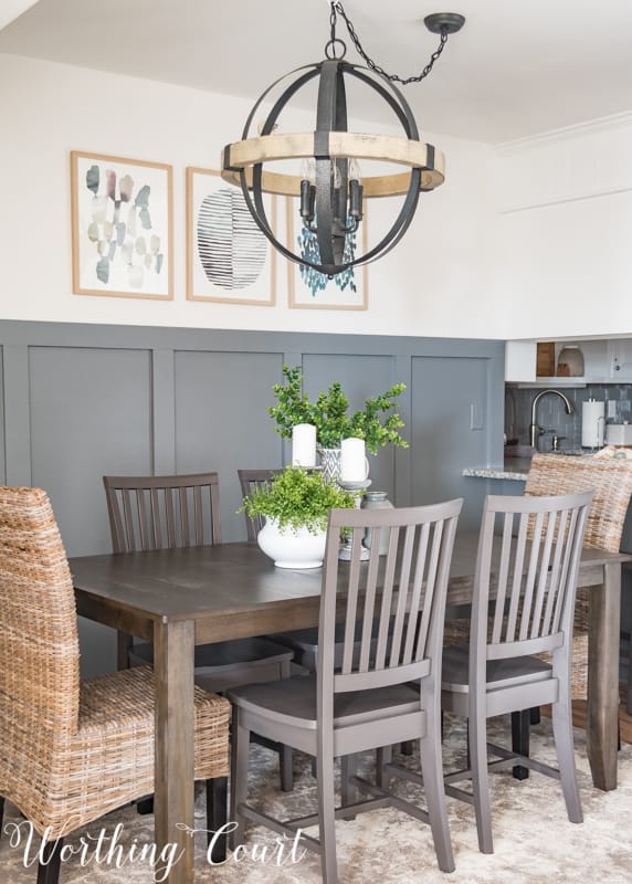
The dining room at our beach condo is a very small space that has to serve as the main entry into our condo and also act as the pass through from the kitchen to the rest of the condo. It’s the very first thing you see when you enter the condo, so its first impression is pretty important to me.
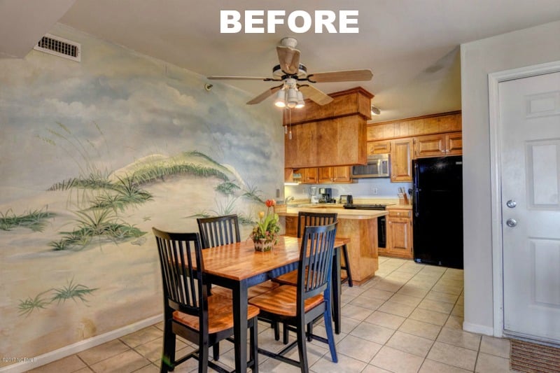
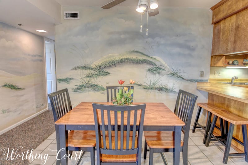
Before we tour the entire finished space, take a look at what we started with. These are the real estate photos from the listing of the condo. You can see that the space is a bit awkward and that it was decorated in “beach rental chic” style. 😀 Other than a badly cracked floor tile, the room was in decent shape, but it definitely wasn’t me. If you aren’t familiar with purchasing property at the beach (at least in North Carolina), the furniture, artwork, accessories, dishes and everything else is normally included in the price, so I was able to reuse part of the dining furniture in the makeover.
After evaluating what furniture I wanted to keep, how the space needed to function and what I wanted it to look like, here’s the mood board and the to-do list that I put together. In the entire condo, I’m going for a modern farmhouse vibe with just a little bit of beach thrown in. Paint colors and a full resource list for everything used in this makeover are below. Psst! Love the idea of using a mood board for your own home decorating? Learn how easy it is to create one by clicking HERE!
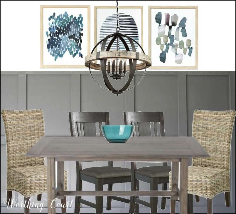
MY TO-DO LIST:
- Remove murals and paint all surfaces – walls, trim and ceiling
- Remove tile and replace with laminate flooring
- Add board and batten to the wall behind the table
- Paint board and batten a medium shade of gray
- Remove the ceiling fan and replace with a statement chandelier
- Purchase a larger dining table
- Purchase end chairs that have a beach vibe
- Paint existing side chairs and barstools
- Add a small chest to the entry area
- Add an area rug
- Add artwork and accessories
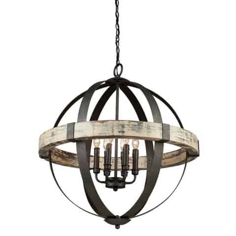
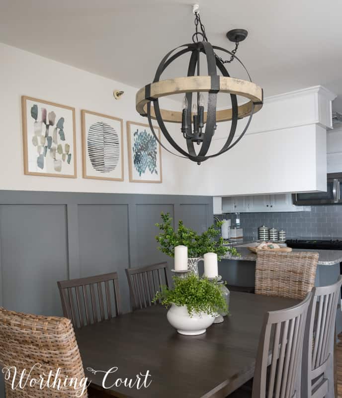
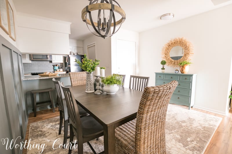
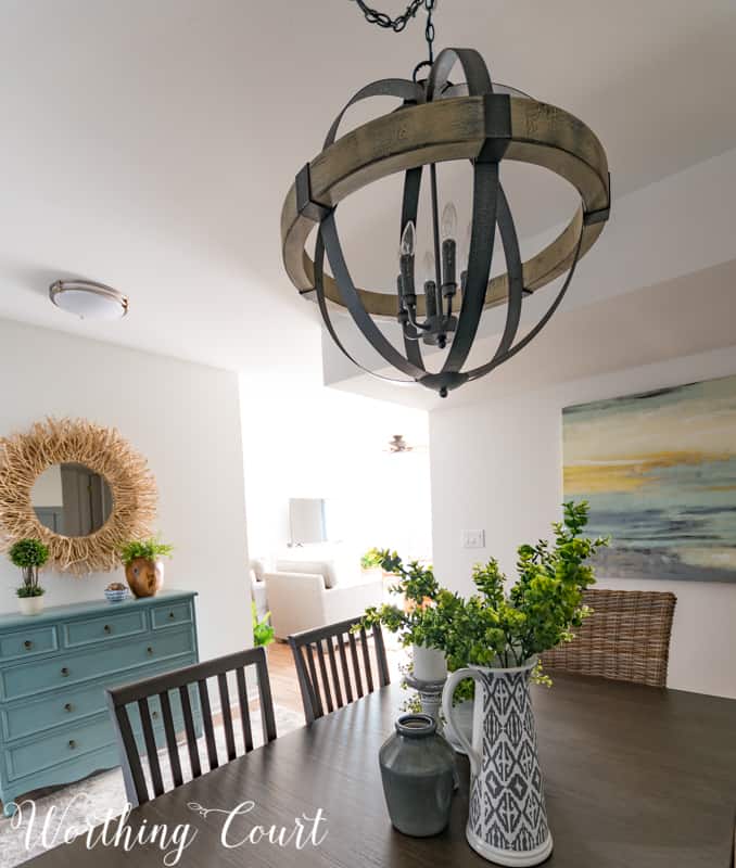
Have you ever had one thing inspire an entire room makeover? Well, that was the case here! I was totally enamored with this amazing chandelier from Lighting Connection and decided to make it the feature of the space. You might remember it from the mid-makeover room update that I posted in October. Isn’t she a beauty? Yum!
A couple of things to note:
- This is a larger chandelier than I would normally hang over a table this size, but the smaller, four light version just wasn’t going to cut it. Whatever light we use in here needs to provide light for the entire space, not just for additional lighting above the table. I admit that I was really nervous about trusting my instincts, but I’m so glad that I didn’t chicken out and go for the smaller fixture.
- And yes, this chandelier is hanging higher than I would normally hang a fixture above a dining table, but it’s for the same reasons as why I chose such a large fixture. The six candelabra bulbs light the entire space up beautifully!
The beach scenes covering two of the walls were actually wallpaper murals and thankfully, came off easily. Before painting, we just gave the walls a light sanding to remove any of the leftover paste residue. Once the murals were removed though, the wall beside the table looked way too bare. It wasn’t a good spot for a gallery wall or a large piece of art since anyone using the chairs on that side of the table could easily knock down anything hanging there, so adding board and batten was a great alternative!

To visually tie the wall treatment in with the rest of the space, you can see that we made it the same height as the bottom of the kitchen cabinets and I love, love, love the color that we painted it. A trio of abstract artwork works perfectly in the space above the board and batten and adds just a bit of my blue accent color to the space.
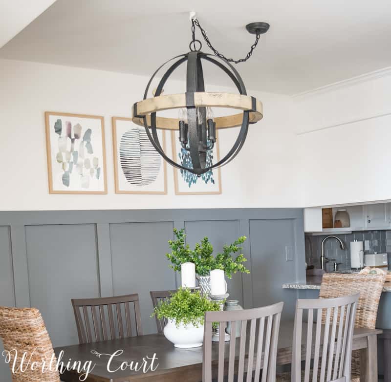
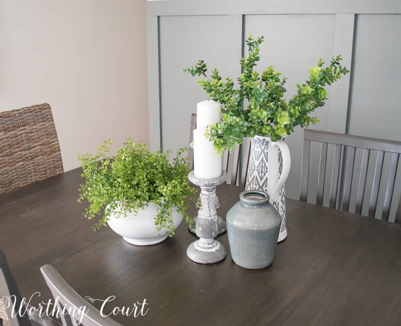
I gave some thought to keeping the dining table that was already here, but it would only accommodate four people comfortably and I wanted to be able to seat at six – eight. For a while I considered purchasing an expanding table, but there really wasn’t any need to go to that expense since we would never likely need that many seats. So I found a very affordable, but sturdy table that works wonderfully in the space that has just the tiniest bit of gray in the brown finish. I gave all four of the existing chairs and the two barstools a makeover using my favorite color of gray spray paint. At each end of the table, I placed a wicker, chair which helps to bring the shades of gray and brown together. 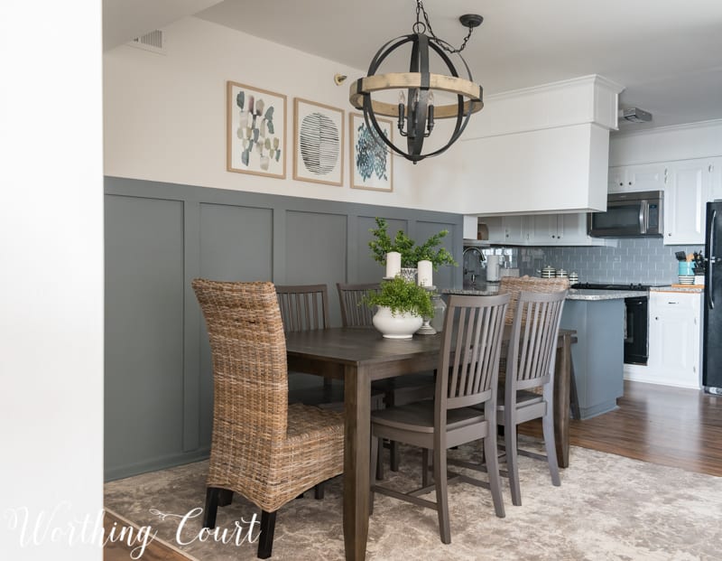
In the entryway portion of this area, I added a narrow chest to the wall opposite the table in a pretty shade of blue. It keeps our car keys, dog leashes and other assorted stuff handy. You might recognize this chest as being the exact same one that I have in the dead space at the top of my stairs at home. Pookie looked at me like I had two heads when I came home with the twiggy mirror, but I love it! It reminds me of pieces of wood we often find during walks on the beach.
Another big blank wall that I had to deal with is the one that is part of the pass through to the hallway and is opposite the front door. Normally I’m not a believer in thinking that every single wall has to have something on it, but this one just did. Without something there, the whole space felt undefined somehow. The large piece of abstract art that I found works well with my modern farmhouse style and is reminiscent of the water and a sunny sky, don’t you think?
To finish the space off, I added an absolutely gorgeous rug! The ivory, gray and taupe colors in this area rug pull the entire area together.
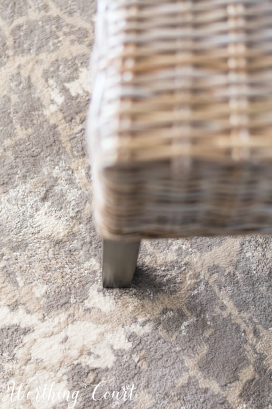
My intention was to just place a rug under the table and chairs, but a rug like that would have impeded on the walkway to the hall and wouldn’t have looked right. Plus, I prefer to have a doormat at any exterior doors, so then I would have had an oddly placed rug under the table and a small rug at the door. Not a great combo in my book. By using an 8′ x 10′ area rug, I was able to turn it sideways so that it grounds the table and chairs as well as acts as an entrance rug. Turning the rug sideways was a great solution for this problematic space and really helps to make sense of the whole area!
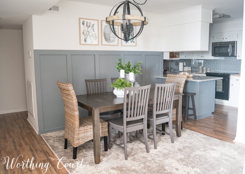

So what’s the verdict – did I do a good job of bringing my moodboard to life?


RESOURCES AND PAINT COLORS:
Some affiliate links have been used. See my full disclosure HERE.
Room Paint is all Sherwin Williams brand – walls: Snowbound, ceiling: Ceiling White, trim: Extra White, board and batten wall: Wall Street
Flooring – Lowes
Chair and Barstool Paint – Rustoleum Anodized Bronze Spray Paint
Chandelier – Lighting Connection
Table – Signature Design by Ashley
Wicker Dining Chairs – Pier 1
Area Rug – Orian (this specific rug will be available soon!)
Blue Chest – Kirkland’s
Round Twiggy Mirror – Houzz (similar to mine)
Teak Wood Vase – Target
Abstract Watercolor Art Trio – Target
Large Square Abstract Art – World Market
Tall Vase – Wayfair (similar to mine)
Small Gray Vase – Hobby Lobby
Round White Footed Bowl – Hobby Lobby
Faux Greenery – Hobby Lobby
Gray Candlesticks – Wayfair (similar to mine)
Chairs and Barstools – left by previous owner
Looks great! I love that chandelier!!
I like the look, but am surprised by some of the choices. I am from the Outer Banks of NC and was a Realtor there for many years. I found that laminate floors are easily scratched by sand and do not hold up well when getting wet by frequent trips to the beach. I also found that if you want to keep your outer doors open and not use a/c all of the time that overhead fans are a must in the living and bedroom areas. They would not be my choice in another locale, but I have heard many people say they wished they had not replaced them to go with a look rather than comfort. I love the sound of the ocean at night, but it can get rather warm without a fan to move the air. I enjoy your blog and will continue to read to see what’s coming up next.
Hi Donna. I understand all of your concerns about using laminate flooring in a beach setting. We did a lot of research before selecting laminate and talked to several people that we know who also have ocean front property and have laminate flooring in their places. This is the second ocean front property that we’ve owned and renovated. Our first property was purchased and renovated in 2008/2009 and also had laminate flooring in it for the entire 9 years that we owned it. It was a great solution for us! It was much more cost effective than tile and doesn’t get that icky sticky feeling that carpet can get over time at the beach. Even though we were/are ocean front, we’ve had no problems with warping from moisture or scratches from the sand. In fact, the only scratches on the flooring at our last place were from where our dog incessantly clawed at the floor by the front door when we left him alone for longer than he liked. Hopefully, the flooring in our new place will prove to be as durable as in our previous condo!
I am so glad you have had a good experience with flooring. It is easy to clean and has a nice look. I certainly share your feelings about carpeting at the beach! It can feel sticky and gets dirty quickly. Enjoy the beach!
Well done! Great success with bringing the mood board to life. The abstract painting is the perfect finishing touch. The farmhouse style condo feels like home with just the right amount of “beach vibe.”
I am loving your chandelier and great new updated look! So much an improvement from the “before” . Beautiful choices!!
Love it ! Very inviting! I find it interesting you painted the light switch on the wall! The home we moved in to they did this also, but I do not know how many years ago And we noticed most of them the paint is now coming off. Trying to decide to repaint them or remove the paint or hmmm. what to do what to do…
Just fyi – what you see on that wall isn’t really a light switch – it’s just a blank plate covering the old telephone wall jack. Remember those??? lol If it was a light switch, I wouldn’t paint it as I think the paint would come off over time because of constant use.
Love all the choices you have made!Great job!Are you going to do another Facebook live when you have completed the condo?Enjoyed the last one!
Thank you, Ellen! So glad you like it. I’ll probably be doing another FB live in March sometime.
Amazing transformation! Everything looks great! And I love how you turned the rug and used it to serve two purposes!
I think your dining room looks great. Love the choices you made…especially that mirror. It’s quite perfect for the beach! 😉
Love It! I really like the board and batten. Very inviting space.
do you have a make-over for the kitchen up yet? Love the tile.Another floor alternative: We put vinyl planking flooring in our home and it resists all scratches and moisture. So many fun colors, too. I love this beachy style.
We’re still working in the kitchen so I don’t have a makeover of that space up yet. Hopefully, it won’t be too much longer!
This is the first I’ve ever heard of a mood board – I love it. I like gray only when it is mixed with some color ie blue. Straight on gray is a bit too much for me, especially when there is more gray in the room. I’m looking at homes for purchase, and they are all painting them gray, and I don’t like it. I would have to repaint the entire place, they should stick with neutral.
Love it! Thanks for the inspiration! Is the mood board and batten hard to do?
Hi Dina. Are you asking about the mood board or the board and batten?
Love what you recreated. A mood board looks to be very helpful. How do you make a mood board? Is it something done digitally?
Look for the tutorial tomorrow (Monday, Feb. 5th)!
This looks beautiful! Do you have the rug name/model that you chose?
Hi Melissa. The rug is by Orian, but that model won’t be for sale until next month. I’ll be sure to come back here and update this post once it is!
Very stylish, love it!
Oh gosh Suzy! Just beautiful! Love your blog, love your choices, your have wonderful taste!
You’re hard work is lovely.
The abstract art is so different from your farmhouse
vibe but it definitely adds the “modern” you were
striving for in your condo.
I know you are pleased to be done and moving on
to your next project.
You are amazing Suzy?.
Love, love, love the light fixture!! I tried to get Ramona to buy something very similar when we remodeled her condo.
Wow Suzy! You did a great job with your mood board! It looks beautiful!! Awesome job! Love it!
I think you did a great job bringing your mood board to life! Looks pretty and functional!