Plans For My Dining Room & My Decorating Disorder
Y’all, I have a decorating disorder. It’s called CantFocusItis. I’ve suffered with it all of my adult life, but I’ve been in therapy, so I’m hoping for a cure! All kidding aside, I really, really do struggle when it comes to staying focused on completing rooms in my house. My habit has always been to do one thing in this room, buy one thing for that room and so on. Before you know it, I feel out of sorts in my own home because I haven’t actually completed anything – just little bits here and there. Am I the only one or can you relate?
So, while it has really been hard (#thestruggleisreal), I’ve been forcing myself to pretty much complete one space before jumping onto the next. I pretty much have to put blinders on when I’m shopping.
The next room on my radar is my dining room. Here’s what she looks like today. This view is looking through the opening from the office.
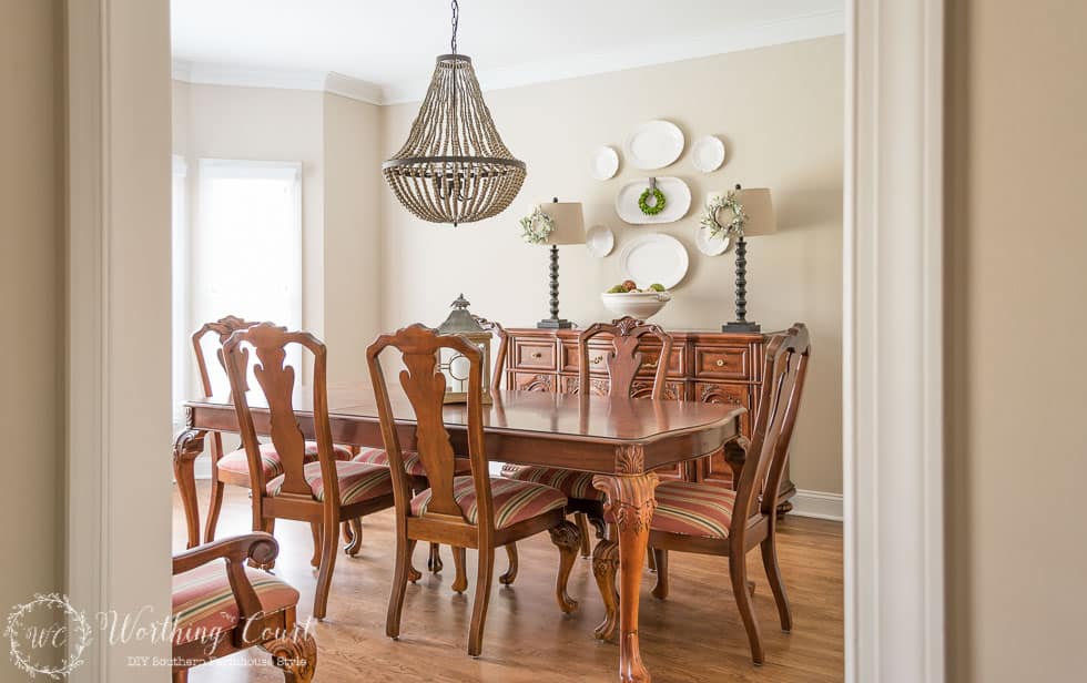
We repainted the walls after removing all of the wallpaper that was here when we purchased the house. All of the trim was stained brown, but we’ve painted it white and the floors were refinished. The only other thing that has been done in this room is to switch out the old chandelier with this beaded one from World Market (oh, how I love it!). This is pretty much how the room has looked for over a year.
Before I tackle a space, I like to spend time thinking about the feel and function that I want the room to have. In my mind, a dining room should feel a little more “special” than any ole eating area. It’s where we typically gather for special meals and occasions.
I’ve added farmhouse flair to the other rooms that I’ve completed in our house, so I want to continue that into my dining room. Keeping all of that in mind, here are my plans – as of today, that is.
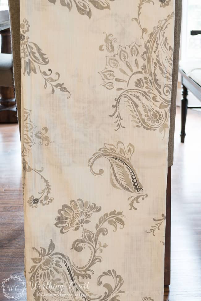
My jumping off point for the plan, is this pair of draperies that I found at TJ Maxx several months ago. I plan to hang them from my cheater curtain rods, like the ones that I used in the breakfast area window. I won’t be hanging them all the way into the bay window though. My plan is to hang a panel on a short curtain rod on the wall on each side of the window.
I’ll be keeping my furniture and the overall arrangement will stay the same. I don’t know if I can accurately put it into words, but I envision a dining room in a real farmhouse as the place where the ‘nice’ furniture is. It holds the dressy furniture that was a special purchase by the owners. Or maybe the furniture was handed down by a loved one, which makes it treasured all the more.
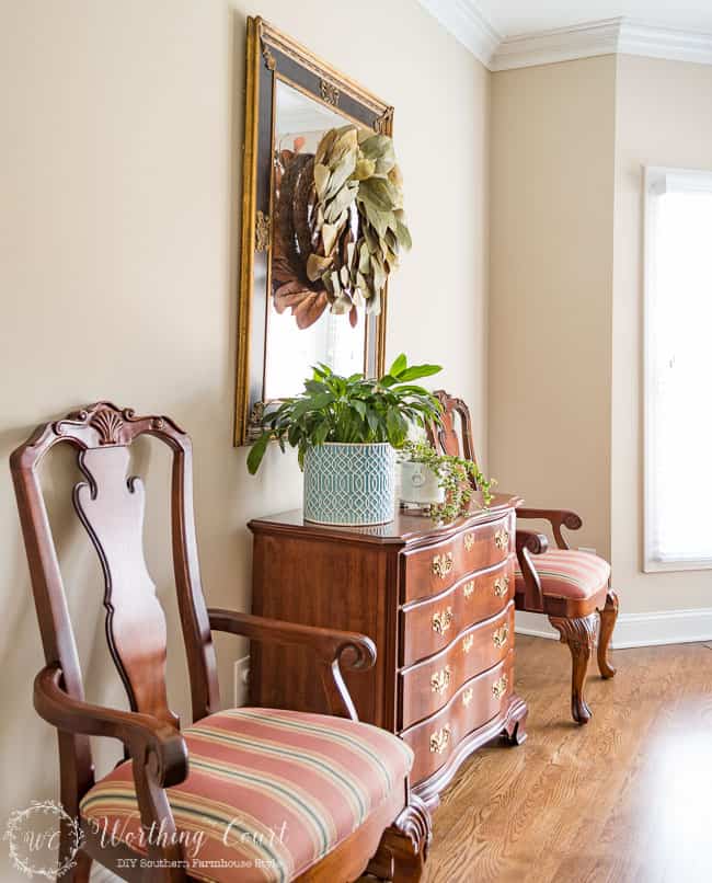
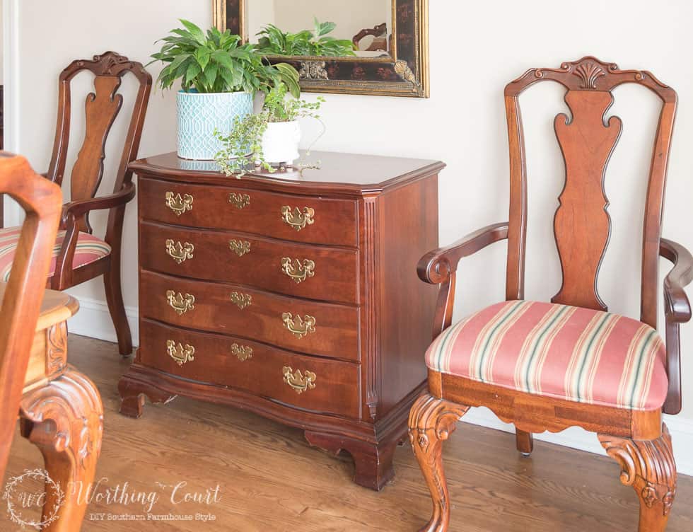
I won’t be painting the dining table, chairs or sideboard, but I probably will paint this little cherry chest that lives on the opposite wall from the sideboard. Any suggestions for a color? I’m not sure about the mirror – where it will go or even if it will continue to live in this room.
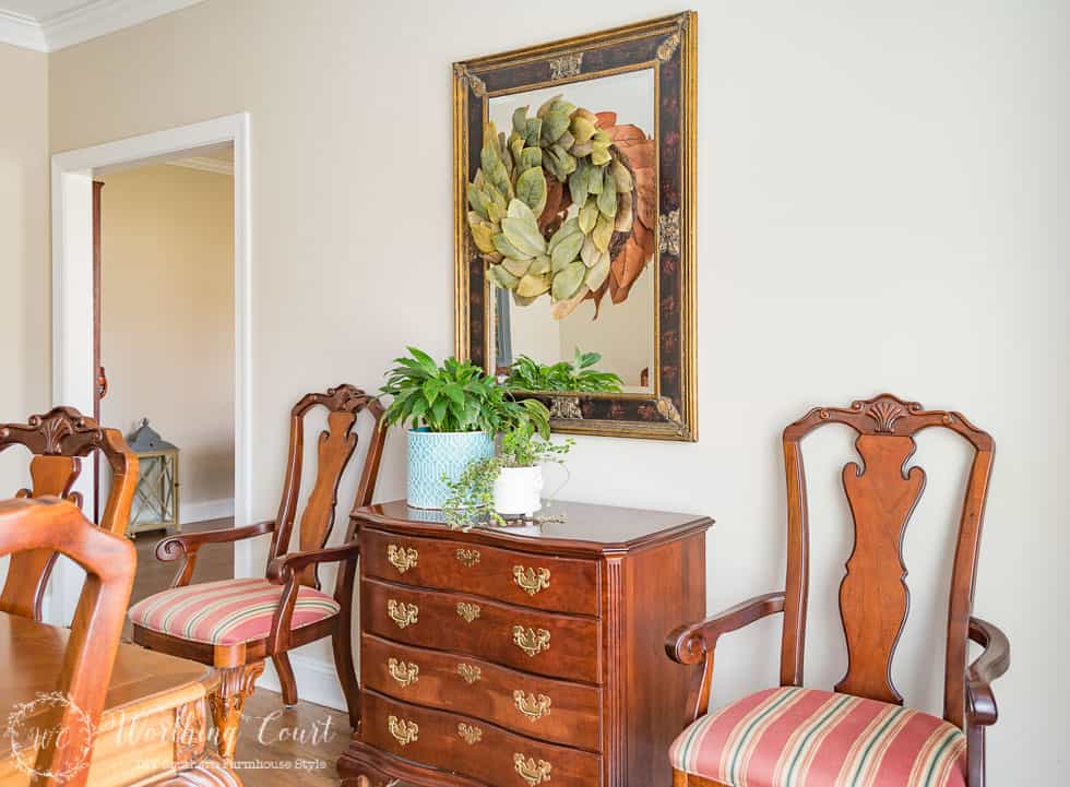
I do plan to update the chair seats by recovering them. I’m on the lookout for a fabric that will work with the draperies.
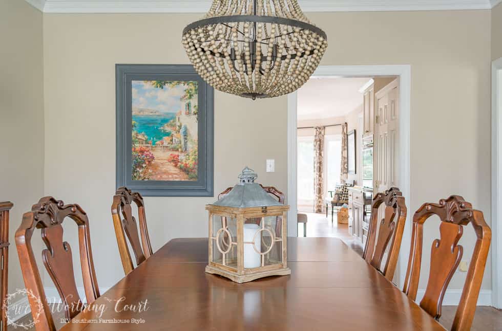
This is the view looking from the dining room into the kitchen. I need to figure something out for the wall to the left of the door. The piece of art that is hanging there now is just a place holder. It’s a diy upcycled piece that used to hang above the mantel in our former home. At the moment, I’m waffling between a diy plate rack or a collage of botanical prints.
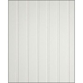
I plan to add some texture to the room by creating a feature wall with this paneling (did I really say paneling???) behind the sideboard. I’m pretty stoked about that. Hope it turns out the way that I picture it in my head!
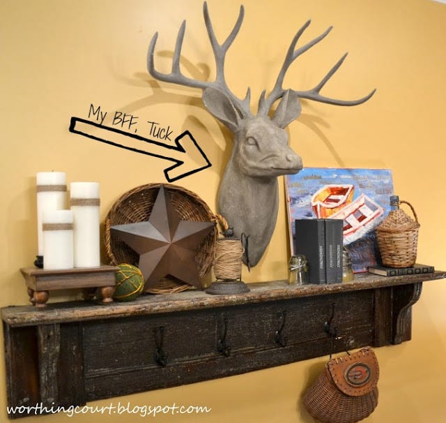
I’m thinking about adding the vintage manel/shelf that used to be in the basement of our former home to the dining room. Should I hang it above the sideboard on the paneled wall or above the smaller chest? Yet one more decision to be made. I love this piece and was really disappointed when I couldn’t make it work where I created a dropzone or on the screened porch.
Still to be decided:
- Do I paint the walls? If I do, I would go with a darker color for a bit of drama. I’m hesitant because this room doesn’t get a lot of sunlight, but I’m hoping that the white paneled wall would keep things bright enough.
- Do I add a rug? It would have to be large enough that the chairs won’t slide off of it when moving them back to be seated. There isn’t an abundant amount of floor space on the sides, so I’m thinking that a rug might make the room look too cluttered.
- And should I change the chairs at each end of the table to something different?
So this is the plan. I’m excited to see how it all plays out and to share the process with you! Do you have any rooms that you’re working on?
Sharing at THESE great parties.
Sounds like you have a wonderful farmhouse plan. Not convinced about dark color over beadboard, though, but I’ve been wrong before. (egg yolk yellow paint in my kitchen, for example! Lol) good luck and I’m sure whatever you choose will be exceptional!
Ha ha, Debra – I’ve made many paint color mistakes in my day! I wasn’t so much thinking about a dark color -maybe just a shade or two darker than what’s on the walls now. I don’t think that I’ll make a decision until everything else in the room is done. Thank you for stopping by!
Good morning! Looks like all of your plans are coming along-I’ve followed you for very long time! My style is more like “Liz” from “The Tuscan Home”. But I love the farmhouse look to. A thought about your dining room I would like to make is that it seems your dining room furniture is very dressy-maybe to dressy for a farmhouse look that is in the rest of your home? You might want to paint it? Or get a World Market table like you have in your kitchen? It does need some color maybe on one wall? Accent wall. I like you have ODD, I change stuff buy stuff and never seem to get all finished. I’m excited to see how it turns out!
Suzy, your furniture is beautiful and I love your curtain fabric! I’m like you – just add things here and there. If I do ‘finish’ something, then I change my mind! I’m proud of you for having a plan! It all sounds beautiful – if it were me, I would make the chest blue. 😉
love and blessings~
Lynda @ Gates of Crystal
Hi Lynda. I’m soooo bad about changing my mind. Hopefully, I’ve thought this through enough, but that’s certainly no guarantee! I like your idea for a blue chest.
Love the room. The color is terrific. Rugs under dining rooms tables always seem to be a fussy nuisance. No matter what you do, they sift and move and the have to be huge to get all the chair to sit on them while extended from the table. And then there’s spills. Ugh. A rug would also make the room seem smaller. Recovering the chair will make a tremendous difference. Painting over the beautiful cherry wood chest…criminal.
I’m pretty sure that I agree with you about a rug making this room smaller. Since I don’t have a huge about of room on the sides, I think it might look cluttered too. I hear ya about not painting that chest! But, it’s an inexpensive piece that I’ve had forever so I think I’m at peace with slapping some paint on it. LOL
You have a wonderful plan! I’m like you – ADD when it comes to decorating. Seems like I do more roaming than actual decorating. Love the bead board idea. You get the look without all of the work. I like Lynda’s idea on the little chest. Painting it blue but I would leave the top as it is now. Recover the chairs in a neutral and bring in color by putting smallish pillows on the extra chairs next to the little chest. I love the idea of upholstered chairs at both ends of the table and I’m crazy for the botanicals on the wall. Wonderful ideas! Can’t wait to follow along as you make your way through this project.
Hi Amy. That’s what I was thinking about painting the little chest – leaving the top of it as is. I love that look! Great idea to add pillows to the two chairs on either side of it! I did that in the dining room of my last house and loved how it tied everything together.
Quick as a bunny put a fabric runner and candles on your table. Your room needs softening. With such formal furniture adding a farmhouse look will be a challenge. Maybe blue and white country China pieces would help too. Checks or stripes would add to the chairs.
Hi Nancy. Yes, this room definitely needs some softening! I know this is going to be a challenge for sure and frankly, I’m a little worried about being able to pull it off! Thanks for the idea of adding a table runner. I’ll keep that in mind for sure! Great minds thing alike – I’m thinking either checks or stripes on the chairs too. 😀
I would not paint the chest, but if you must I would wait and see what fabric for your chairs are used. And I would use a fabric that brings in the farmhouse feel. I’m leaning toward a soft blue or grey, only if you feel you must paint the chest. No rug on the floor. I also wouldn’t go darker in a room that doesn’t get a lot of light. If you must maybe only one wall? yet your doing the paneling on one area so that would make it too busy. I love the mirror above your chest. And a mirror always adds dimension to a room. Can’t wait to see the change. And I love the curtain panels!
Hi Dee. If I paint the chest, I plan to leave the top as is. There’s just SO MUCH brown in that room (especially if I don’t add a rug) that I feel like I need to break it up. The lack of light in the room is exactly why I’m hesitant to paint it any darker. I wasn’t thinking about using a real dark color in the room – just a shade or two darker than what’s there now. I guess that I’ll get everything else in place and then decide.
I think it will be a challenge to get the farmhouse look with the formal furniture. Instead of the feature wall, I would do wainscoting in the whole room. I would paint the walls in a medium taupe, not a dark color. It will make the wainscoting pop. I would use a table runner or place mats to soften the look of the room. Unlike the other comments, I would use a rug. I have a patterned one under my table. It really makes the room much cozier & doesn’t show spots at all. I have two young grandchildren to prove it. Good luck with your choices.
Hi Judy. I admit that I’m a little nervous about being able to pull this off! I actually did think about adding wainscoting to the whole room, but I had that in the dining room at my last house so I was ready for something a bit different. The room definitely needs some softening, so I like your idea to add a table runner!
I can’t tell from the picture, but looks like the chest might not be in the best of shape, so painting it in that case would be okay. I would go with a subtle green to play off the botanical prints. I would also change out the hardware. Way too fussy for a farmhouse look. I would recover the chair seats in a taupe and white or black and white polka dot to go with the curtain fabric, but add a bit of playfulness to the room. I would get rid of the wreath on the mirror. If the room needs more light, you need to allow the most reflection off of the mirror possible. I would like to see the paint left neutral, but somewhat darker to bring out the warmth of the dining set. The breadboard would be okay on one wall but I would paint it the same color as the other walls.
Can’t wait to see the end product!
Hi Cindy. That chest is a little scuffed up, but the main reasons that I want to paint it are that I’m so over the cheap cherry finish, plus there’s so much brown going on in that room that I’d like to break it up a little. I agree about changing the hardware – I just need to find something that will work on that curvy front! Love your ideas for fabric on the chairs and I definitely need to get rid of the wreath from the mirror!
Personally I think you should paint the chest a beautiful rich deep blue. But, you should probably decide on your chair covers first…that would probably be smarter. I have a hand me down dining room …and while I didn’t choose it…I wouldn’t want to replace it either. It fits our eclectic look. Your dining room is lovely as is…can’t wait to see how you make it lovelier! 😉
Hi Donnamae. Good idea to decide on the fabric for the chairs before painting the chest! Most everyone seems to be in favor of blue. We’ll see – it’s the little things that this that always manage to stump me!
We have been in our new house for almost a year and I haven’t finished a single room. Your dining room is beautiful already. I love the draperies you found. I have checked every time I go to TJMaxx or HomeGoods, but so far haven’t found anything that pretty. Those would work so well for my dining room, too! I think once you find a fabric for your chairs, everything else will be easier to decide. That’s my holdup right now. Or my excuse…. 😀
Hi Sheila. It seems like those stores go in spurts when it comes to draperies. Most of them have grommets, which I don’t think would work well with the look that I’m after. Have you check out Target for draperies? My store only carries 84″ long ones, but just about all of them are available online in 96″ length. Your home is gorgeous and I’m really enjoying watching you pull it all together! It’s a process for sure.
As for the chest I would leave the rich top as is and go with a rich cream paint and new hardware. I’m one that likes to change things to often and a specific color might be in style one day and out the next. I would find a cute plate set for the small wall and put possibly a platter at the top, underneath possibly 2 or 3 plates, and the last row could go on the wall or the fireplace mantel you have with cups, saucers, and possibly salad plates up against the wall. The colors can be playful, subtle, interchangeable. But the mantel needs a little love and paint. Have fun… can’t wait to see!!
Ooh, I like your idea for painting the chest a cream color, Debbie! I was thinking that I would leave the top as is no matter what color I paint it. You’re totally right about using a specific color. That’s exactly why I chose a white backsplash in my kitchen, even though what I really wanted was gray. You’ve really made me stop and think about painting that mantel, but I’m not sure that I could do it. It has the most wonderful chippy patina that I hate to cover up. Great ideas for using and displaying a plate set too!
I looked at the mantel again and those hooks would be perfect to hang the tea cups.
If you were to paint the chest, I’d make it a neutral color with the wood top exposed. How about a natural fiber rug under the table. It would break up the wood tones from the floor to the table. Definitely choose head table chairs . So many choices for you. Have fun!
Hi Kathy. You’re the second person to suggest a neutral color on the chest and I really love that idea. That’s my problem when it comes to decorating – so many choices! 😀
thanks for sharing on craft schooling Sunday, great to see things in the “before.” My husband’s idea of decorating a home is to do one room at a time, but i could honestly never do that, so instead very little gets done, sigh. How about doing something on the ceiling? Just a thought! And maybe adding some interest to the beaded chandelier?
I can sooooo relate to your non-ability to focus. Please let me know if your therapy helps. LOL I love your decorating style. Thank you for sharing your journey with us 🙂
I love your ideas! For colors, I would figure out a painting I love for the wall first, and then figure out fabric and furniture paint based on that. Maybe that would make it easier?
I hear you – I suffer from barewallsyndrome.
I love the curtains and the chandelier. I think it would be neat if you painted the window wall a deep color in the gray-graphite family or else a deeper gray like BM’s Rockport Gray. Since there’s not a huge amount of wall showing as well as the fact that curtains will frame the window, it will make an impact without taking over the room.
I think a rug would work just fine, regardless of how little floor will show. Dining rooms reserve the right to be dramatic and he beaded chandelier is a good start!
As far as painting the chest, I might look for a longer sideboard first and perhaps turn the mirror horizontal to gain a wider reflection. The cool shelf would look great on the opposite wall above the paneling.
Fabric for the chairs could be a black and cream check in a faux silk and you could opt for cream colored arm chairs for the heads of the table. Thanks for asking for reader input – Whatever you do it will be beautiful!!
Wow, you have the luxury of a great sized room. I love the idea of fake draping those sidewalls. The beadboard is very interesting, but with the scale of the furniture and the heigth of the ceilings…a common practice at the late turn of the 19th century was to have beadboard/wood panels 2/3 of the way up the wall with a plate ledge or railing top. With todays decor and the scale of your pieces, this would give your room an intimate feel and bring the ceiling into the overall design rather than floating. You could even be brave and keep light panels and darker upper walls and ceiling.
Just a thought, but i am sure what ever you do will be great as you have a beautiful start already.
Hi Suzy
I can so relate to the feeling of being a bit scattered when it comes to completing home décor projects. For me, it’s keeping a mental inventory of certain items & then seeing them at an irresistible price at TJ or HG and buying them because you never know when you might find them again. Thus, I end up with a bit of this & a bit of that.
You definitely have the right approach. Make a plan & see it through. Love the direction you are going. You finished projects are always an inspiration.
LOVE that chandelier…it’s on my list for your dining room redo someday! I would totally go with painting the chest depending on what fabric you get and what color you paint the walls! Something bold and fun? Some paint and new hardware it’ll be a whole new piece! Good Luck!
I just recovered the chairs in our dining room and painted the table to give it a more modern fresh look. I love what you’re doing in your dining room. You have to come link these up at Welcome Home Wednesdays. Party is now open! http://www.suburbansimplicity.com