A Living Room Makeover Created With Summer In Mind – Before And After Room Reveal!
Are you a warm weather lover? You don’t have to live in a warm climate to have the look and feel of summer in your home year round. This room is inspiration for creating the look in your living room or family room through careful use of color, pattern play and texture.
What better time to share the final reveal of the living room at our beach condo than during The Summer Colors Home Tour hosted by my friend, Jennifer Zuri from Town & Country Living! Several bloggers are joining together to show you our favorite colors of summer and how we love to decorate with them. You’ll find inspiring summer decorating ideas every single day this week! The schedule for the week and links to everyone’s posts can be found at the bottom.
In case you haven’t visited here at Worthing Court before, we’ve been giving our condo, located on the beach in North Carolina, a full remodel. I’ve been working toward a modern farmhouse look that can be used anywhere – no matter how far from the beach you live. So far, we’ve completed the kitchen, dining room and living room, which I’m excited to give you a tour of today! Click HERE to see the finished kitchen and HERE to see the finished dining room, both rooms with before and after photos.
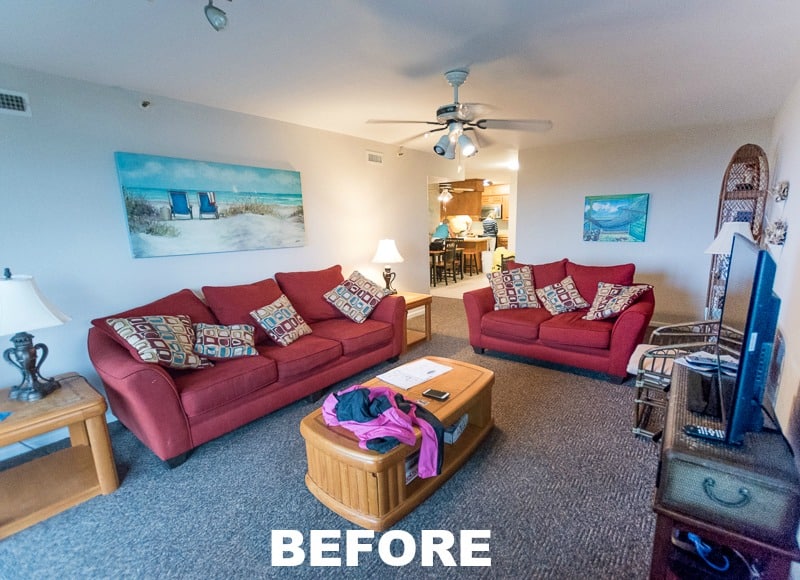
Since this is a room reveal, let’s start with the before. This is what the room looked like on the day that we looked at the condo. It wasn’t decorated to our taste at all and everything was very worn and kind of icky since the previous owners had been using it as a vacation rental.
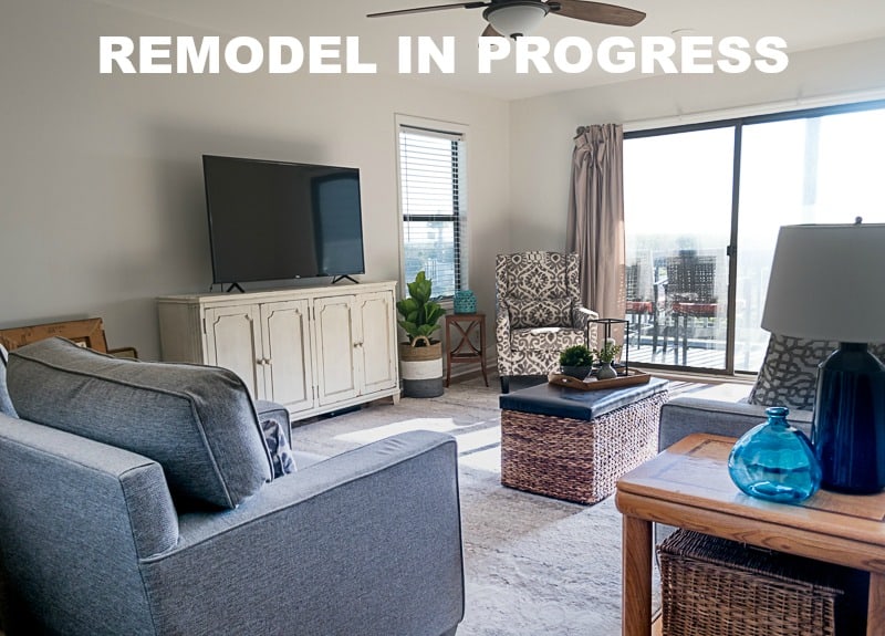
We started off the makeover of the living room by painting the entire space, replacing the carpet with new flooring, adding an area rug and bringing in new furniture. This work-in-progress photo shows how I kept the walls, flooring and furniture a neutral color and simple in style. This trick will allow me to change up the decor of the room anytime that I feel like it. At this point, the previous owner’s draperies were still in place.
In addition to the modern farmhouse vibe I’m after, I’m giving every room a coastal feel, with just a nod to the beach through the use of color, texture and art. No cutesy beachy chotchkies allowed. 😀 Fast forward to a few months later and here’s how the living room is looking today!
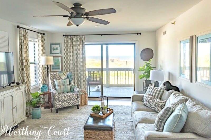
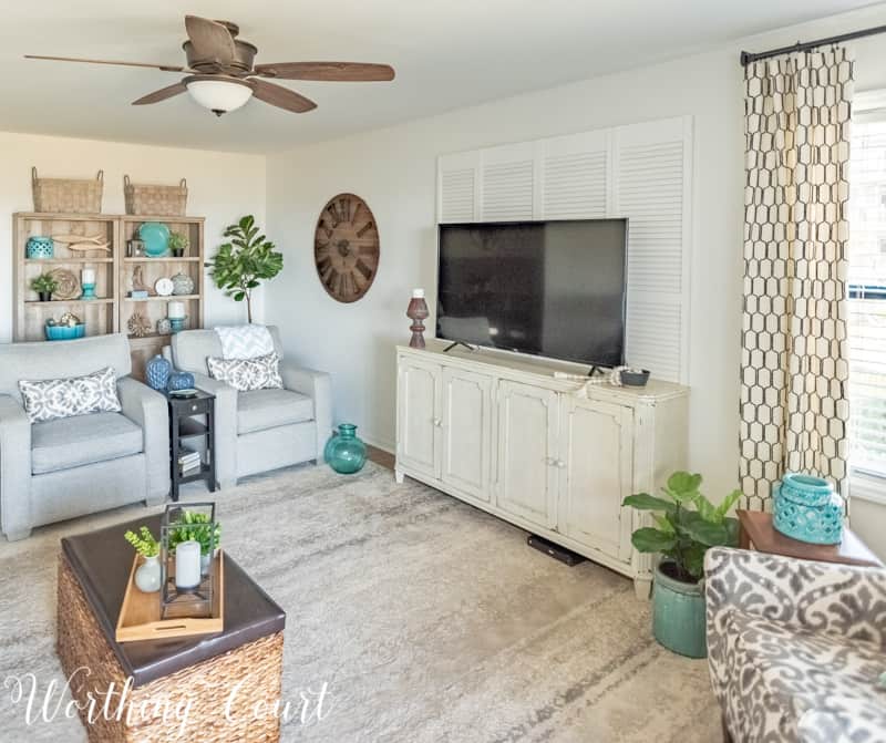
Looking at the opposite end of the room, you can see that the living room is open to both the dining room and kitchen, so the finishes and decor in all three spaces needs to flow together.
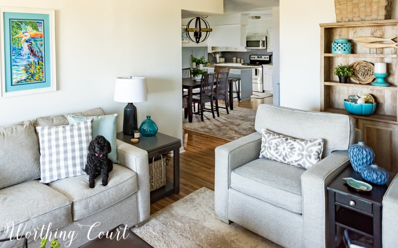
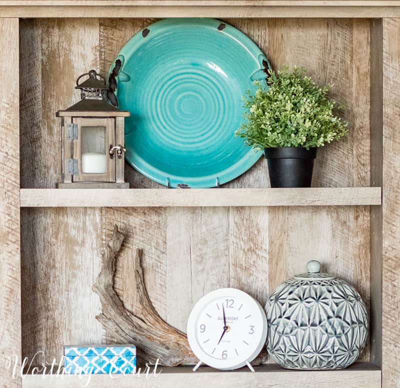
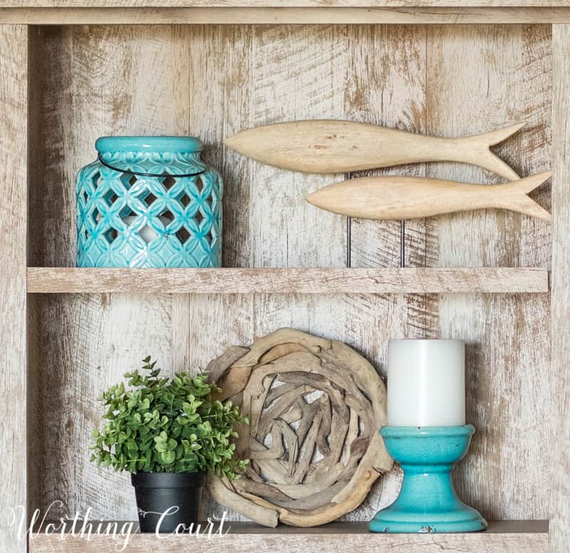
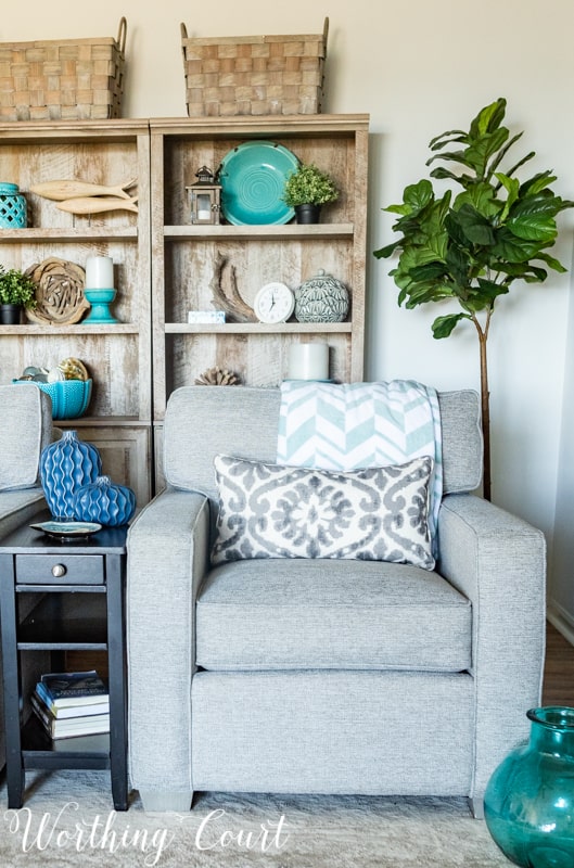
A pair of driftwood-finish bookcases, located behind a pair of chairs, balance the height of the sliding glass doors by adding height to the end of the room opposite from the doors. Baskets added to the top make them feel even taller. They’re a great place to display a few accessories and provide storage behind the cabinet doors on the bottom half.
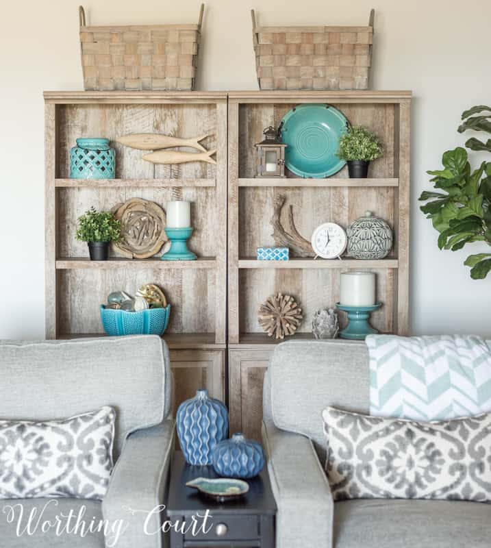
The addition of a faux fiddle leaf fig tree helps to fill the empty corner.
To help fill the big blank wall behind the tv, I purchased two sets of bi-fold doors from a local salvage place and mounted them to the wall by attaching D rings to the back. Easy peasy and the added texture is just what this spot needed. The hubs thinks I should paint the doors gray, but I kind of like them as they are. What do you think?
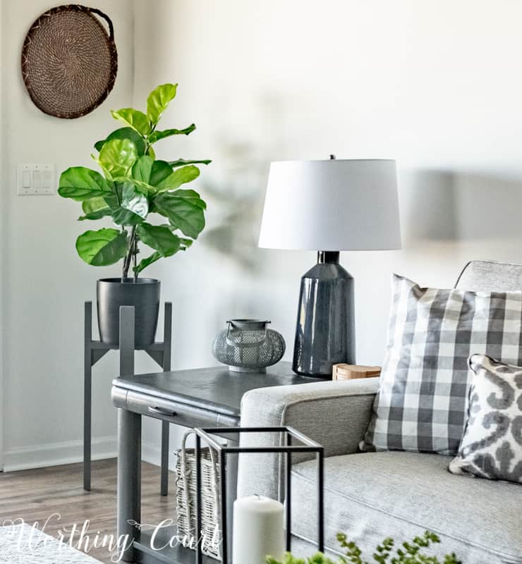
A smaller faux fiddle leaf, in a modern planter with a round flat wicker basket on the wall above it, helps to fill another empty corner in the room. If you compare this to the before photo, you might recognize that this is one of the original end tables left by the owner. They’re sturdy and are the perfect size for the room so I couldn’t justify the cost of replacing them. All they needed was a makeover with my favorite spray paint, a handle added to the drawer and a basket placed on the bottom shelf.
I love live plants as much as the next person, but they just don’t make sense here at the condo since we don’t live here full time. I’m just as happy with the real-looking fake ones that I’ve added and the greenery really helps to make the space feel “alive”.
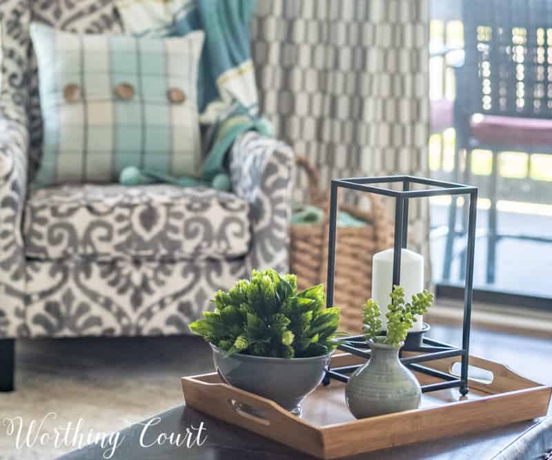
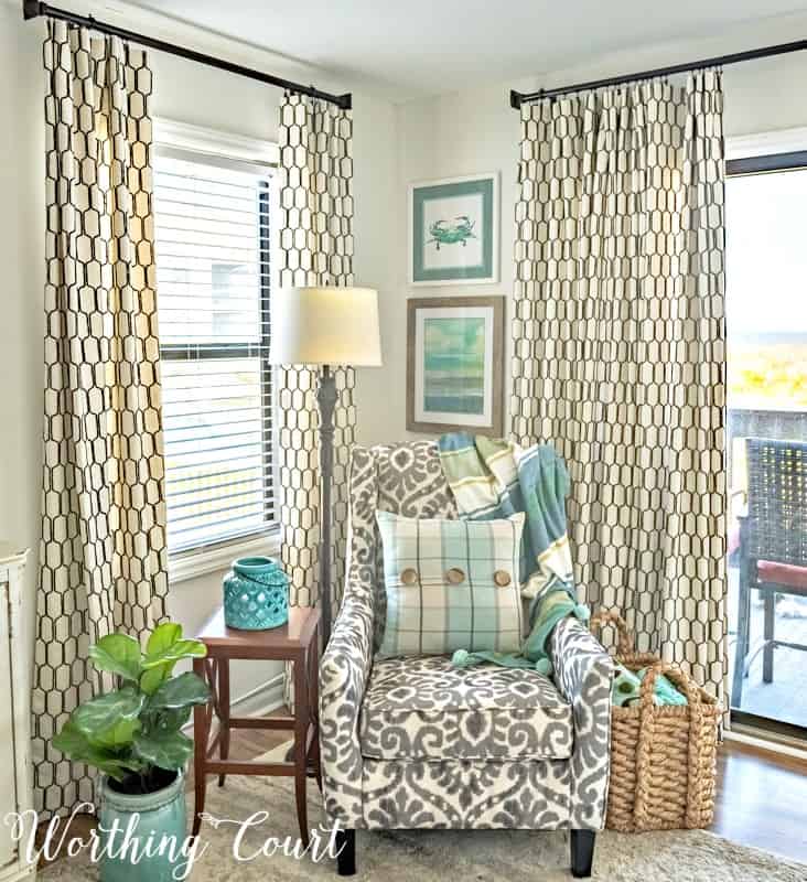
The room truly began to feel finished and pulled together once my diy curtain panels were added. They look like pleated draperies, but are really just super easy to make flat panels that look pleated when they’re open. You can find my step-by-step tutorial for making professional quality flat curtain panels for your own home by clicking HERE.
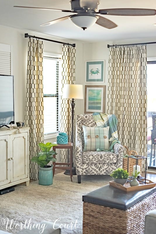
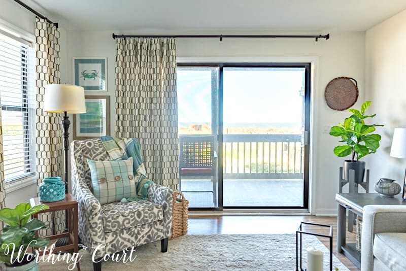
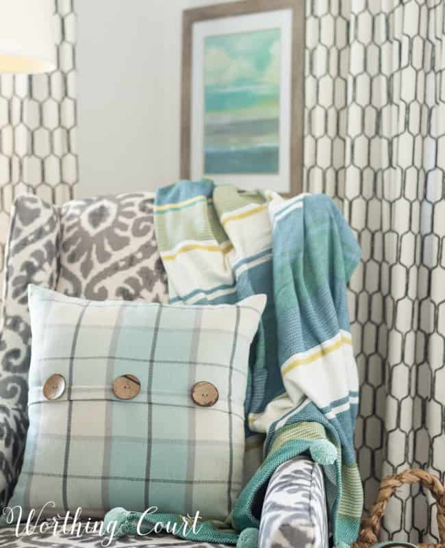
This little corner of the room, with its mix of patterns and varying shades of blue and green, epitomizes summer to me. I think this is exactly what you’d expect in a coastal style home geared toward summertime living!
Thank you so much for stopping by today! I hope you enjoyed touring my summertime living room. Click on the links below for Monday through Wednesdays summer ideas and then be sure to come back on Thursday and Friday to see the rest of the bloggers on the tour.
Monday
Town and Country Living – Shabbyfufu – Sand and Sisal – On Sutton Place
Savvy Southern Style – Happy Happy Nester – Designthusiasm
Tuesday

Tammy Damore – Saw Nail and Paint – Finding Silver Pennies – Southern Hospitality
Duke Manor Farm – Shabby Art Boutique – Sincerely Marie Designs
Wednesday

A Burst of Beautiful – StoneGable – Maison de Cinq – The Wicker House

Worthing Court – My Soulful Home – Craftberry Bush – Housepitality Designs

Great job, love your blog! What is your wall colors. What is a good white for a living room and dining room.
Thank you so much, Charlene! The walls are painted Sherwin Williams Snowbound. It’s a white that has just the barest hint of gray in it that I only see when it’s beside other samples of white paint.
Thank you for the color. I love white but am a little I intimidated by it but am definitely going to try it. It is just paint . I grew up in Greensboro so fun to see your blog. Thanks again for your time.
Charlene
Love all your aqua accents!
Beautiful and tastefully done! Love your color choices. Such a tranquil place for some R&R.
Hi Suzy,
Love the transformation! I kind of agree with your hubby in regards to the louvre doors behind the TV. If you’re not sure try with some large poster board first.
That’s a great suggestion, Jill!
Amazing Suzy! I’m with Hubs on this one. Your favourite gray spray paint on the shutters would anchor that wall and highlight the texture of the doors.. it would also add some tension behind the flat black TV screen. I love, love, love your design sensibility.
There’s definately a great deal to know about this issue.
I really like all the points you’ve made.