Mastering the Art of Choosing an Interior Color Scheme
Choosing the perfect interior color palette can seem overwhelming. Check out these tips to help you narrow down your options and create a beautiful and cohesive look for your home.
Color schemes play one of the most crucial roles in interior design. The right colors can influence your mood, make a room feel more inviting, and improve the overall look of your space.
A poorly chosen color scheme can have the opposite effect.
In this post, you’ll find practical tips for picking the perfect color scheme, insights into popular choices from top designers, and a real-life example.
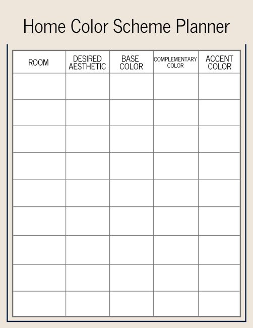
And to help get you started, you’ll also find a handy resource for an online color scheme generator. Annnd there’s also a printable Home Color Scheme Planner that you can print out and use below!
Welcome to chapter 9 of the Simply Decorating Series; a free resource designed especially for the diy decorator who is eager to transform their home into a place that reflects their personal style and needs. Each post breaks down complex design ideas into simple, actionable steps. If you’re just beginning the series, start with chapter 1, How to Decorate a Room – Where To Start.
One thing to note: while talking about choosing an interior color scheme for a home, I’m not only referring to wall colors. While paint is a significant component, a comprehensive color scheme includes everything from furniture and a rug to fabrics and decor and artwork.
How to choose and combine colors for a perfect interior color scheme
Let’s look at practical tips and guidelines for choosing a color palette for your home’s interior.
Start with a Base Color
Selecting the base/dominant color for your home will set the tone throughout all of the spaces. It’s a huge step toward creating a cohesive home when you decorate.
Be sure to choose one that reflects the mood you want your home to reflect.
- For a calm, relaxing atmosphere, opt for soft blues or greens.
- For a more energetic vibe, consider bold colors like red or orange.
- Neutral colors like beige, gray, or white are versatile options that work well with a variety of accent colors.
Once you have your base color, you can start building the rest of the color scheme around it.
Select Complementary and Accent Colors
Now that you’ve chosen your base color, it’s time to add the complementary and accent colors that you’ll use throughout your home.
Complementary colors are those that sit opposite each other on the color wheel, like blue and orange or yellow and purple. Using opposing colors in a home creates a vibrant and dynamic look.
Accent colors are great for adding a pop of color and should complement the base color without overwhelming it. You’ll want to use these colors for smaller elements like throw pillows, artwork, or accessories across different rooms.
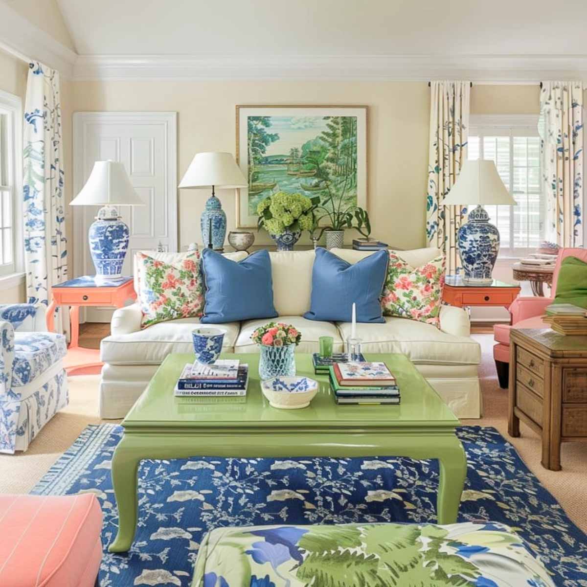
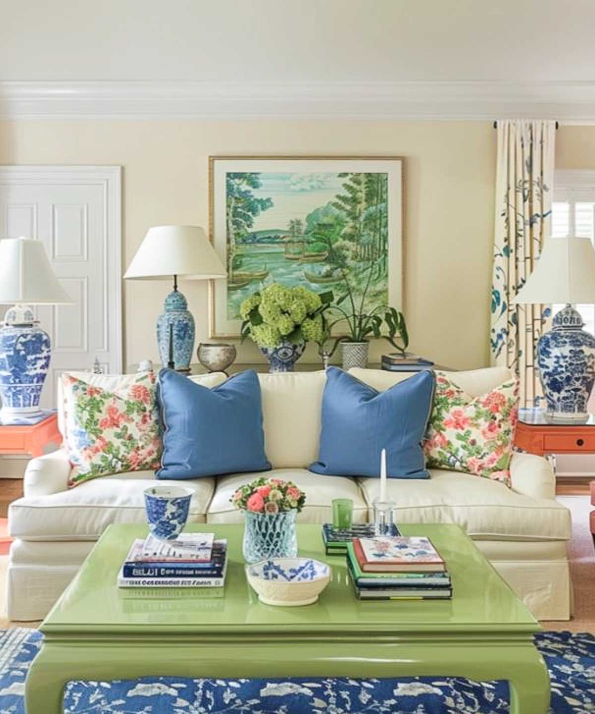
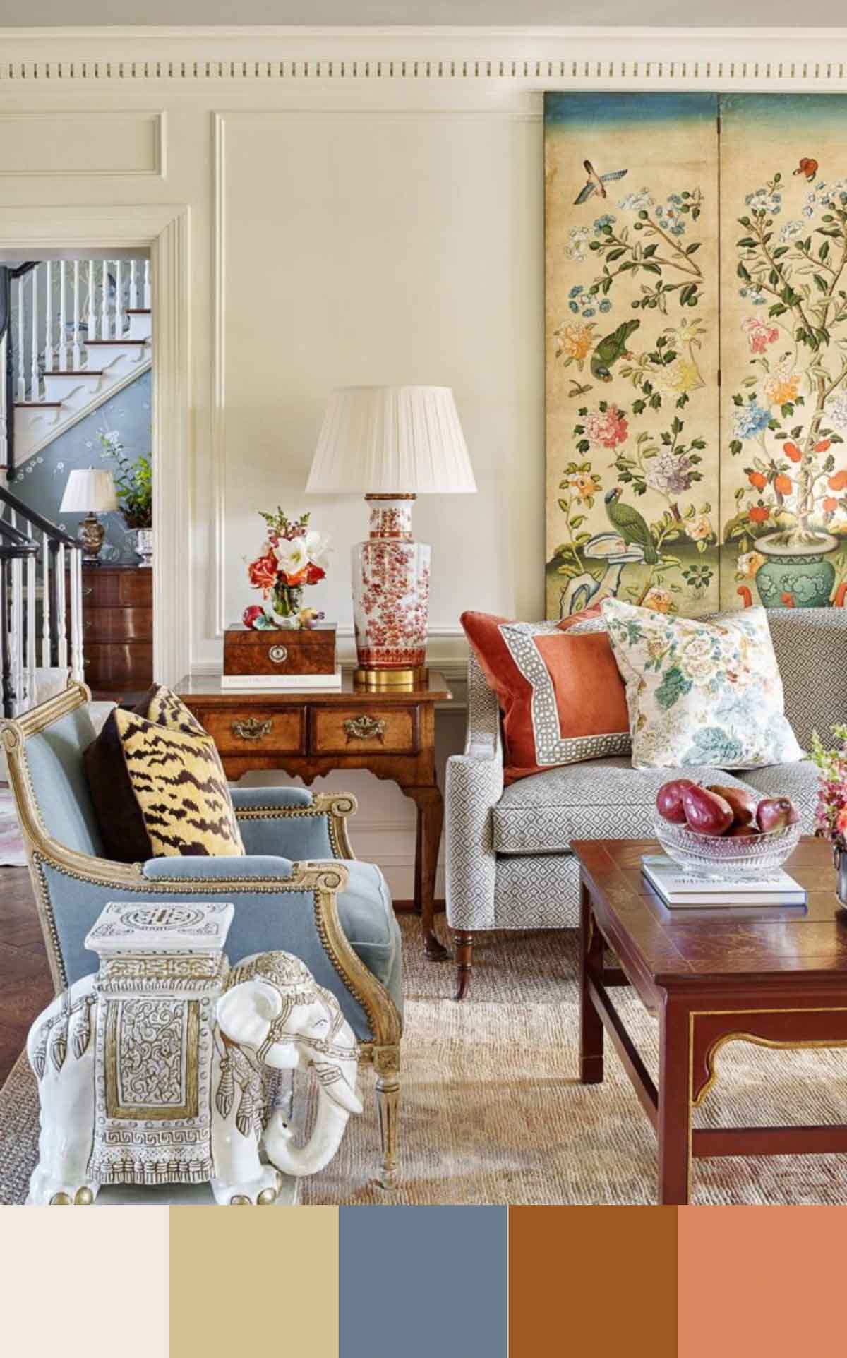
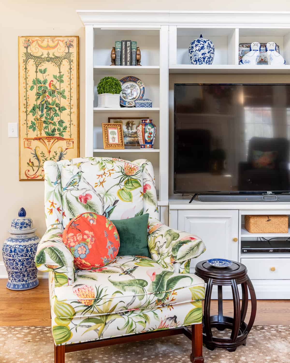
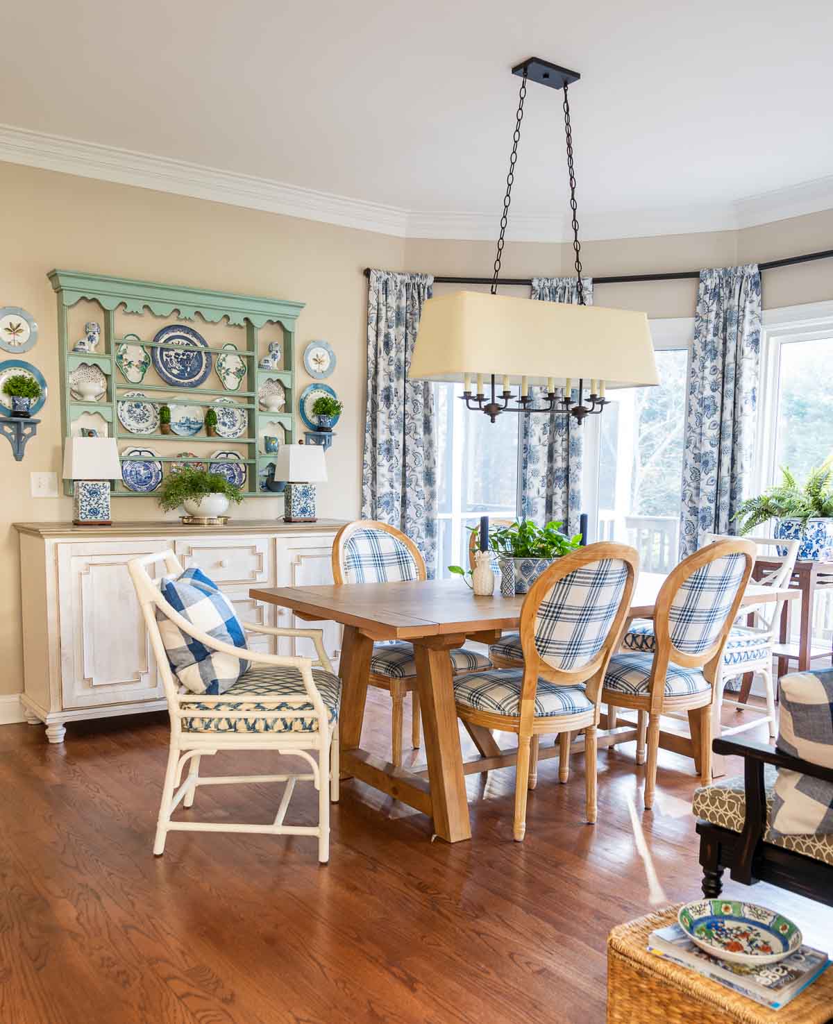
In this living room, I think the base color is the soft neutral on the walls and sofa. It’s a toss up though as to which color is the complementary color and which color is the accent color. What do you think?
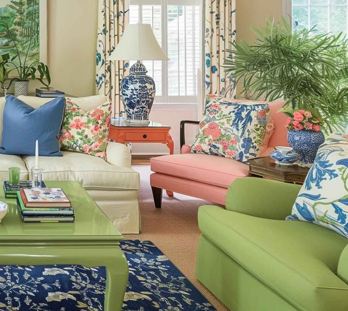
A good rule of thumb is to follow the 60-30-10 rule: 60% of your home should be the base color, 30% a complementary color, and 10% an accent color.
TIP: Bold colors add personality and energy, but balance them with neutral backdrops and incorporate bold hues in smaller doses through accessories, artwork, or accent walls.
Consider the Function of the Room
Don’t forget to consider the function of each room as you’re making your choices.
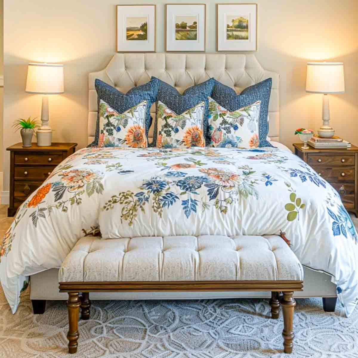
A bedroom should feel calm and restful, so soothing colors like soft blues, greens, or pastels are ideal.
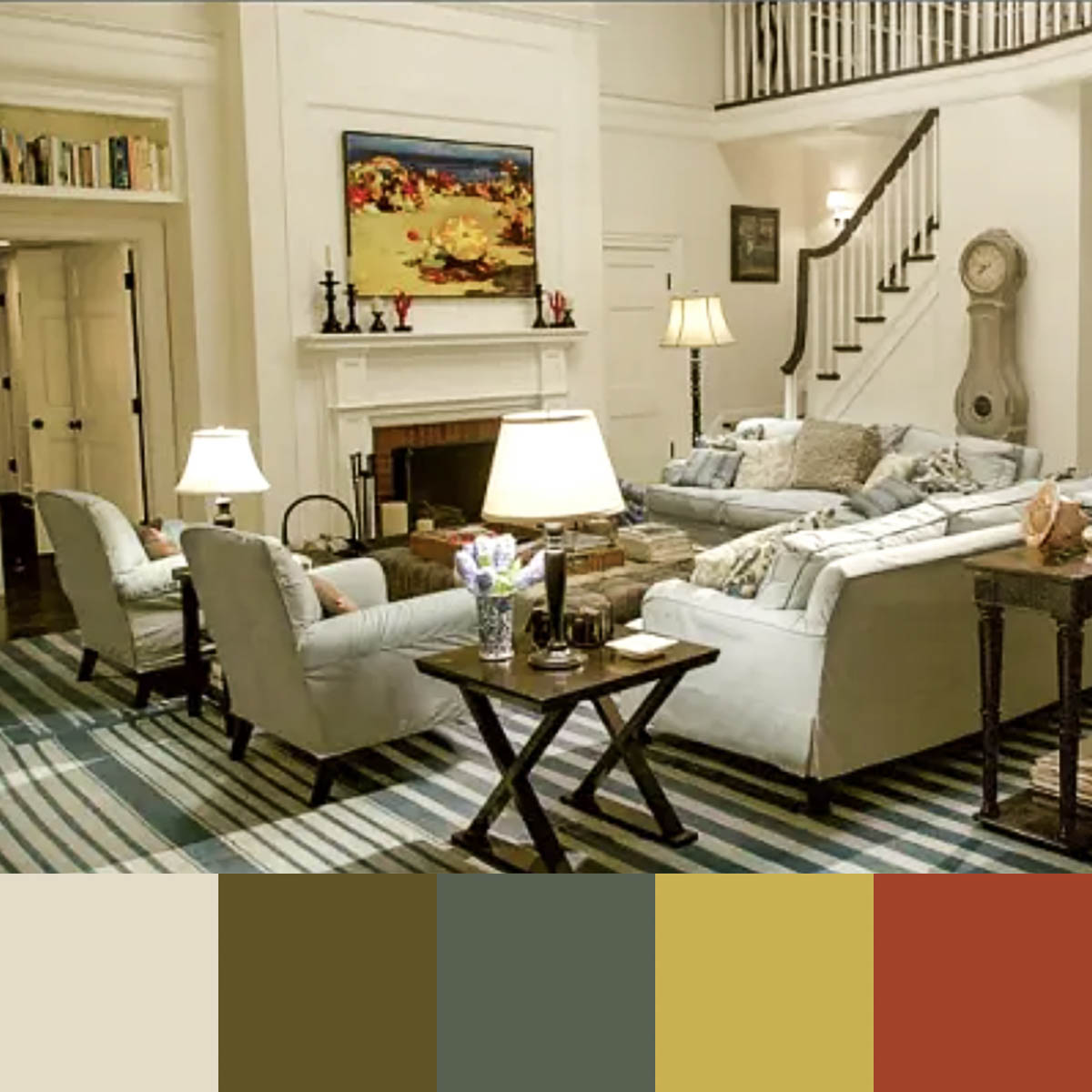
This bedroom has the same color scheme as the living room, but still has its own unique look. Can you see how the two rooms would flow well together as you walk through the home?
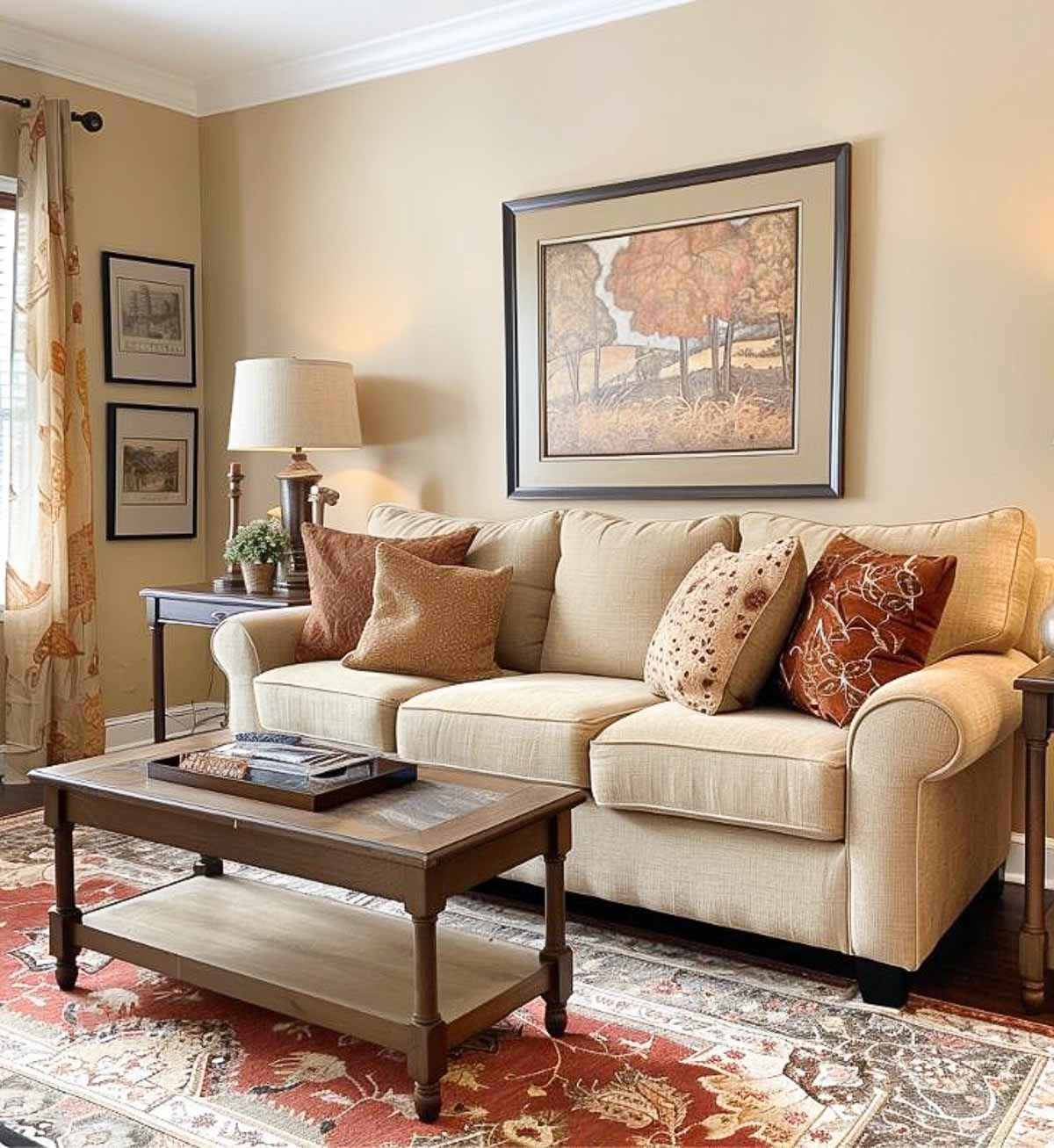
In a living room, where you might entertain guests or relax with family, warmer colors like beige, brown, or soft yellows can create a welcoming atmosphere.
For a home office, you might want colors that promote concentration and creativity, such as muted greens or light grays.
TIP: To make these different color choices work in the overall color scheme for your home, choose a unifying neutral base color that flows through all rooms and use consistent accent colors to tie the spaces together.
Using an online color palette generator
An online color palette generator can be an incredibly useful tool when planning an interior color palette for your home.
Even if you’re starting from scratch, these tools can help you visualize how different colors will work together and provide inspiration for creating a cohesive look.
- You can experiment with different combinations.
- They help you visualize how various shades and tones interact with one another.
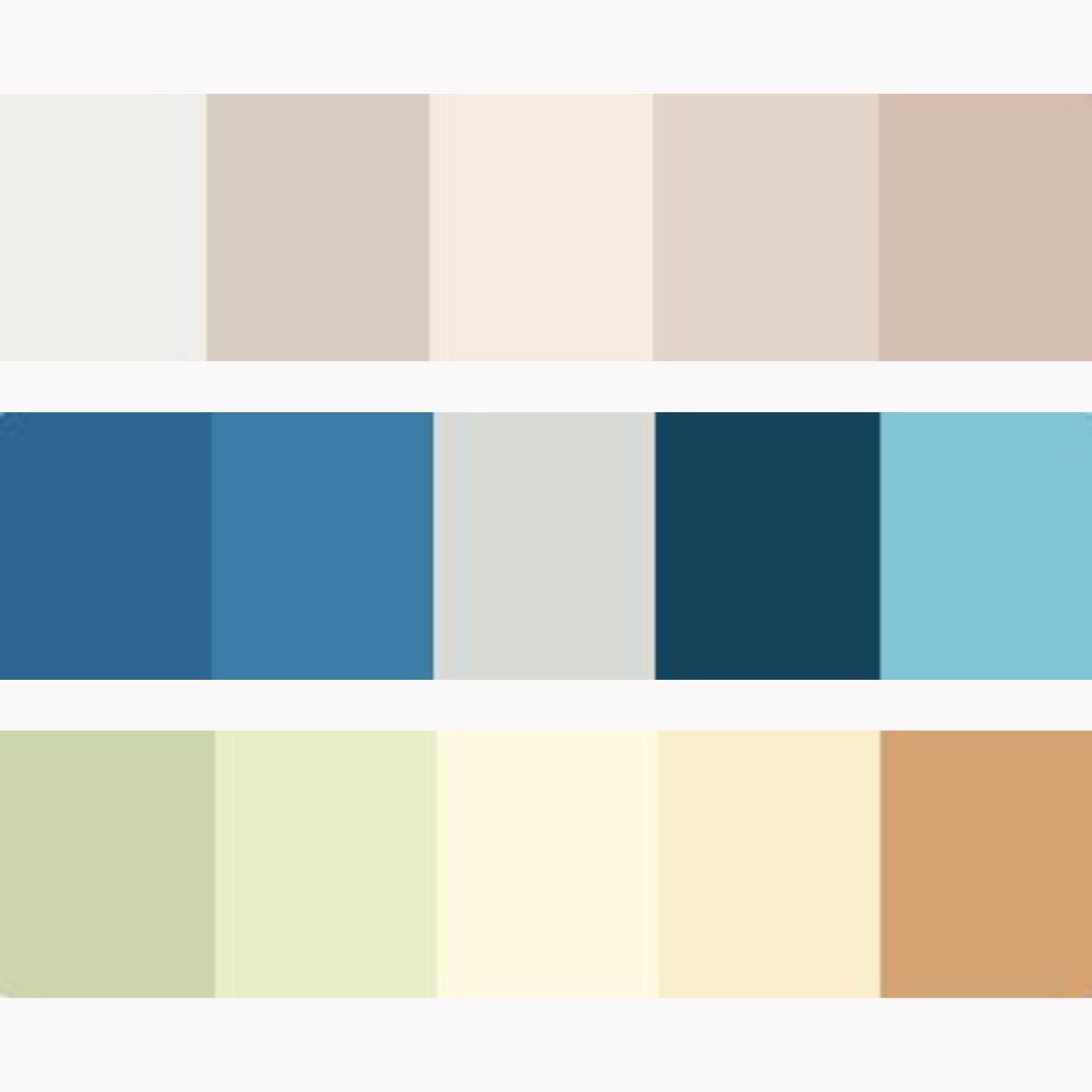
Two of my favorite free color palette generators are:
- Coolors: A user-friendly tool that allows you to generate palettes with just a click. You can adjust colors, lock shades you like, and explore trending palettes. They offer a free and a paid version.
- Adobe Color: An advanced tool that offers a color wheel and several color harmony rules to create balanced palettes. It also allows you to extract colors from uploaded images.
Most major paint retailers, such as Sherwin Williams and Benjamin Moore, offer a tool that will help you visualize their exact paint colors in your room by uploading a photo.
Tips for using these tools:
- Start by inputting your your chosen base color into the generator to see suggested complementary and accent colors.
- Don’t be afraid to play around with various combinations to see what resonates with you.
- Most generators allow you to save your palettes so that you can refer back to them.
Color schemes that well known designers love
Need some inspiration? Take a look at these beautiful rooms designed by James T. Farmer, Nancy Meyers, Bunny Williams, and Eric Ross.
Each room showcases the designer’s favorite color palette, along with a generated color palette to help you visualize and apply these ideas in your own home.
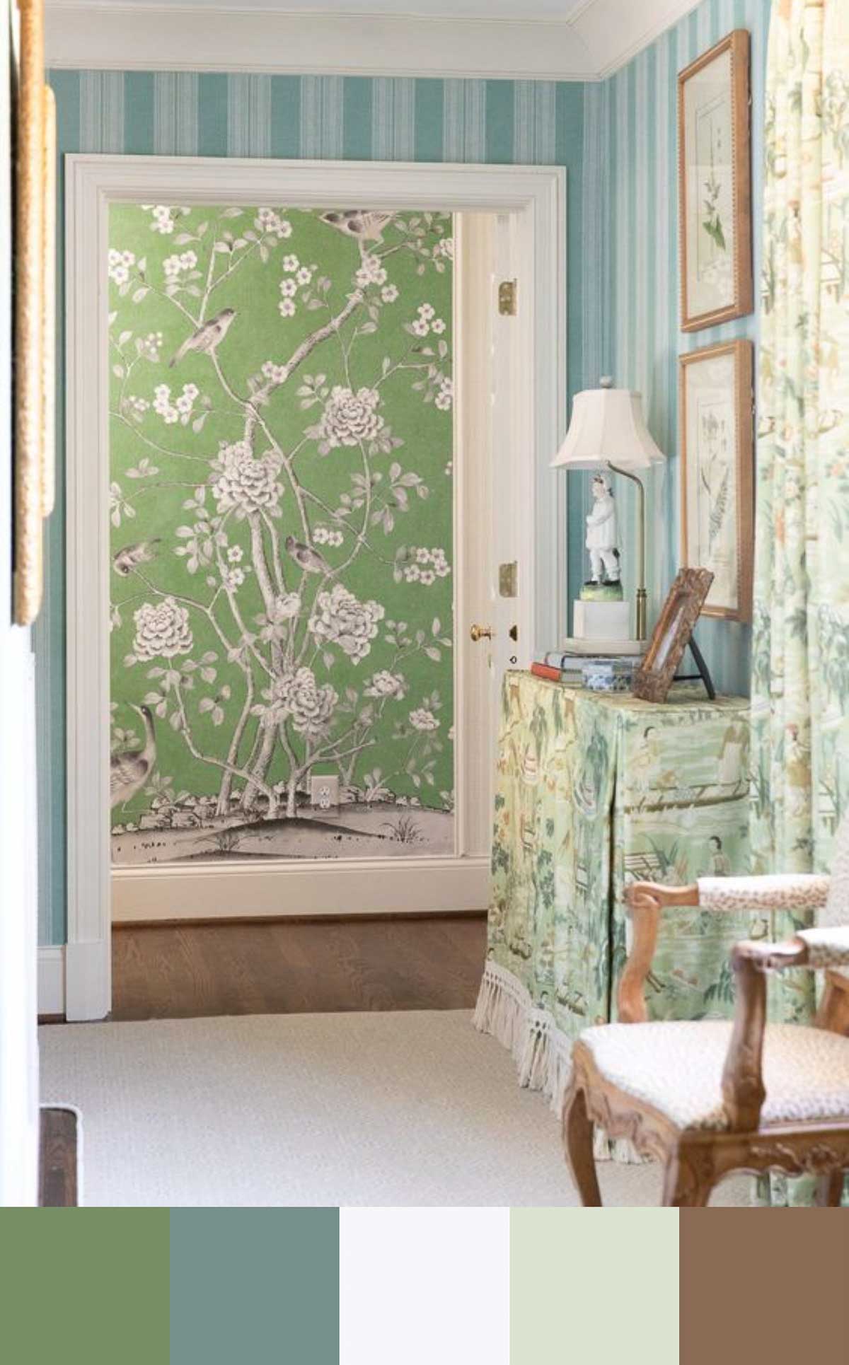
James T. Farmer
James T. Farmer is know for creating timeless and welcoming interiors. He often integrates soft, nature-inspired hues like sage green and sky blue, paired with warm neutrals.
Nancy Meyers
Nancy Meyers may best be known as the genius behind the sets of many famous movies. Her palettes often feature a soothing mix of whites, creams, and beiges. She also frequently uses a blue and white combination, which adds a fresh, coastal feel to her interiors.
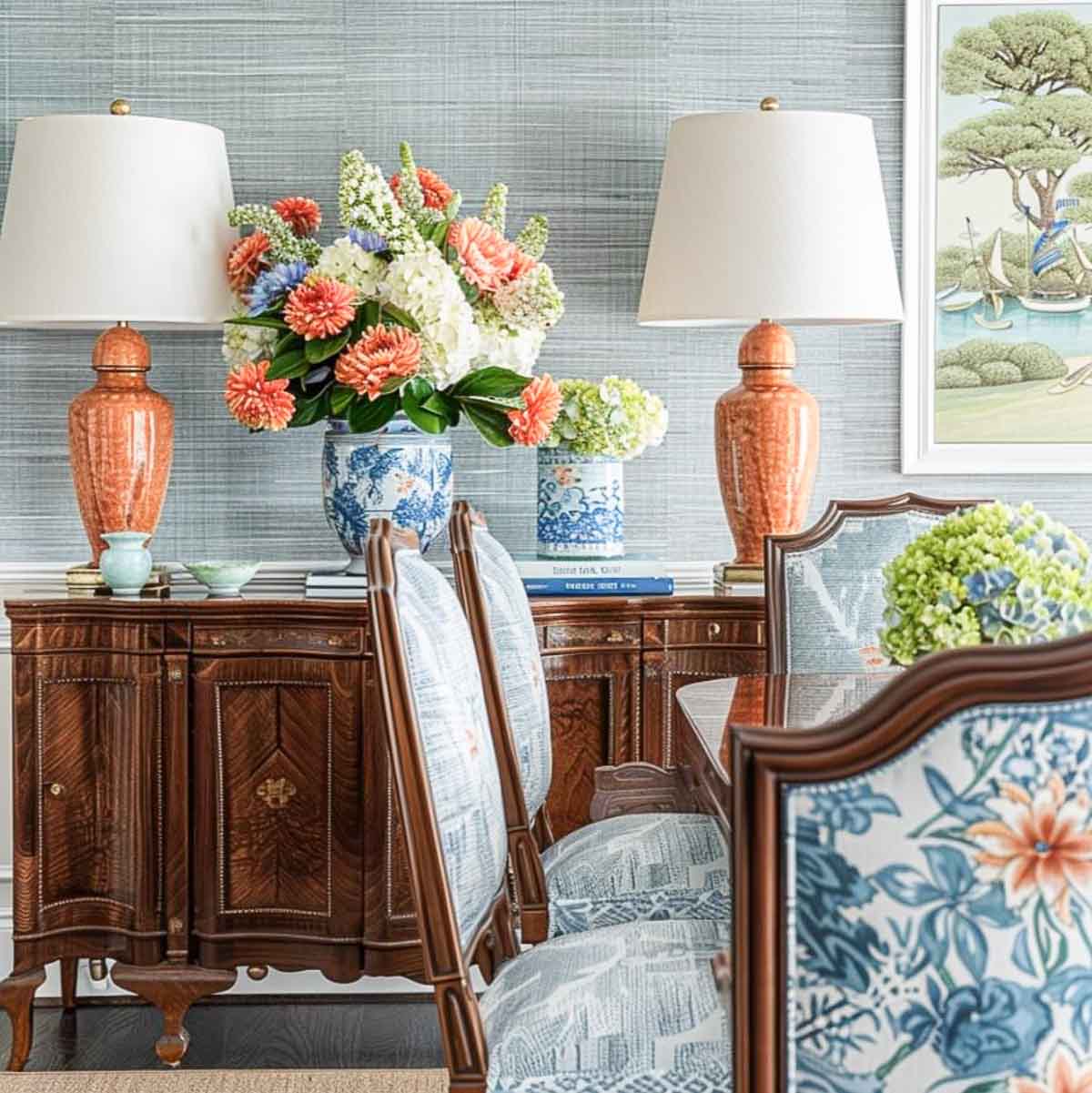
Bunny Williams
If you’ve ever looked at a Ballard Designs catalog, you’re probably well-versed in Bunny Williams style. She favors deep, saturated colors like rich browns, vibrant reds, and sophisticated greens, and uses them to create dramatic, inviting spaces that exude warmth and luxury.
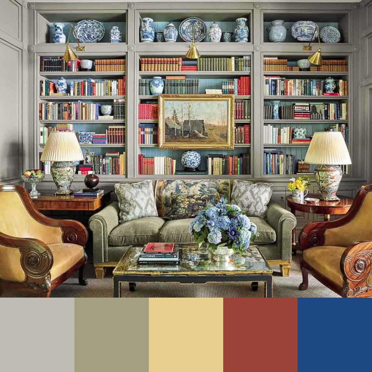
Bunny Williams via 1st Dibs, photo by Francesco Lagnese
Eric Ross
Eric Ross often uses classic, traditional color schemes that include deep blues, warm yellows, and rich greens. These colors help create a timeless, elegant feel in his designs, often drawing on historical influences to add depth and character to a home.
TIP: To adapt a designer’s color scheme to your home, start with the dominant color, select the accent colors and use them wisely. Balance bold and neutral tones, consider the room’s function, and test colors under different lighting.
Interior color schemes and their emotional impact
In case you haven’t noticed, color has a profound impact on our emotions and can influence how we feel in a space.
Why should you care about that? Because understanding the psychological effects of color can help you create the type of atmosphere you want in your home.
I reviewed the different types of emotional responses to specific colors in my post about how to choose the right color for any room, so there’s no need for me to rehash it here.
But let’s take is a step further and group colors into warm vs cool and talk about the psychological effects of each one.
Warm colors include red, orange, and yellow, which are known to evoke feelings of warmth, comfort, and energy.
They can make large, open spaces feel cozier and more inviting. However, too much warmth can be overwhelming, so it’s often best to balance warm colors with neutral tones.
Cool colors include blue, green, and purple. These hues are perfect for spaces where you want to unwind and relax.
Cool colors can also make small spaces feel larger and more open. They are ideal for any area where a serene atmosphere is desired.
That knowledges is all well and good, but how in the world do you apply color psychology to your own home? Here’s a few tips:
- Mix and match warm and cool colors to create a balanced environment, such as complementing a cool blue bedroom with warm, earthy accents.
- Tailor color choices to the function of each room by using energetic colors in social spaces and calming hues in relaxation areas.
- If you want to make a subtle statement, layer different intensities of the same hue.
Remember to always test paint samples on your walls under different lighting conditions before committing, as colors can change throughout the day. And if you’re unsure about a bold color choice, start small with a powder room or an accent wall to experiment without overwhelming your entire home.
A real-life example of a cohesive interior color scheme
That’s a lot of information to absorb! Are you left wondering how to apply it to your own home.
Here’s an example. Each room has three colors listed, following the 60-30-10 rule.
The first color is the predominant color (60%) in the room, the second is the complementary (30%) color in the room, and the third is the accent color (10%) in the room.
And yes, if this color story was used throughout an entire home, it would create a cohesive and harmonious scheme.
Living Spaces, where you want a welcoming and comfortable atmosphere:
- Colors: Accessible Beige (Sherwin Williams), Hawthorne Yellow (Benjamin Moore), Red Earth (Farrow & Ball)
- Effect: These warm and neutral colors set a welcoming and comfortable tone. Accessible Beige provides a versatile base, Hawthorne Yellow adds warmth and brightness, and Red Earth introduces a rich, grounding accent.
Home Offices, where you want to feel motivated and energized:
- Colors: Mindful Gray (Sherwin Williams), Soft Fern (Benjamin Moore), Charlotte’s Locks (Farrow & Ball)
- Effect: These colors balance calmness with energy. Mindful Gray provides a neutral, focused base, Soft Fern adds a hint of nature and tranquility, and Charlotte’s Locks injects a vibrant, motivating accent.
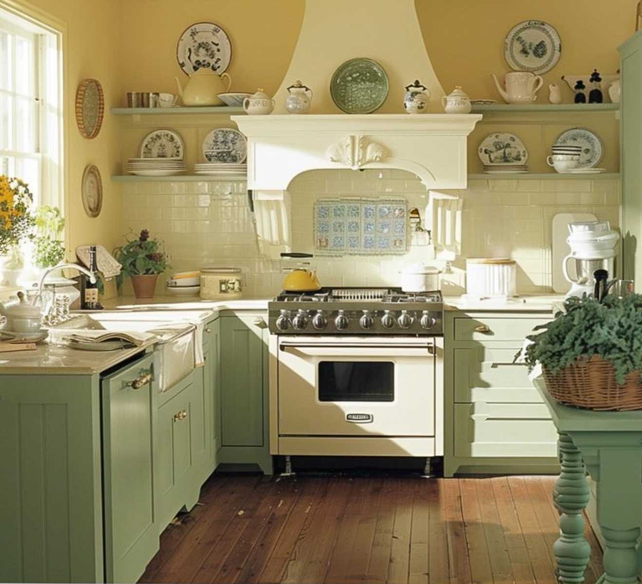
Kitchen and dining areas, where you want an appetizing color scheme:
- Colors: Simply White (Benjamin Moore), Sage Green Light (Sherwin Williams), Yellowcake (Farrow & Ball)
- Effect: These inviting colors make the a kitchen or dining area feel warm and appetizing. Simply White offers a clean and versatile base, Sage Green Light adds a fresh, natural touch, and Yellowcake introduces a cheerful, appetizing accent.
Bedrooms, where you want calming and restful colors:
- Colors: Palladian Blue (Benjamin Moore), Sea Salt (Sherwin Williams), Calamine (Farrow & Ball)
- Effect: These are soft and soothing colors that will create a restful environment. Palladian Blue offers a serene base, Sea Salt adds a touch of freshness, and Calamine brings a gentle, calming accent.
Although all of these schemes include a variety of colors, they work together cohesively because they share complementary tones and balance between warm and cool hues.
The neutral base provides a consistent foundation throughout the home, while the complementary and accent colors add interest and variety. Each room would feel unique yet connected.
As you can see, choosing an interior color scheme for your home involves more than just picking paint colors.
With these tips and examples, you’re well on your way to mastering the art of choosing the perfect interior color scheme!
Here’s the Home Color Scheme Planner for you to print to help plan the color scheme for your own home. It’s a great little tool to keep up with your chosen colors and to take to the paint store with you!
Simply click on the image to print.
Next in the Simply Decorating series: how to makeover a living room when you change your style.
To follow along with the Simply Decorating Series, sign up for my emails.

Suzy, thanks for the informative post. I learned a lot of things I did not know and I was introduced to designers I had never heard of. I have to say I fell in love with the orange lamps never did I think I would love a room that was so colorful. But it is absolutely beautiful. Thank you for sharing all your knowledge, your images and your blog.