Mastering Living Room Design with Two Focal Points
When your living room has two focal points, arranging furniture and decorating can feel like a puzzle. How do you tackle this common issue?
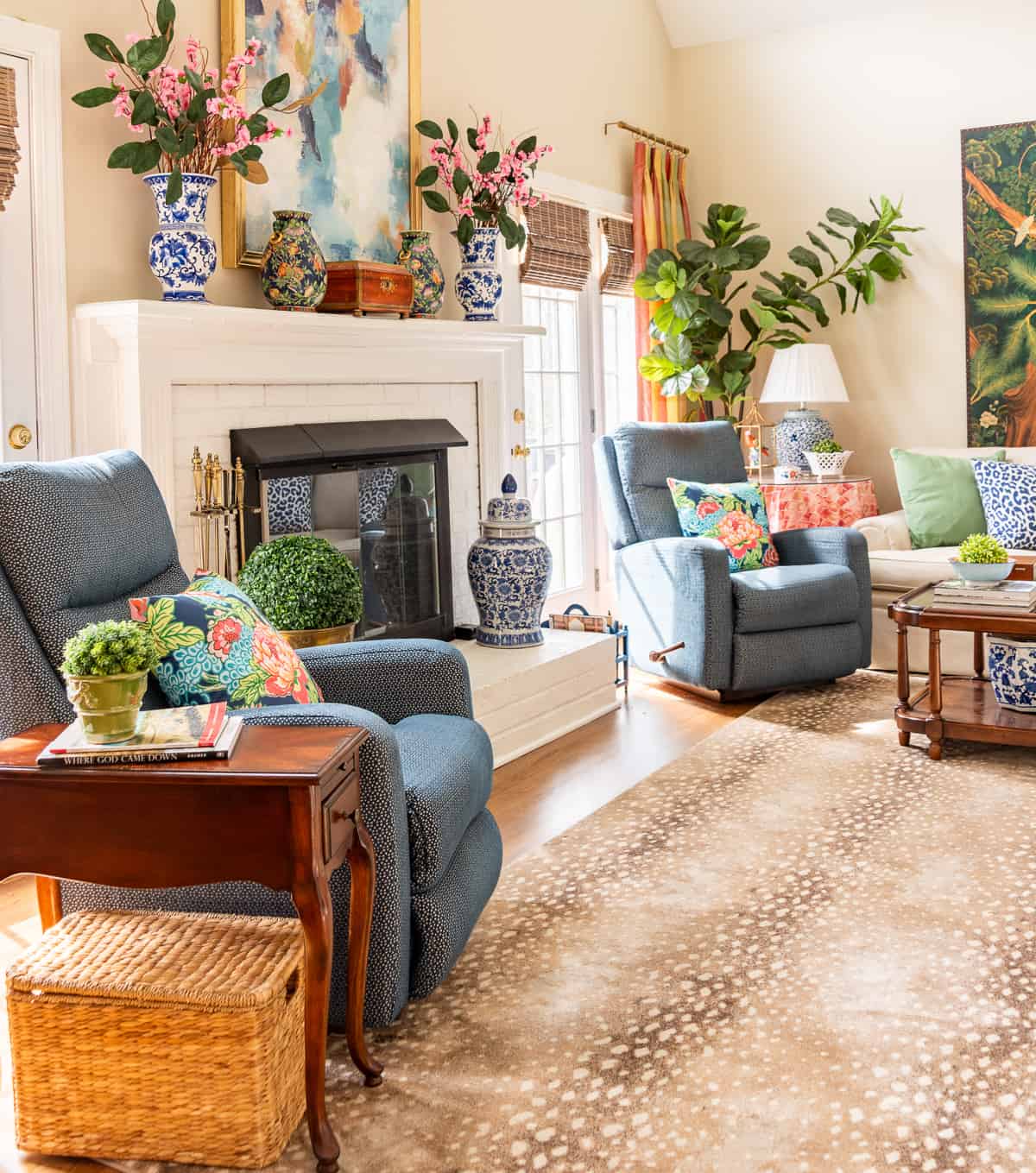
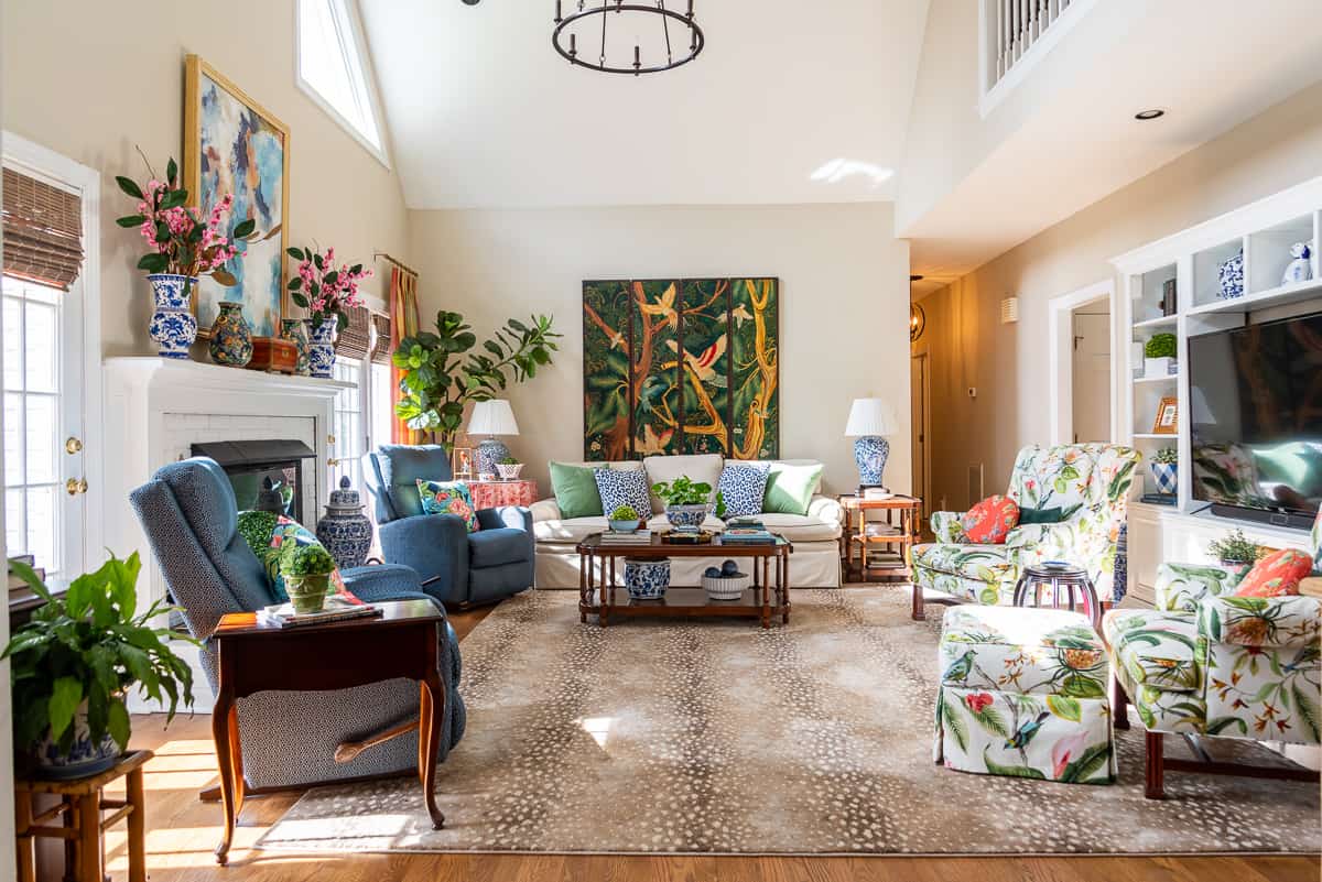
I know from experience—my own living room has a fireplace and French doors on one side and a large entertainment center on the opposite side. Finding a way to balance both sides has definitely been a challenge!
Welcome to chapter 5 of the Simply Decorating Series; a free resource designed especially for the diy decorator who is eager to transform their home into a place that reflects their personal style and needs. Each post breaks down complex design ideas into simple, actionable steps. If you’re just beginning the series, start with chapter 1, How to Decorate a Room – Where To Start.
Let’s explore clever ways that you can handle this decorating dilemma in your own home.
In a living room, the primary focal point should naturally take center stage, but that doesn’t mean other elements can’t have their moment, too.
In fact, in open-concept spaces, it’s common to have a focal point at one end of the room, with a secondary focal point providing balance and interest at the other end.
How to find the focal point in your living room?
Identifying the main focal point in your living room might feel like being a detective in your own space, but don’t worry—it’s easier than you think!
Start by scanning the room. What catches your eye first? What stands out as the most dominant feature in the room? It could be anything from a large picture window or French doors framing a beautiful view, to a grand fireplace mantel anchoring the space.
These features are natural focal points. Think of them as the “anchors” of your room, with everything else designed to complement and revolve around them.
The challenge arises when there’s a secondary focal point—like an accent wall, an architectural feature, or even a statement piece of furniture.
These can throw a wrench into your living room furniture arrangement, especially if they’re on opposite sides of the room (like mine). For example, I have a fireplace on one side and a large entertainment center on the other.
In fact, depending on how you enter the room, you could even argue that the decorative screen behind my couch is a third focal point!
Designer strategies for two focal points
When you have two focal points in a room, it’s all about balancing them without letting one overpower the other.
Here are some designer-approved strategies to help you create harmony in a living room with multiple focal points:
Balance visual weight
When dealing with a living room that has dual focal points, the key to making it all work is balancing the visual weight. Furniture placement plays a crucial role in creating harmony in the room.
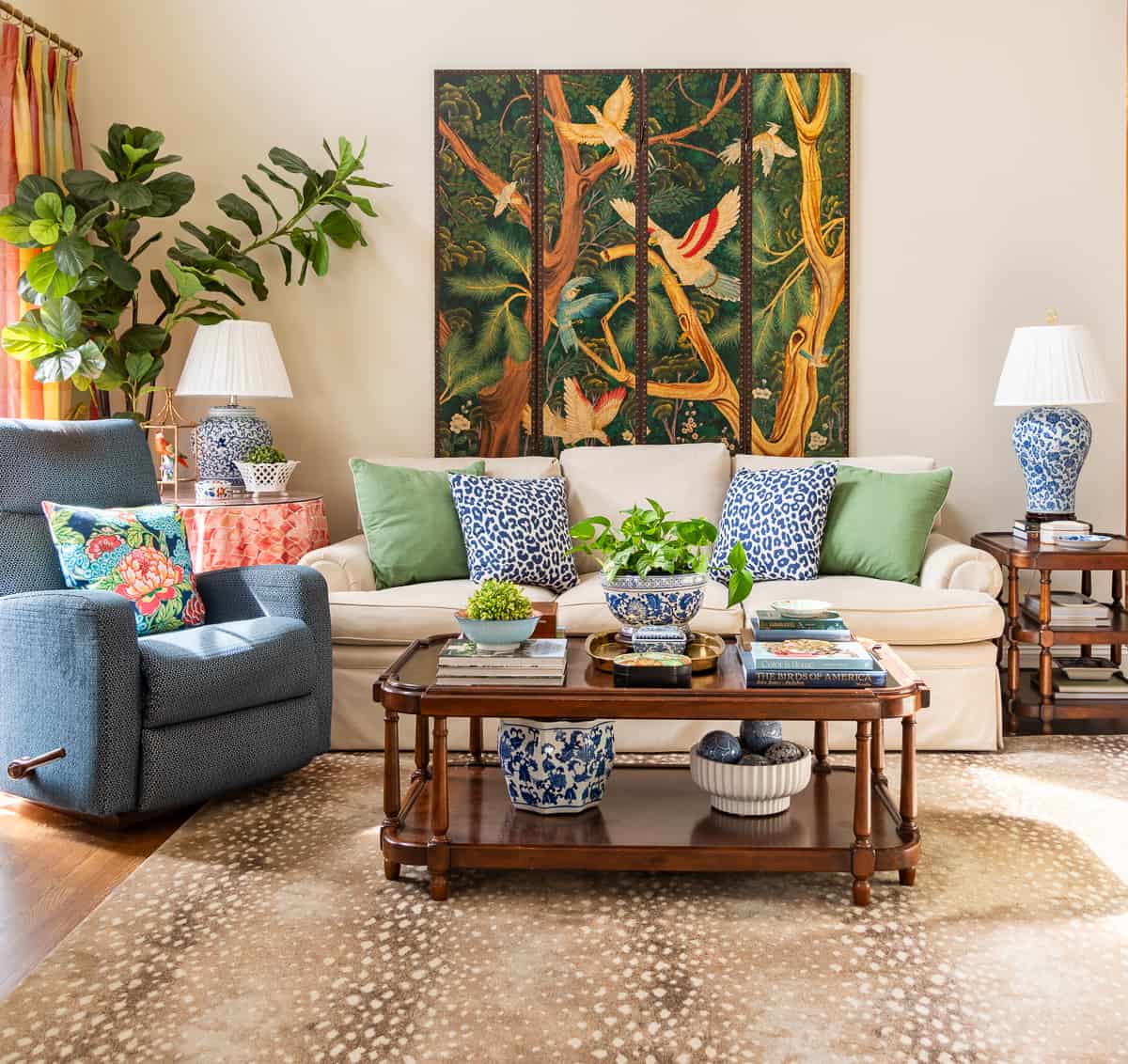
Think of your living room as a stage where each element is a supporting actor. The goal is to arrange the furniture and decor in such a way that each focal point—whether it’s the main one or the secondary one—remains important without overshadowing the other.
Size and Scale
If one focal point is significantly larger or more visually commanding (like a large window or a striking piece of art), you can balance the visual weight by enhancing the other focal point.
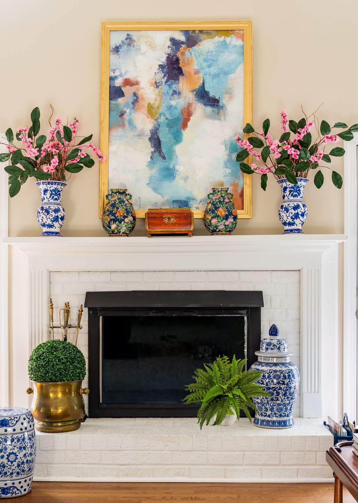
For instance, adding larger decorative elements to a mantel can help balance out a sizable entertainment center in the room, just like I’ve done in my own space.
Symmetry and Asymmetry
Depending on the layout and focal points, you can use either symmetry or asymmetry to create balance.
For example, if your room has a fireplace and a large picture window on a perpendicular wall, the furniture arrangement should draw more attention to one focal point while downplaying the other.
In a symmetrical layout, place two identical sofas facing each other, aligned with the fireplace, and position a coffee table in between. This directs the attention toward the fireplace and away from the window.
In an asymmetrical setup, you could place a sectional sofa with its longer side facing the fireplace, and its shorter side positioned to face the window.
Add a chair in the opposite corner, facing the sectional. This arrangement still prioritizes the fireplace but allows for a more dynamic, balanced feel.
Color and Texture Play
Colors and textures are powerful tools for linking two focal points.
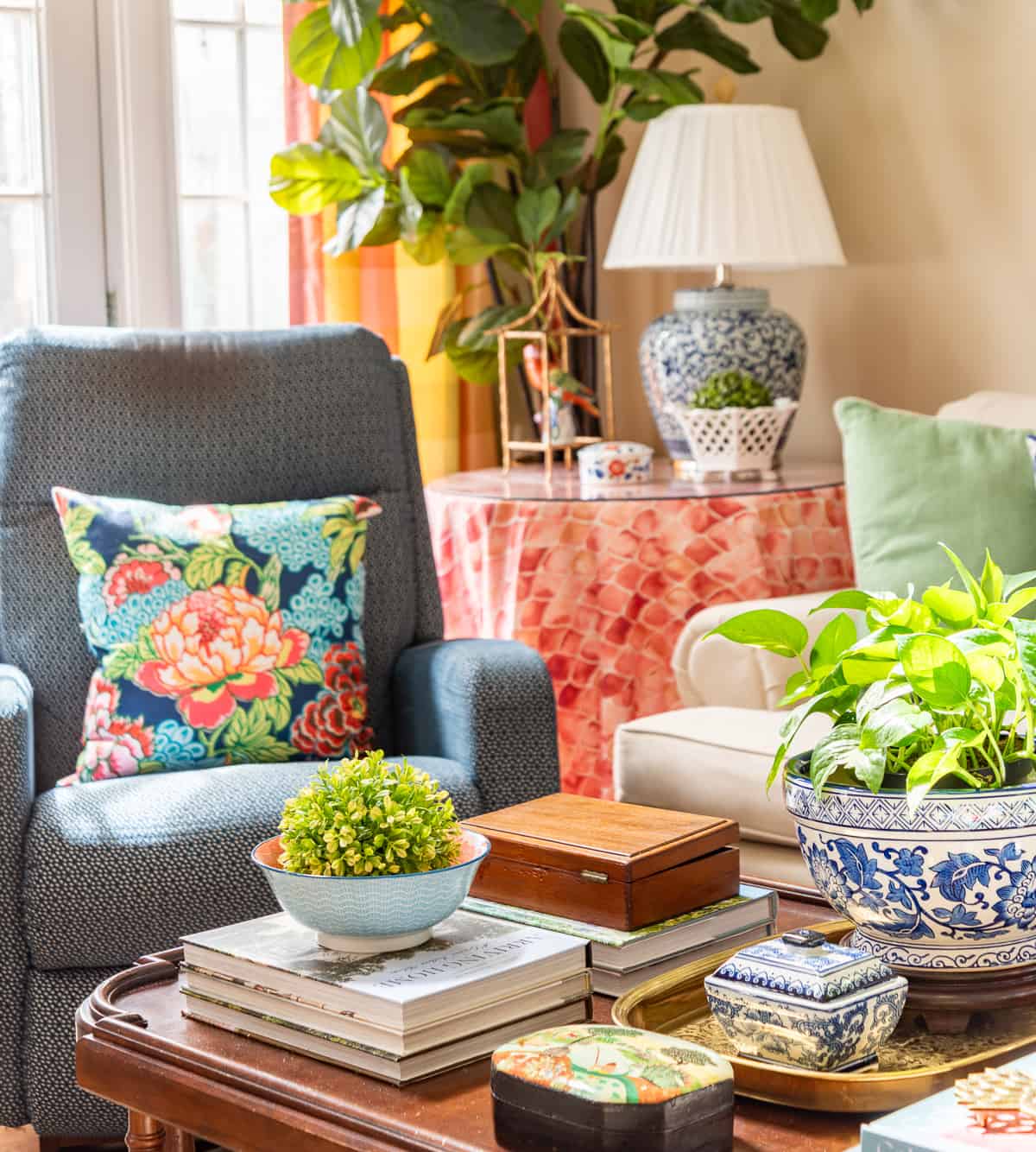
If one feature is colorful or textured, try incorporating similar hues or materials near the other focal point to create cohesion. Think fabrics, rugs, furniture with natural fibers, or art pieces that reflect similar tones or textures.
Lighting as a Balancing Tool
Lighting can also be a great way to balance the room’s visual weight. Accent lighting can draw attention to artwork or architectural features, while natural light from windows can be enhanced with the right window treatments, providing a balanced and inviting atmosphere.
Decorative Elements
Incorporate decorative elements like rugs, cushions, plants, and artwork to help distribute attention between your focal points.
These smaller, attention-drawing pieces can tie the room together and balance the visual weight between the two dominant features.
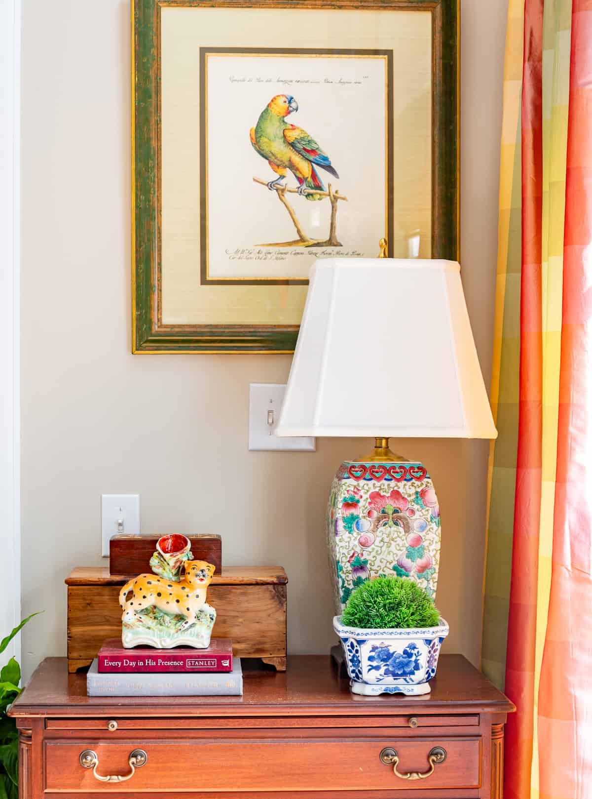
The use of negative space
Negative space is the art of intentionally leaving certain areas of your room empty, and believe it or not, it can be just as impactful as the furniture and decor you choose. But why is negative space so important in a room with two focal points?
I actually wrote a whole blog post about using the negative space in a room, but picture this: You have a stunning fireplace on one side and a breathtaking bay window on the other. If every inch of your room is filled, it’s like a visual shouting match—everything competes for attention, and it can quickly feel overwhelming.
By thoughtfully preserving negative space, however, each focal point gets its moment to shine.
Think of negative space as a visual ‘palette cleanser.’ It gives your eyes a rest and provides a clear path to take in each focal point without distraction.
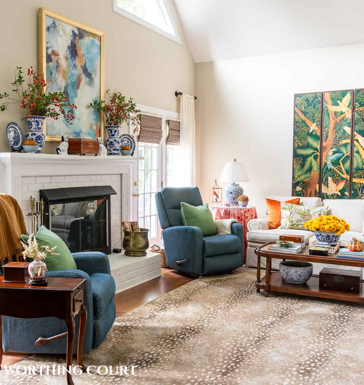
In many ways, it’s like the quiet space in a room full of louder conversations. When used correctly, negative space not only makes the room more aesthetically pleasing but also more relaxing to be in.
Additionally, negative space has the magical ability to make a room feel bigger, which is especially useful in smaller spaces. By not overcrowding the room, each focal point stands out more, and the space feels more open and airy.
Negative space doesn’t always mean bare walls or empty corners, though. It can also refer to the spacing between furniture, the area around your coffee table, or even the way you hang art on the walls.
The goal is to create balance and breathing room so that the room feels harmonious, not cluttered.
In short, when you’re working with two focal points, negative space is like the quiet best friend who ensures both stars of the show shine equally.
Attention to rhythm and repetition
Think of rhythm in design like the beat in your favorite song. It’s what gives a room life, keeping your eyes moving naturally and making the space feel cohesive.
When you have two focal points, like a cozy fireplace and a stunning window view, rhythm helps create a connection between them.
So, how do you achieve this? It’s all about repeating certain design elements—whether that’s color, shapes, textures, patterns, or materials.
For example, if you have a blue sofa in front of your fireplace, you could repeat that color in throw pillows near the window.
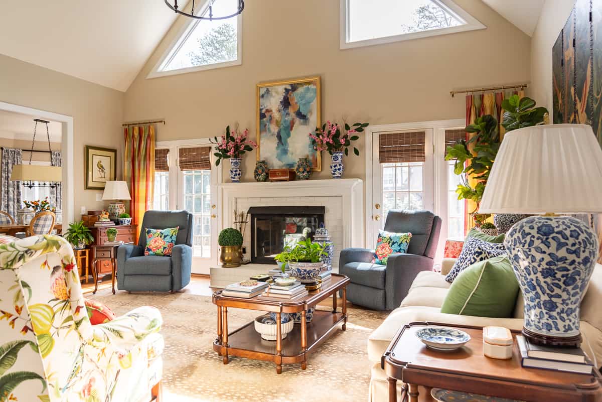
Or, if there’s a circular mirror above the fireplace, you might add a round coffee table or incorporate circular patterns in rugs or cushions around your other focal point.
Repetition creates a sense of harmony and order, subtly telling a story throughout your space. It makes each element feel connected, as if it’s part of a whole.
This is especially useful in a room with two focal points because it helps guide the eye smoothly from one area to the other without jarring interruptions. It’s like leaving a visual trail of breadcrumbs that leads you around the room.
That said, don’t overdo it. A little repetition goes a long way. It should feel natural, not like you’ve walked into a room where everything is overly matchy-matchy. The goal is to connect each focal point in a way that feels effortless and harmonious.
Strategic contrast and variety
While repetition has its place, contrast can also be incredibly effective. It’s a great opportunity to juxtapose different styles, textures, or colors near each focal point, creating distinct yet harmonious areas within the room.
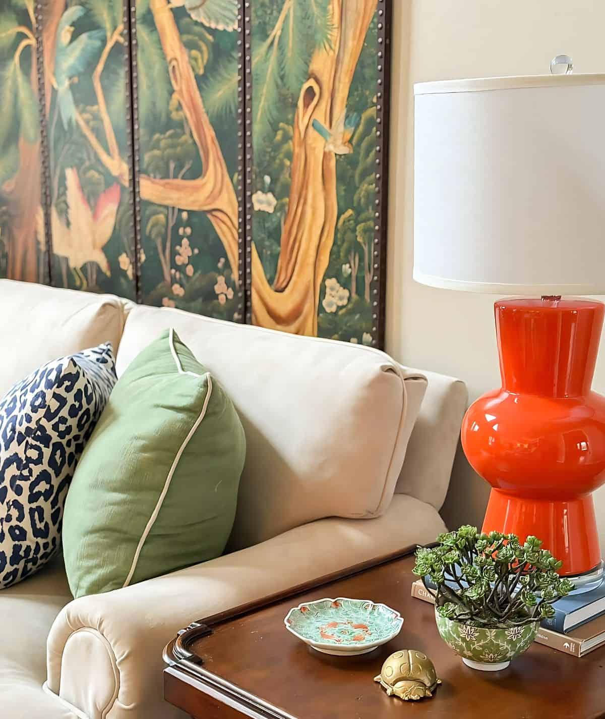
Imagine you’re an artist with a blank canvas—contrast and variety are your vibrant paint colors that bring everything to life. By mixing different styles, textures, or colors near each focal point, you create spaces that feel unique yet connected.
For example, let’s say you have two focal points in your living room: a large TV on one wall and a rustic fireplace on the other. They’re quite different, right? That’s where the magic of contrast comes in.
By playing up their differences, you create an interesting and dynamic space. Pairing the sleek, polished look of the TV with the rough, warm textures of the fireplace adds depth and character to the room.
Variety is all about mixing things up—different shapes, sizes, textures, and colors. Imagine one focal point is a modern, traditionally designed fireplace at one end of the room.
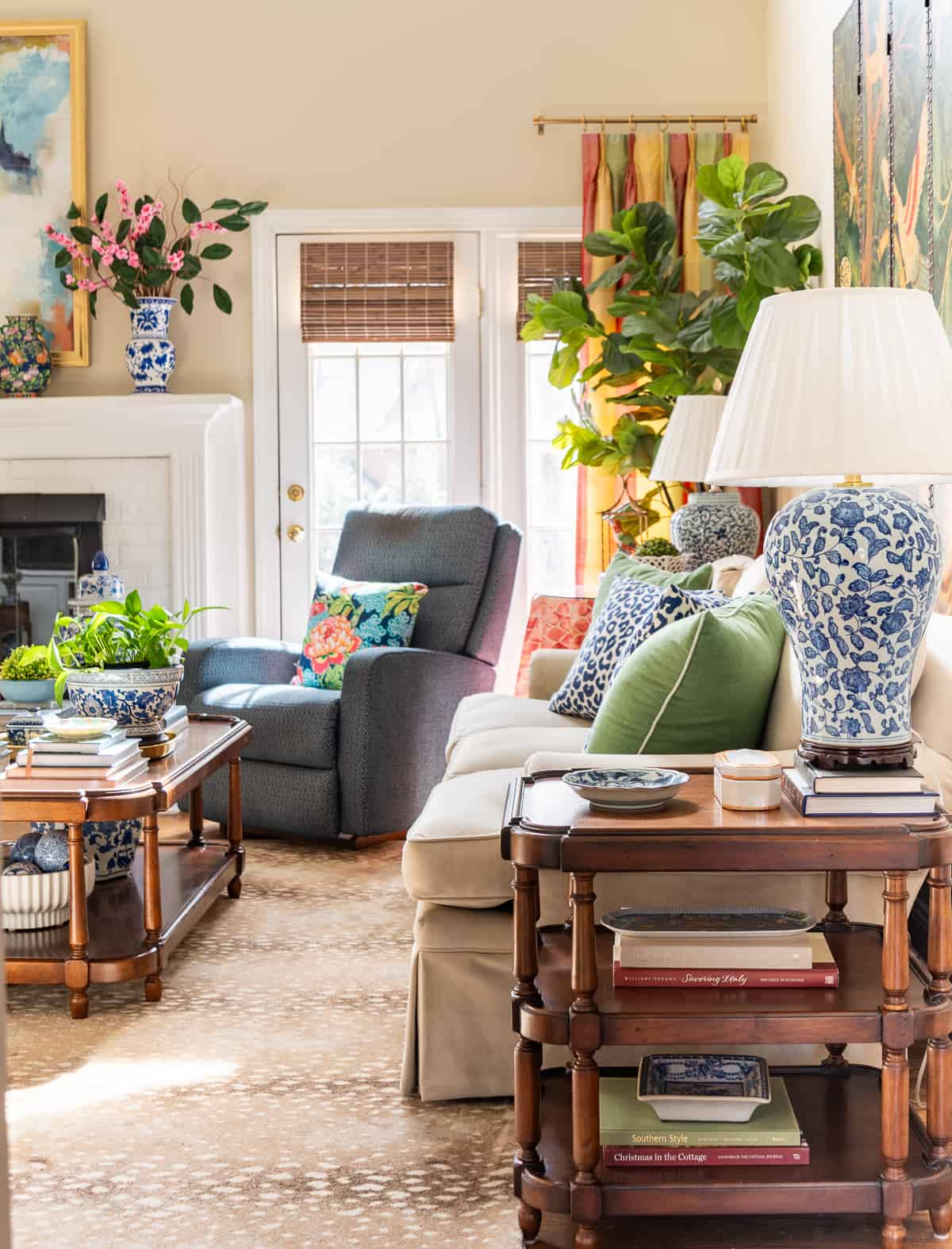
To contrast this, you might place a large, modern sectional sofa in front of a gallery wall. The difference between the two creates a visual tension that’s intriguing and engaging.
So, how does this help with two focal points? When done well, contrast and variety make each focal point stand out, complementing rather than competing with one another.
How to make a focal point in living room without a fireplace?
Do you live in a basic home or apartment with no clear focal point—no large windows, no fireplace, and no architectural features? Can you even have a focal point in a living room without those elements? Absolutely!
In fact, it’s a perfect opportunity to get creative and highlight what makes your space unique.
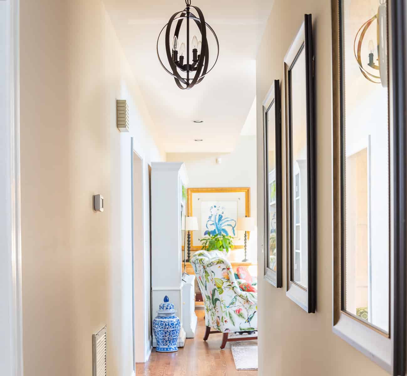
Even if you don’t have large windows, they can still be a shining star in your room. Dress them with a beautiful window treatment or leave them bare to showcase a lovely view. The natural light that pours in can turn a window into the heart of the room.
But if windows aren’t your room’s strong suit, don’t worry! You can always create an accent wall. Whether it’s with a bold paint color, striking wallpaper, or a board and batten treatment, a blank wall is a canvas waiting to be transformed into an eye-catching feature.
Art can also be a game changer. A large, statement piece of art can anchor the room and set the tone.
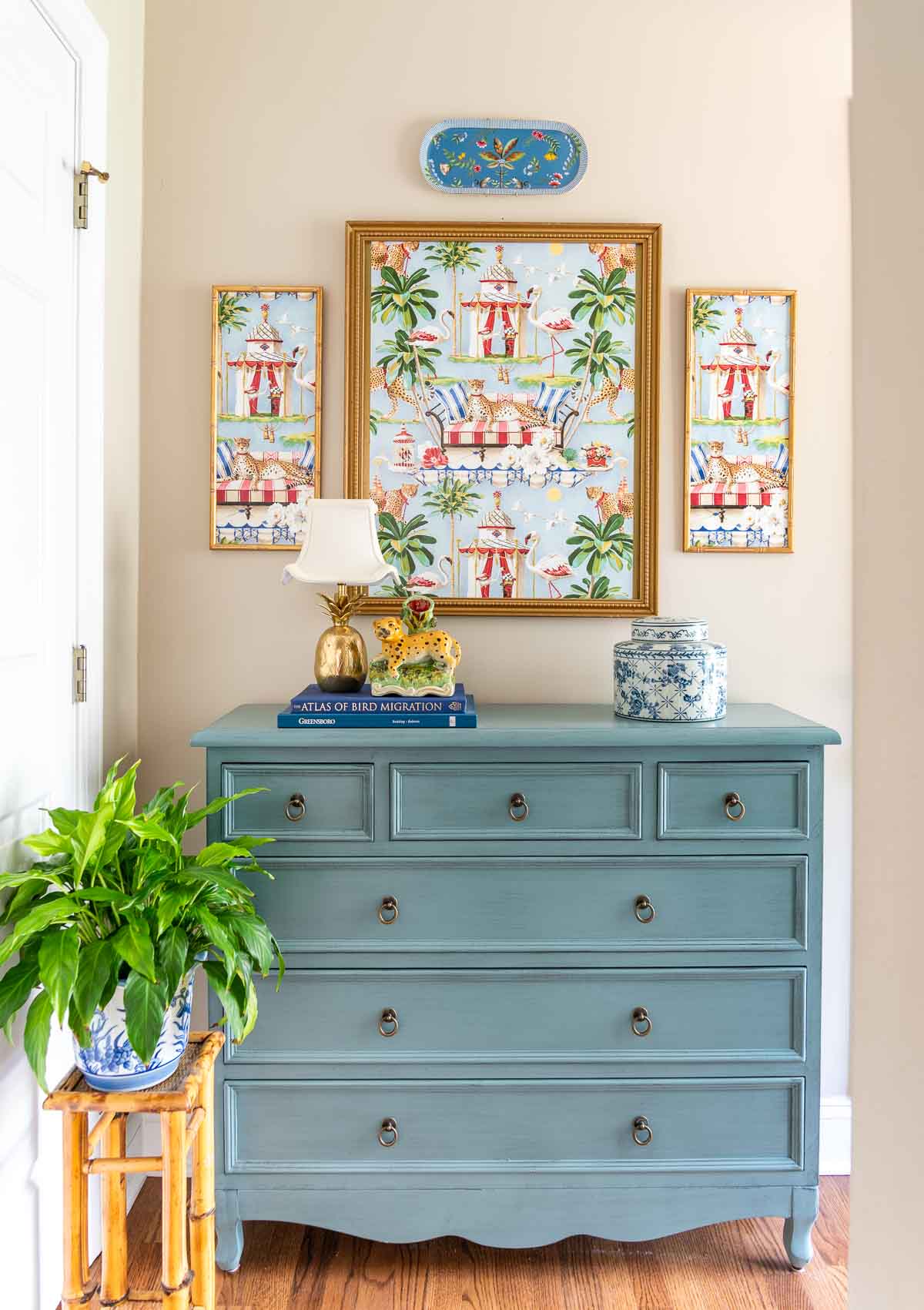
Whether it’s a vibrant painting, a monochromatic abstract piece, or a gallery wall with a collection of smaller works, art has the power to define a space and make it come alive.
Lighting plays a major role too. A statement chandelier, a contemporary floor lamp, or even a string of fairy lights can draw the eye and add warmth and charm to your space.
Even a well-styled bookcase can serve as a focal point. It’s not just for storage—it’s a chance to display your personal style. Style it with books, plants, and unique knick-knacks to create a conversation starter.
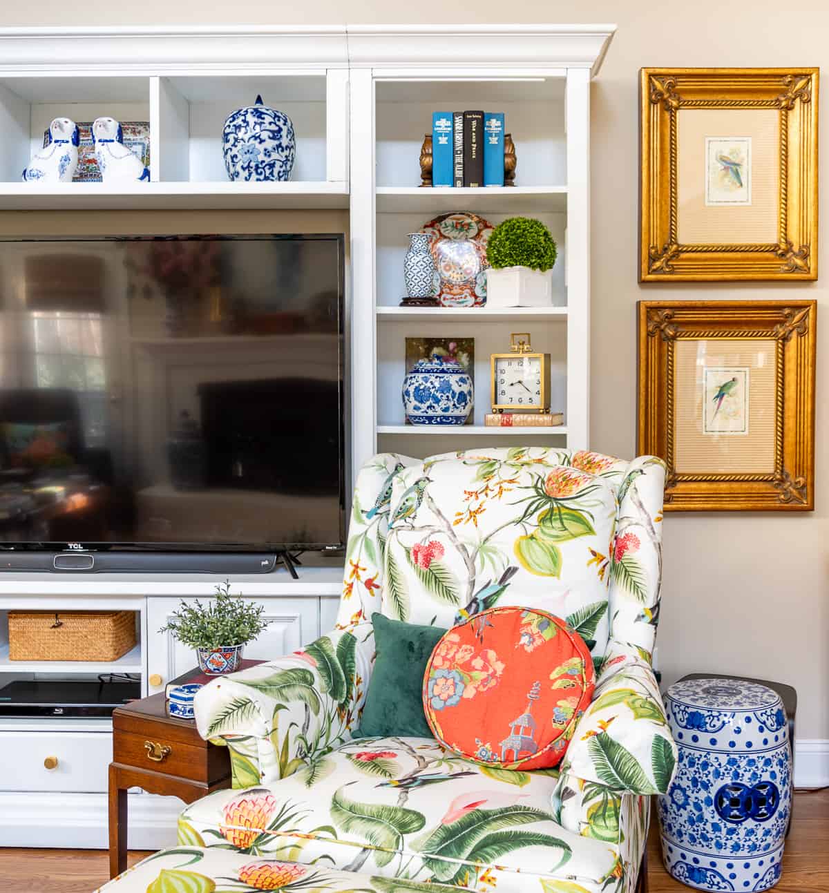
A cozy nook can become a focal point too. A plush armchair, a side table, a lamp, and a small shelf with your favorite books can turn a corner into an inviting, focal point that draws people in.
Finally, don’t forget about furniture. A unique or large piece of furniture, like an oversized sofa or a striking bookshelf, can serve as a focal point. Simply arrange the other elements of the room around it to highlight its presence and make it stand out.
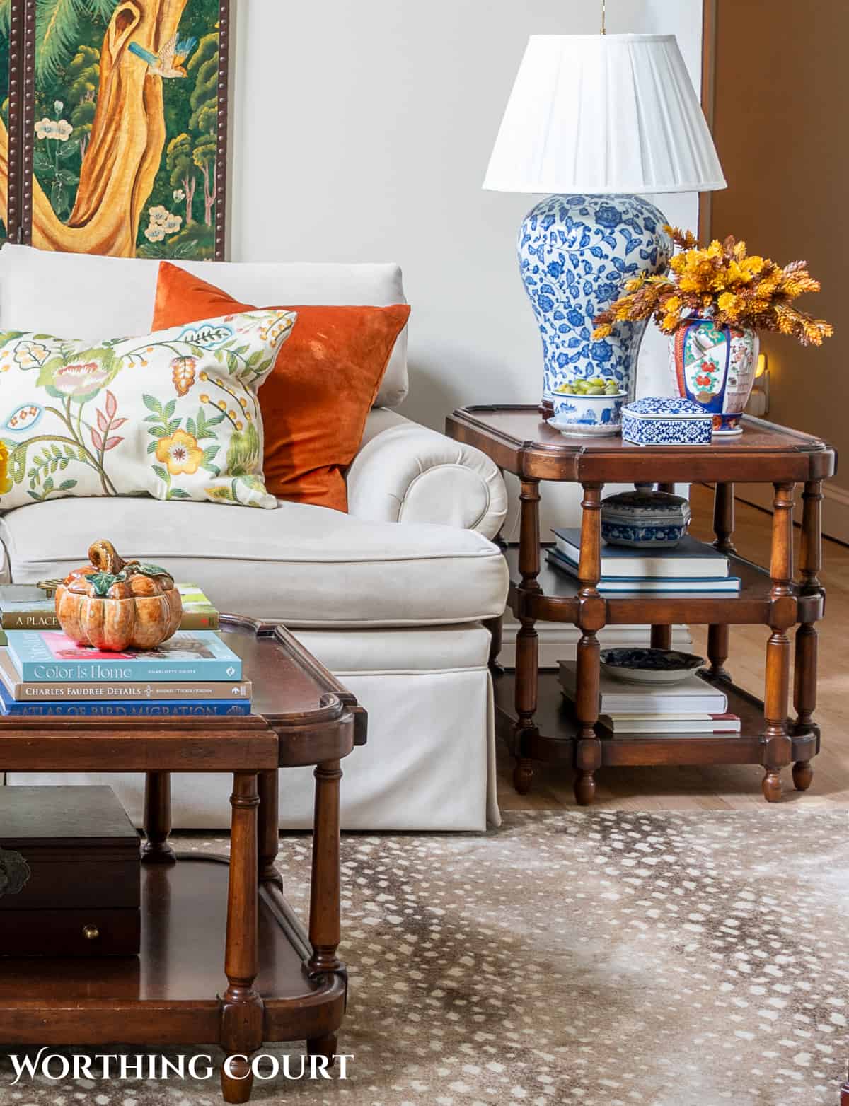
Remember, your living room’s focal point is about showcasing your style and what you love. Without a fireplace, you have a blank slate to create something that truly reflects your personality.
Ultimately, whether you’re dealing with a small living room or a large one, the goal is to create a space that feels like home.
Next in the Simply Decorating series: how to layer decor when you decorate and why it’s important.
To follow along with the Simply Decorating Series, sign up for my emails.

Thank you for some clarification on this…I have multiple focal points and it gets a little confusing on which space should be the ideal focal point. Good suggestions!
Great tips! I’ve been trying to make my living room mantel more of a focal point…just finding it hard to find the right art and accessories.
I have been trying for a decade! to make my fireplace the focus in my LR…after reading this, I realized the focus should be on my lovely large “picture” window that looks out to a garden. I hate fireplaces, have never used mine and never will. Thanks for giving me great ideas beyond my frame of reference.
I’m so glad you found it helpful, Susan. Thank you for letting me know!
Fabulous features, all are so beautiful, specially love the one with the green and white. Ok, this were terrific tips, I never thought about the focal point and I do have a few, specially my vintage French, marble table in the foyer. Thanks for sharing this. Hugs,
FABBY
Great post Suzy….Love Candice…she’s rock star!
Hi Suzy, Thanks for sharing these great tips at the Open House party. The first photo makes me want to change everything in my living room to this pretty green. Hugs, Sherry
Such a useful post and great great images. I especially liked that Tori Fairley. I am seeing her stuff everywhere lately. She has probably been around but now that I have discovered, and fallen in love with her style, I feel like she may be my new muse. 😀 Thanks for sharing on BeColorful I learned a lot.
pam
All are great tips, especially in dealing with a large room with multiple focal points. Thanks for sharing your tips at Potpourri Friday!
Wonderful and informative posts. Beautiful inspiration images.
Clicking to Follow on Linky.
Great idea! ANd great tips! Thanks for sharing Joann Come and follow me on my new blog http://josthisandthat3.blogspot.com/
Suzy, what a great post! I love all of Candice’s rooms! She’s awesome!
These are all great tips. Multiple focal points make my family room hard to decorate since we have a wall of windows, a fire place, and of course a tv. Even a decorator from a furniture store couldn’t really offer much help. I’ll have to read your ideas further to get some good ideas. Thanks for linking up to Your Cozy Home Party this week!
I love your tips. We have a fireplace in our living room, a big TV, and a wall (20′) of windows looking out to a view. We went with a pretty symmetrical arrangement of furniture in a square so there is always something facing either the fireplace or the view. Then we wall mounted the TV and it folds back to blend in. I used your ideas without even knowing!
Fabulous post. I always learn so much. Love all of your pics also, great inspiration and eye candy.. Thanks so much for joining TTT. Hugs, marty
I just found you via At The Picket Fence and I am your latest follower. Great post. I have a similar situation in our family room. The fireplace is on one wall and the TV wall unit is on the adjacent wall. The truth is that the room is used for our family to watch TV together and hang out so the fireplace is my secondary focal point. It’s definitely tricky. Your post is full of great information.
Oh goodness! So many pretty rooms! Thanks for all the great ideas and tips! I love the room with the TV armoire BESIDE the fireplace. Didn’t think to do that but it works so well!
Melody
ChattyChics.com
Great tips. I’ve been moving art around today, trying to get a new look. Thanks for the inspiration.
This is a great post! I went through this challenge with my family room. I think I ended up coming up with a pretty good solution, but it’s very hard to make it work.
What great tips! I’m having this issue with one my my rooms and have been trying to make it work for some time. Hopefully with all these suggestions I can figure something out. Megan
Awesome posts with great tips Suzy! Thanks so much for sharing this with us at Inspiration Friday this week!
Vanessa
This is a very good article and I enjoyed the pictures.