How to Choose the Perfect Paint Color for Any Room
Choosing the right paint color for a room can be a daunting task. Here’s how to pick pick the right color every time!
As I was researching this article, I quickly realized that this can be an overwhelming topic. It’s no wonder so many people have a hard time getting it right.
Welcome to chapter 4 of the Simply Decorating Series; a free resource designed especially for the diy decorator who is eager to transform their home into a place that reflects their personal style and needs. Each post breaks down complex design ideas into simple, actionable steps. If you’re just beginning the series, start with chapter 1, How to Decorate a Room – Where To Start.
I’ve done my best to break the process of choosing a paint color for a room down into easy to understand, manageable steps to simplify your decision making.
Oh brother, this is a “problem” that I can really relate to.
Let me tell you about the time that I wanted a precious pink room for my baby girl and how the room ended up looking like a bottle of Pepto Bismol has been thrown on the walls.
Or the time that I wanted a bright and cheery color for the first kitchen I ever had with white cabinets, so I chose yellow, but it ended up looking like a giant, sunny-side-up egg had exploded all over the room.
Or my personal favorite; the time I chose a beige from a paint chip, without considering the undertones or lighting. At some hours the room looked like a bowl of butterscotch pudding, at others it was a blush wine tasting, and by evening, it was as if we were living inside a lavender sachet.
Newsflash: it isn’t just you and it isn’t just me. We all make mistakes. Even professional interior designers, who have their design degree and who are well versed in color theory, struggle to pick the right wall color at times.
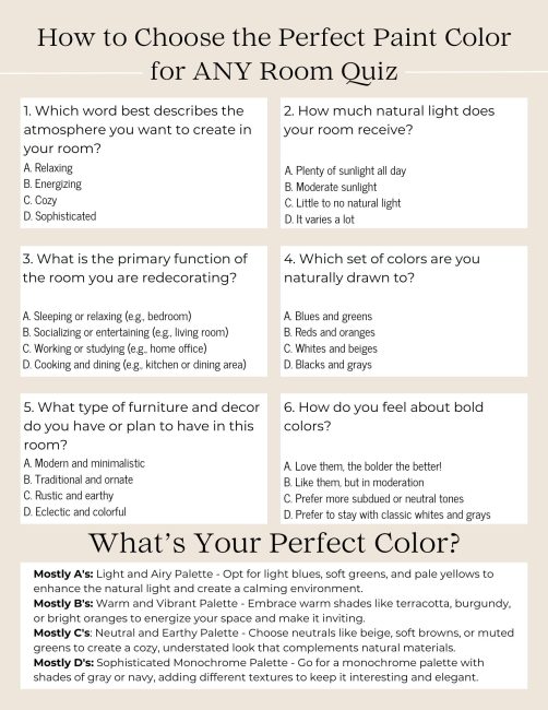
TIP: Take the quiz below to get help you get started choosing the perfect color!
So, if you’ve ever stood bewildered in a paint store staring at thousands of color chips or regretted a color once it’s on the wall, this guide is for you.

Are you redecorating or refreshing?
Choosing a new paint color for a room can vary significantly depending on whether you are keeping the existing furnishings and decor in a room versus fully redecorating a room.
To put it simply:
- Not Redecorating: Your choice of paint color needs to complement existing the furniture, artwork, floor covering, and other decor elements. Basically, it needs to not clash.
- Redecorating: You have the freedom to choose a paint color without being constrained by current decor. This allows for bolder choices and the opportunity to shift the room’s style, color scheme, or mood entirely.
TIP: When redecorating a room, choose the final paint color last. It’s much easier to choose a color to go with the new furnishings and decor than the other way around.
Analyze the room
It’s important to understand the specifics of a room. Ask yourself:
- What is the room used for? A room’s intended use plays into a color choice.
- How much natural light does it get and from what direction? For example, a north-facing room that receives less sunlight may benefit from warm colors like yellows or neutrals to brighten the space.
- What forms of ambient lighting are there? For example: Overhead lights can make a room feel harsh, so you may want to use a warm paint hue.
- Are there imperfections on the wall surface? This will have an impact on the sheen of paint that you use.
- Is it a large or small room? Do you want it to appear to be larger or smaller?
Learn a little color theory
You don’t need to become an expert, but understanding the basics of the psychology of color and how to coordinate colors can significantly enhance your ability to create a room that is visually pleasing and emotionally comfortable to be in.
Color psychology explores how different colors affect human behavior and emotions. Here are some of the basics:
- White: denotes purity and cleanliness, but it can be cold
- Gray: considered a calming modern or chic color
- Beige: evokes warmth and coziness
- Red: associated with energy and passion.
- Blue: know for its calming and soothing effects
- Yellow: evokes cheerfulness and warmth
- Green: combines the cheerfulness of yellow and the calming effect of blue
- Orange: a vibrant and energetic color
- Purple: conveys luxury and sophistication
The psychology of color can be a great guide for choosing appropriate colors for different rooms in a house, as different colors can influence all sorts of things from mood to appetite.
To sum it up, color theory says that chosen colors should not only fit with the desired aesthetic but should also consider the room’s function and the psychological effects of those colors on mood and behavior.
When it comes to coordinating a color palette from room to room, a color wheel can be your best friend.
To choose colors that complement one another, look at which colors are opposite each other on the wheel. The right combinations in a room can create a dynamic look when used together.
In a similar way, using colors that are adjacent to one another harmonize well and offer a more subtle and cohesive feel.
Conversely, not applying the principles of a color wheel at all can lead to rooms with colors that clash, give off the wrong vibe, and even create visual fatigue.
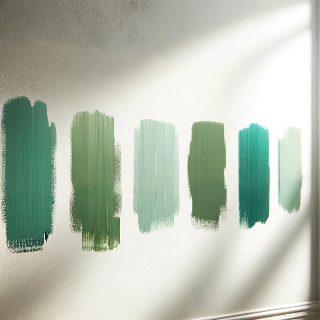
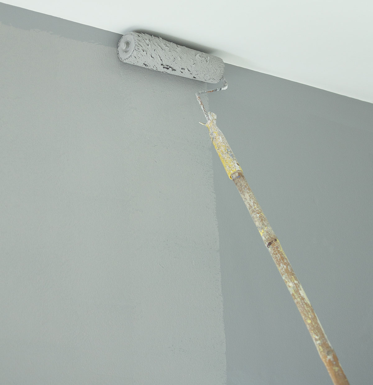
Test colors
Now that you’ve considered all of the above, it’s time to pick some paint chips from the store. But don’t just stick to one; select a range of shades and undertones from each color family.
Whatever you do though, don’t make your final choice from a paint chip! Take the chips home to begin to get an idea of which colors will work in your room.
If you’re redecorating a room, I’m going to assume here that you’ve already found some inspiration and have taken the quiz to determine your design style and that you’ve created a mood board to work from.
But if you’re coordinating new paint colors with existing furnishings and decor, you’ll want to make sure the chosen shades complement the colors and style of everything in the room.
If there are furnishings or decor that will remain in the room, hold the chips next to them and against different walls in the room. Observe them in the room at different times of day and under different lighting conditions.
After evaluating how the colors work in the space, narrow down your options to the ones that best fit your needs and preferences.
Once you’ve narrowed your choices down, purchase sample pots of the different colors. You have a two options for deciding on the final color:
- Paint a large area of each of the walls in the room with two coats of paint. One coat won’t give a true representation of the color. Painting a section on each wall of the room will allow you see how the color reacts to different angles of light.
- Instead of painting the wall, paint two coats of the paint on foam core poster board from the dollar store. Move the board around the room to observe how it reacts to lighting and how it looks against any existing furniture and decor.
Other than purchasing samples, another choice is to purchase peel and stick samples of the paint. Some paint stores sell them, but my favorite by far is to order them from Samplize.
At roughly 9″ x 15″, their samples are larger than what you usually get at a paint store and each stick-on sample costs less than most paint samples, plus they ship overnight.
They are wall-friendly and can be moved from wall to wall to see how the color looks at different times of the day and under different lighting.
They have samples available from Sherwin Williams, Benjamin Moore, PPG and Farrow and Ball.
Choose the correct sheen
Alright, you’ve chosen the color, but there’s one more step and that’s to choose the sheen, or shininess of the paint.
The is an example of the same color of paint in flat, semi-gloss, and gloss finishes.
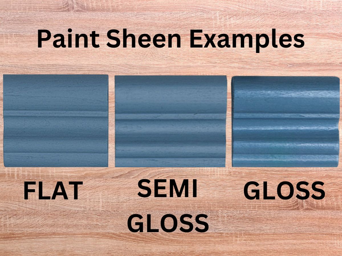
The sheen will have a direct impact on how the color looks and how durable it is.
- Flat or Matte: Works well in a living room and bedroom where a more subtle sheen is usually preferred. You’ll also want to choose this sheen if you want to minimize the visibility of any imperfections on the wall surface. This sheen of paint can be more difficult to clean or remove scuffs from.
- Semi-gloss, Satin or Eggshell: Works well in any room where you desire a soft, subtle sheen. This type of paint is usually more forgiving when cleaning marks or getting rid of scuffs.
- Gloss: Usually used in areas that are prone to wear and tear because of its durability and ease of cleaning. You’ll find it used most often on trim work.
- Lacquer: This sheen is gloss on steroids. The high-gloss sheen dries hard and is the most durable. In today’s world, monochromatic lacquered rooms are very popular with design enthusiasts.
When the trim work in a room is painted the same color as the walls, it’s common to use flat or eggshell on the walls and semi-gloss or gloss on the walls.
TIP: My favorite tool for removing scuffs from a painted wall is Mr. Clean sponges, dampened with water.
Light vs dark paint colors
It’s a well known fact that dark walls make a room feel smaller and light walls make a room feel larger.
But did you know that there are other considerations as well?
Dark colors on the walls: are moodier, can mask imperfections and minimize undesirable features, can mask stains, can affect a room’s perceived temperature, and can serve as a backdrop to highlight artwork, decor, etc.
Light colors on the walls: create a sense of airiness, provide a neutral backdrop for every other color in the room, create a calm, tranquil environment, are generally preferred by home buyers (think resale), and will show dirt easier.
Commonly asked questions
Why Does My Paint Color Look Different on the Wall?
Have you ever chosen a paint color that looked perfect on a swatch but unexpectedly different once it was on your wall?
This is a common experience. Here are few reason why:
The lighting in your room plays a significant role. Natural light shows the truest color, while artificial lighting can alter how a color appears.
The surroundings in your room impact how color appears. Colors can reflect off each other.
The texture and condition of your walls can also affect the appearance of paint. Rough surfaces may make colors appear darker, while smooth surfaces might reflect more light and show colors more brightly.
Finally, a color’s undertones might be more noticeable on a larger scale. On a small swatch, subtle undertones might not be evident, but once the color is on an entire wall, these underlying tones can become more dominant depending on the lighting and surrounding colors.
How do you transition colors from room to room?
Consider sight lines when standing in any given room – the colors visible in adjacent rooms. Choose colors that harmonize with what you can see from room to room. Put that color wheel to good use!
Consider making subtle changes to colors in different rooms instead of using colors from entirely different color families.
Does paint appear lighter or darker when it dries?
Paint typically appears darker after it dries. When it’s wet, it has a higher sheen due to the moisture in it. But the extent to which the color changes can vary depending on the type of paint (oil-based or water-based), the color itself, and the underlying surface.
How many coats of paint will my walls need?
It depends on several factors – the type of paint, the underlying color, the new color, and the finish.
As a general rule:
- Two coats are typically recommended for most painting projects to ensure even coverage and depth of color.
- If you use a primer on a previously unpainted surface or to cover a significantly different underlying color, you might still need two top coats over the primer for the best result.
What color should I paint the ceiling?
The most used color for ceilings is aptly named ceiling white, which is typically a very flat, matte white designed to help make ceilings appear brighter and higher. This specific shade of white usually has a neutral base without any strong undertones.
But if you’re after a designer look, treat your ceiling as a fifth wall, painting it the same color as the rest of the room. If you go this route, consider painting all of the trim and crown moulding in the room the same color for uninterrupted color.
Do’s and don’ts
And lastly, we’ve talked lots of about the Do’s when choosing a paint color for a room, but what about the Don’ts?
DON’T DO THIS
Don’t overwhelm a room with paint colors.
Don’t ignore the emotional impact of color.
Don’t forget about your home’s overall flow and the sightlines between rooms.
Don’t rush making a decision that you may regret later.
Color trends come and go quickly. Don’t get caught up in one.
DO THIS INSTEAD
Limit to no more than one accent wall.
Refer back to the section on color theory.
Use a cohesive, coordinating color palette throughout all of the rooms.
Give yourself permission to live with samples for several days.
Use timeless colors on your walls. Add trendy colors with accessories and fabrics.
Take the color quiz!
I composed this printable quiz to get you started on the road to determining what paint color palette will be best for you.
For the most accurate result, take your time and answer thoughtfully! After you answer all the questions, tally your answers and find your style directly at the bottom.
The quiz is a pdf, so simply click on the image to open it in a new screen and print!
I hope this post has helped you to realize that choosing the right paint color for your room doesn’t have to be a daunting task.
By following these simple do’s and don’ts, you can confidently select the right color every time and create the ideal atmosphere for you and your family.
Happy painting, and may your home reflect all the joy and comfort you envision!
Next in the Simply Decorating series: How to Deal with Multiple Focal Points in a Room
To follow along with the Simply Decorating Series, sign up for my emails.
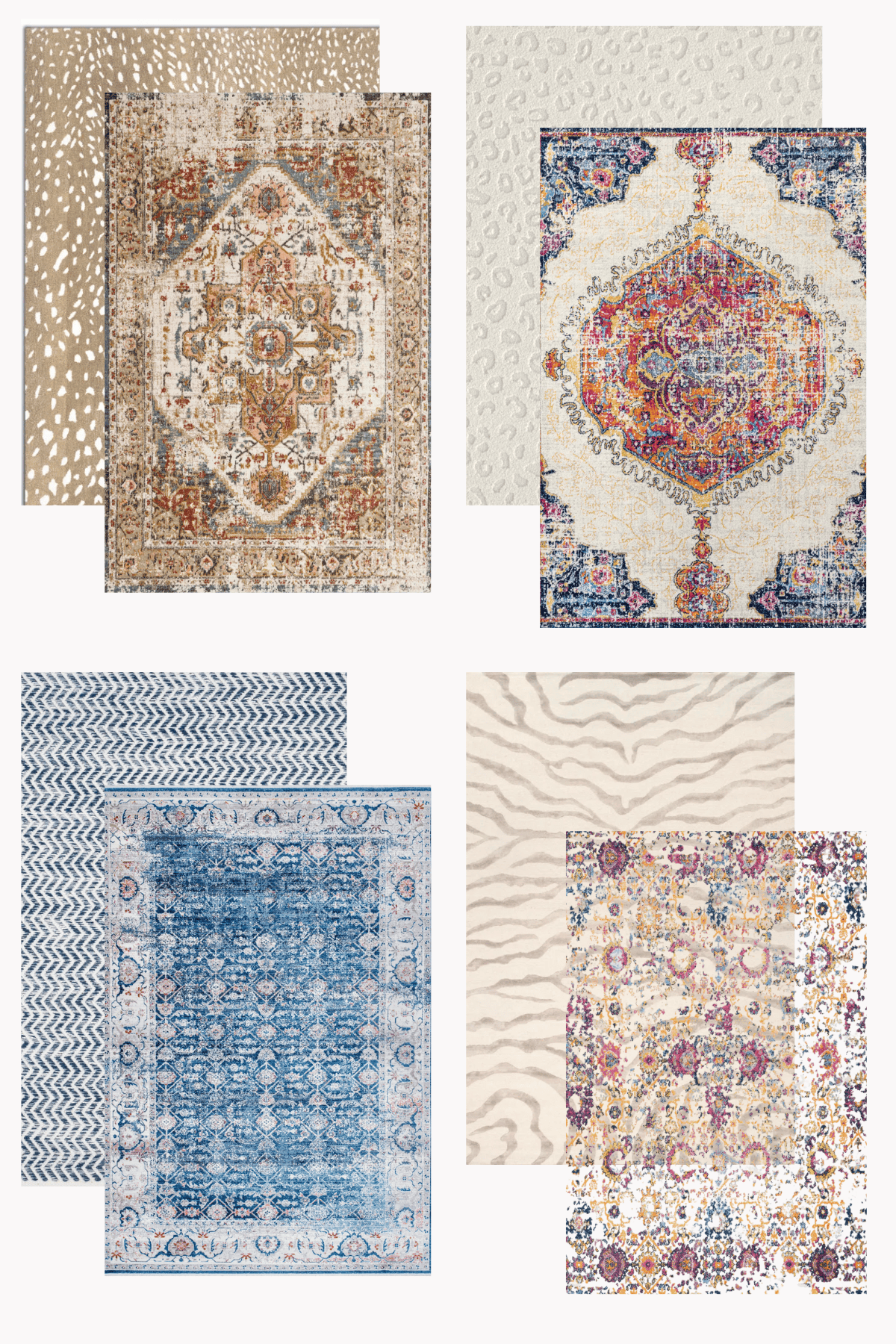
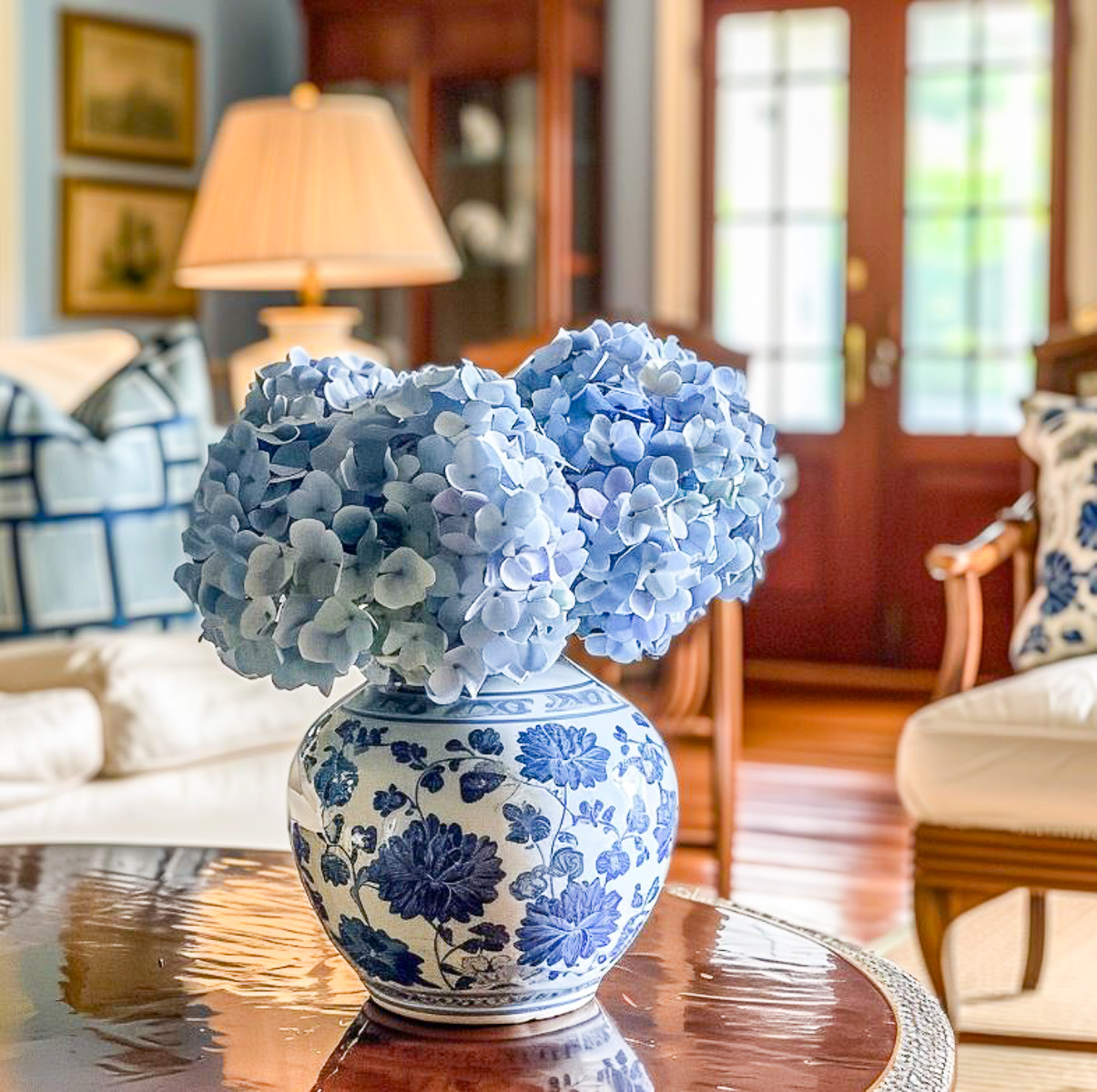
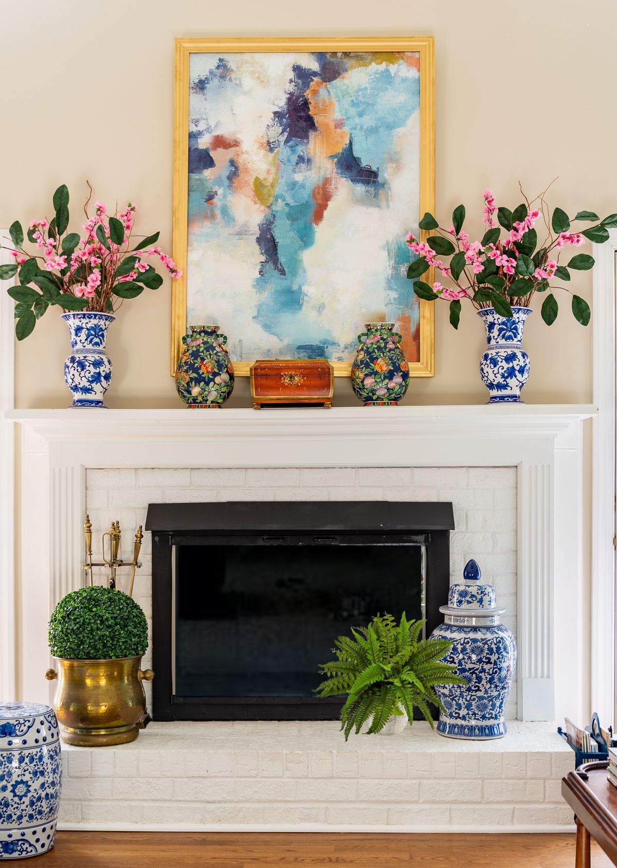
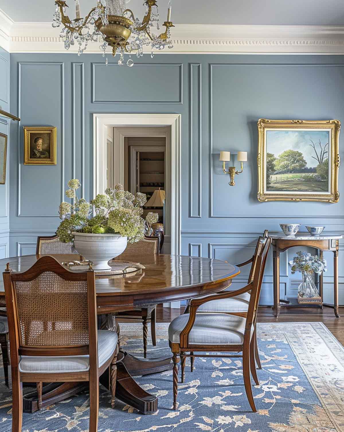
The blue in this room is gorgeous but I would think too formal for our home on the lake. I love color and chose to paint our living area Bookroom Red this year, a huge departure from the blue I’ve had for years. What I didn’t expect is the way the blue and white chinoiserie stands out against this backdrop. And greenery, it’s dramatic. I would have loved to use green as my accent color but the rug I purchased has a ton of blue that wasn’t evident in the picture online. Never again will I purchase a rug on line. So, I bring the green in with plants.
We also opted for a Benjamin Moore flat paint and it is stunning. Your advice is spot on and easy to follow!
That’s great to hear – I’m glad you found the advice helpful! And yay for using greenery! I think it’s a very undervalued item in the world of home decor.
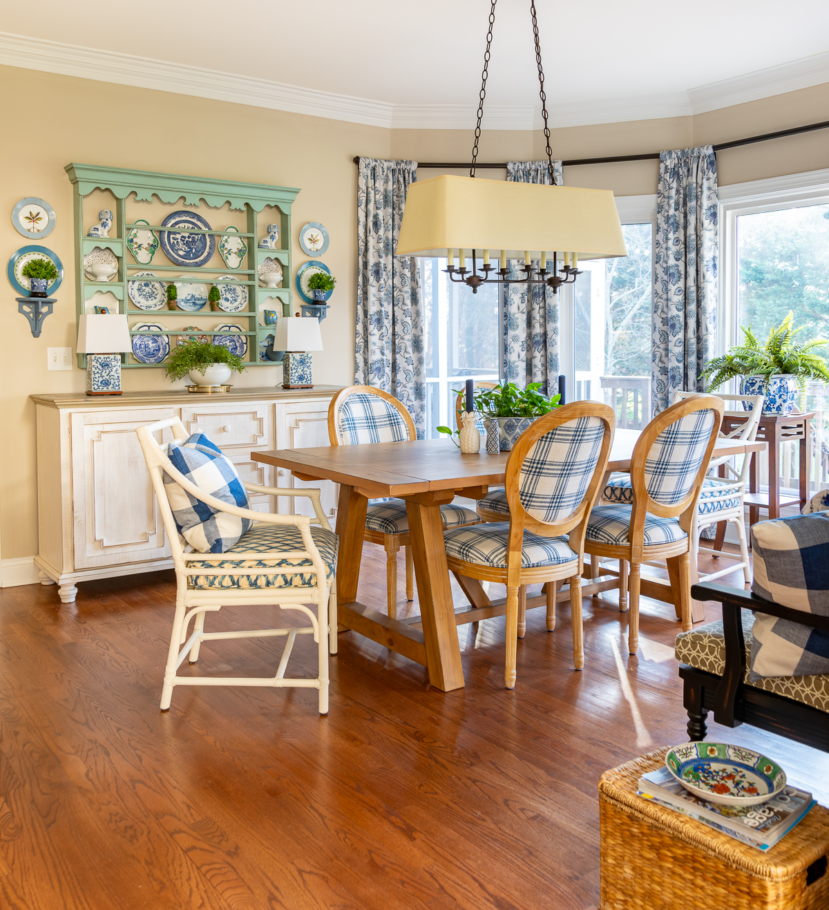
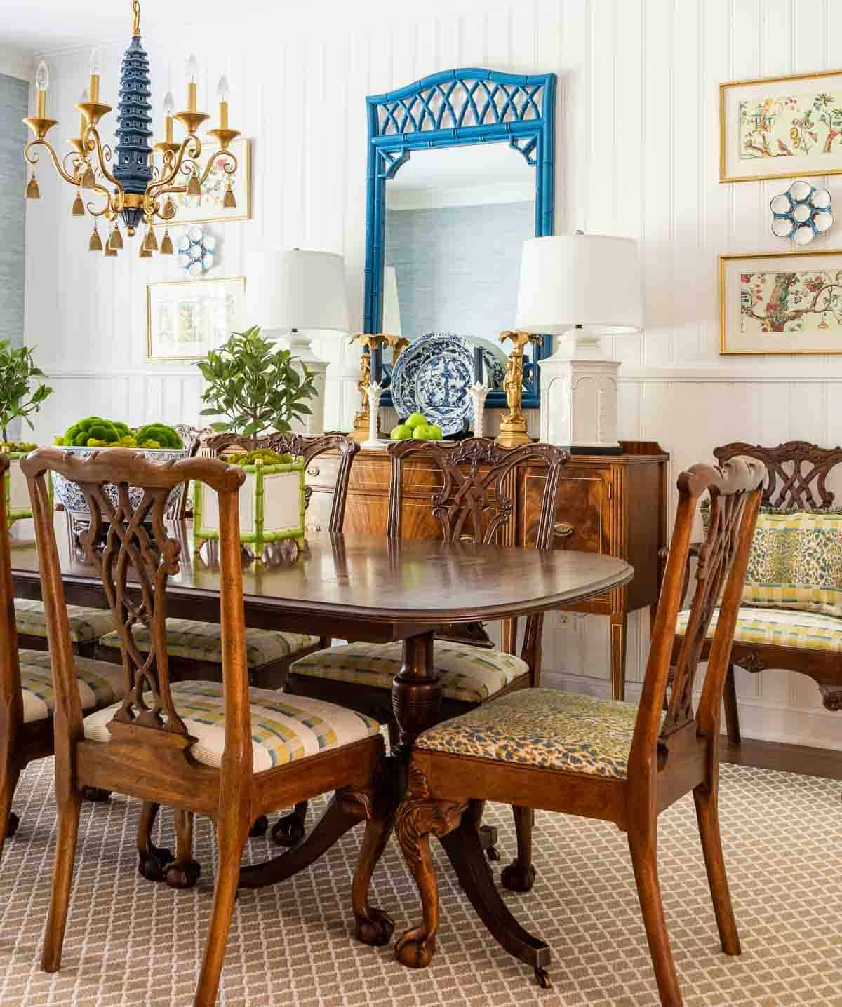
What is the paint color of the blue dining room with picture frame moldings?
I’m sorry, but that isn’t my home so I don’t know the name of the paint color. It sure is pretty though!