Farmhouse Dining Room Makeover Reveal – Before And After
How to turn a dark and dated dining room into a bright and inviting space ready for entertaining!
Now that I’ve put the finishing touches on the dining room, I’m finally ready for the big reveal of the finished product! It’s a great feeling to be able to show you a completed room after chipping away at the space for months.
I’m going to be a bit of a rebel again. Just like when I shared the before and after reveal of my family room, I’m going against the “blogging rules” and showing you the not-so-great before’s first, instead of a beauty shot. This is the dining room as it looked on the day that we first looked at the house. The owner had the room decorated in a very traditional style, with dark trim and heavy dark furniture.
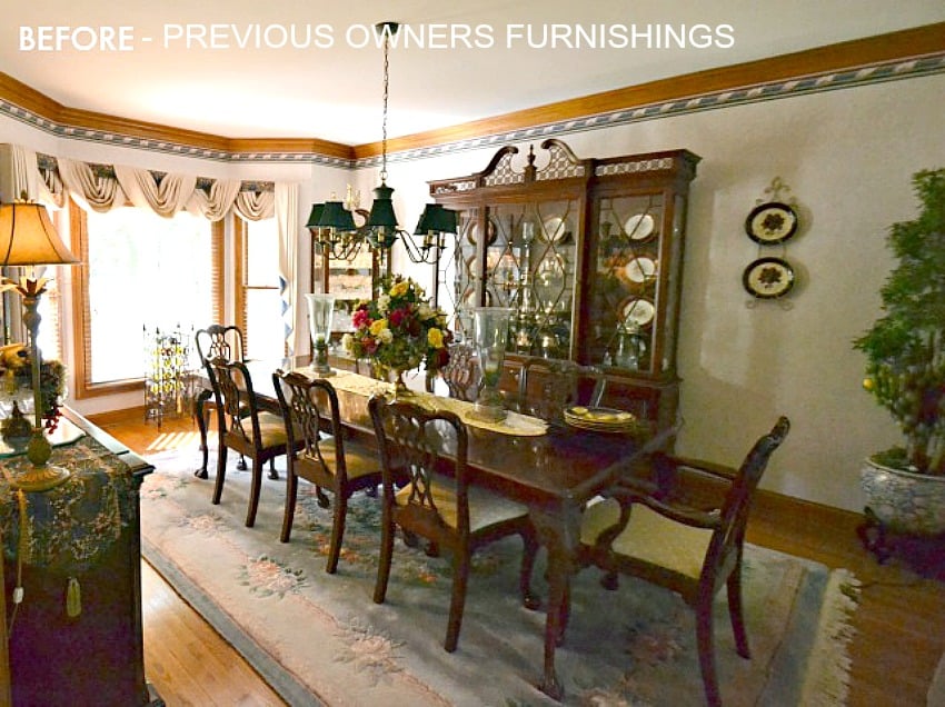
This shot is taken looking back toward the doorways to the kitchen and office. Good grief, it’s hard for me to even remember the room looking like this.
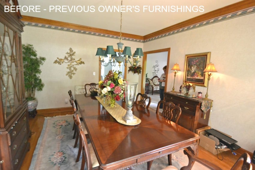
And this is how the room looked before we started the makeover. At this point we had removed the wallpaper, repainted the trim and walls, replaced the chandelier and refinished the hardwood floors. This is how the room looked for about 18 months, while we finished up remodeling the kitchen, breakfast area, laundry room, screen porch and family room.
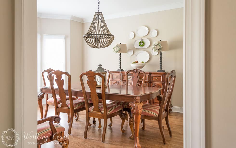
And, here’s how the room looks today. So much brighter! We completely remodeled this house when we bought it, but this is one of the rooms that, thankfully, only needed cosmetic changes.
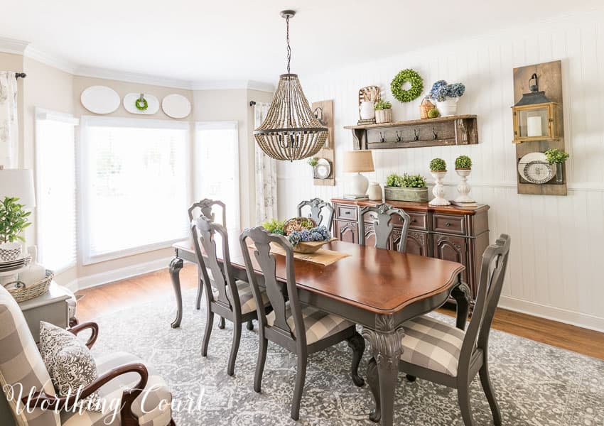
The super fast and easy planked wall was one of the very first makeover projects that we tackled and boy, what a difference it makes in the room. I’m calling it vertical shiplap and it says instant farmhouse to me! Click HERE to read all about how we created this planked wall in one afternoon.
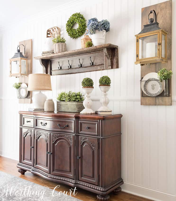
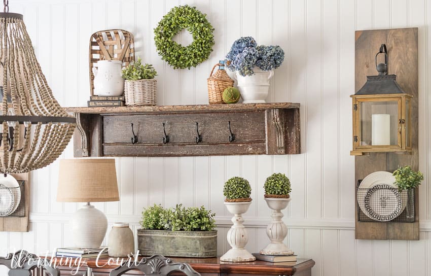
Maybe you remember my post about the diy Fixer Upper style hanging lanterns that I made for either side of the sideboard. Well, I knew that I would have fun changing up what is displayed in those baskets beneath the lanterns. I replaced what I originally had in the baskets with a couple of plates and just one vase with greenery. In case you missed it, click HERE to read the step by step tutorial.
I’m still in love with the large wall of botanical art that I added to the wall beside the door going into the kitchen. I think that it adds a lot of life to the room and fits in well with any greenery that I have in here. You can read all about how I created all of the art for only $75 by clicking HERE.
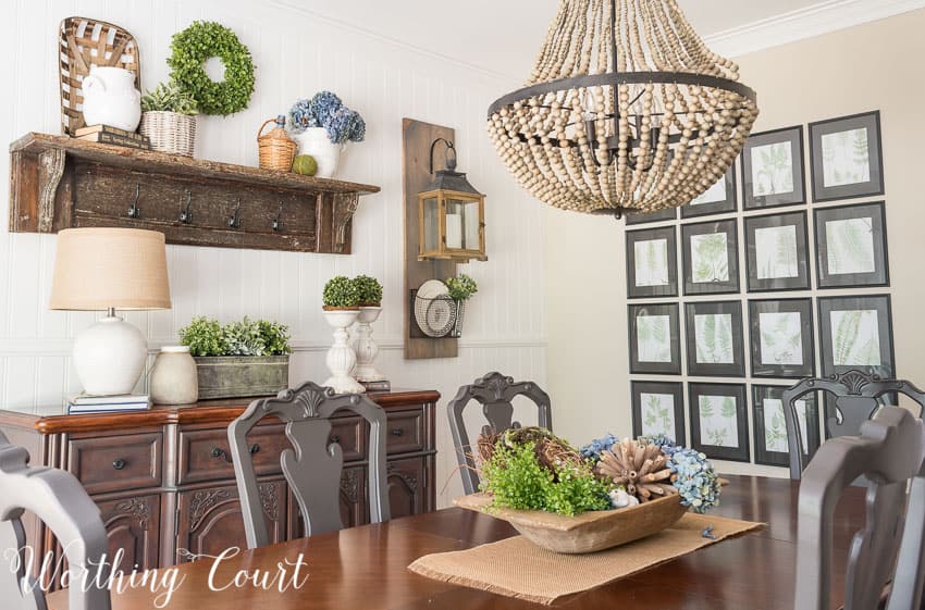
I decided to simplify the centerpiece on the table and replaced the large lantern and topiaries that were on it with my doughbowl filled with all sorts of summery goodies. We’ll take a closer look at that on another day.
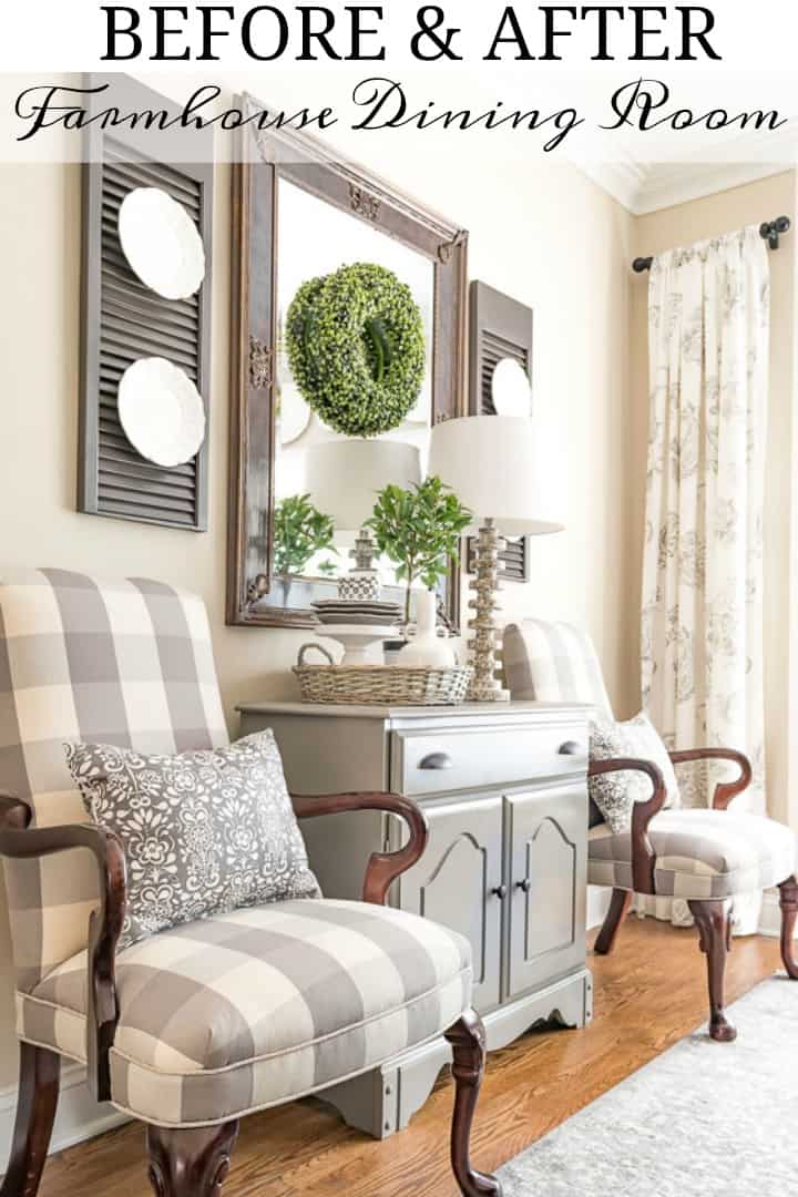
One of the more dramatic changes to the room took place on the wall opposite the sideboard. I had agonized so much about what to do with the little cherry chest that used to live under this mirror, but it finally occurred to me that my already-gray chest, that was in the foyer, would be perfect in here. And then – it was pretty much a no brainer when Pookie asked me what I wanted for my birthday…to recover our old office chairs! I used two euro shams from Ikea to make the lumbar pillows for each chair. I love their pattern mixed with the buffalo check.
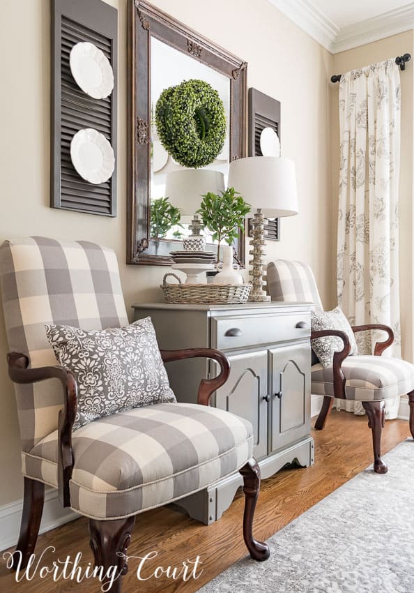
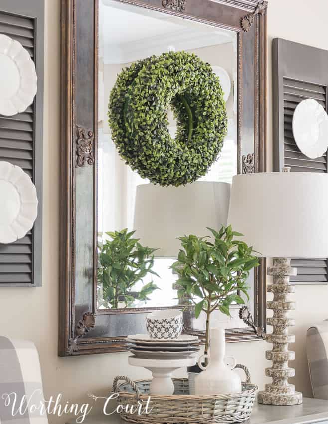
Because of the additional bit of light that it adds to this sometimes dark room, I decided to keep the mirror above the chest instead of replacing it with a chalkboard. The newly painted mirror blends wonderfully with the rest of the room now. Plus, I really like the way that it reflects the sideboard vignette on the other side of the room.
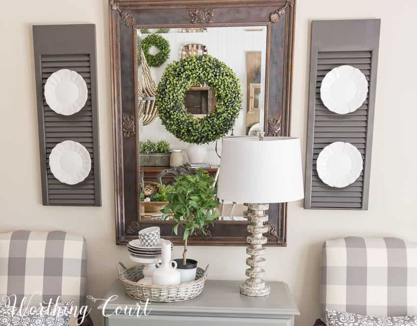
And btw – I get asked about these shutters a lot. They actually aren’t shutters at all, but are two parts of an old pair of bi-fold doors that I cut down. They’re spray painted with Rustoleum’s Anodized Bronze and I attached two D ring hangers to back of each one to hang them on the wall.
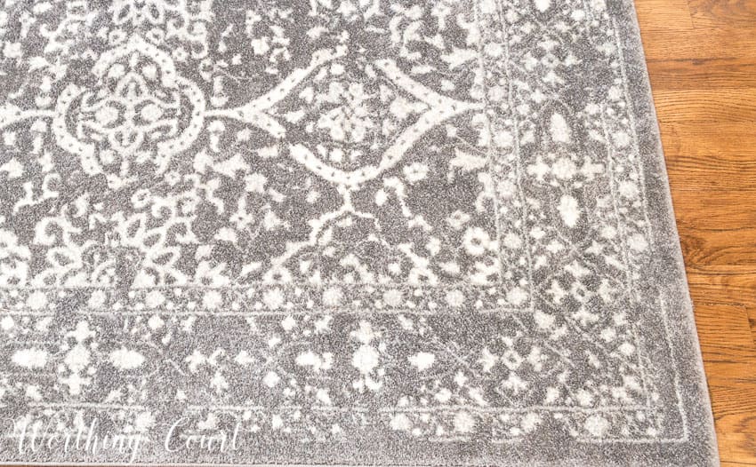
I was very afraid of doing two things when it came to the makeover of this room. One was whether or not I would be totally wasting my money and regret adding a rug to this room. I don’t believe I would love the final result nearly as much if I had opted not to take a chance! The rug is great quality and was a super deal for such a large one – under $300 for a 9′ x 12′.
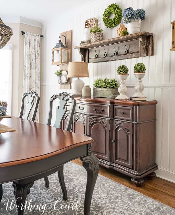
The rug has the slightly faded, worn vintage look that is so popular right now. It’s available in multiple sizes and can be found HERE.
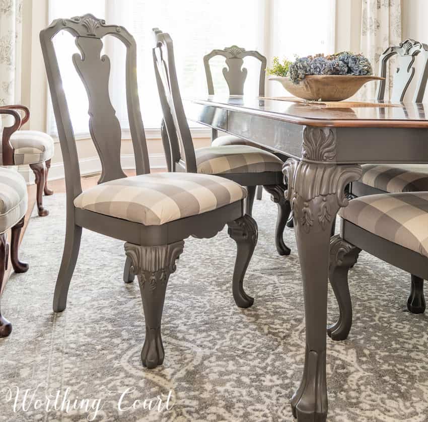
My second fear, and the biggest one of all, was whether or not to paint my table, chairs and sideboard. I mean, once it’s painted, it’s painted – right? My furniture wasn’t all that expensive when I purchased it back around 2004, but neither was it the least expensive I could have bought. I was so afraid of ruining it, but with encouragement from friends and family, I finally realized that it was the right thing to do for this makeover. I’m sooo happy that I took the plunge! Click HERE to take a closer look at all of the pieces that I painted and the various techniques that I used.
So for those of you who are contemplating any sort of a makeover, my advice is this – TAKE YOUR TIME. If you’re unsure of anything, just complete one step at a time and you’re bound to be pleased with the end result.

Suzy, I have followed your decorating adventure from the beginning. I often wondered what you would do with the tables, chairs & chest because as pretty as they were they just didn’t fit the palette you had chosen. Your decision to paint them all was spot on. The room is absolutely beautiful and the quality of the furniture is enhanced with the gray base & wood top. Thank you for sharing your thought process behind your decisions. I’ve enjoyed it & learned so much.
Suzy love your fall mantel. Looks so stylish. Also like your dining room make over. Great job!
Absolutely love your fall dining room makeover! It’s gorgeous! My favorite…the boards with the lanterns and baskets underneath!
Really enjoyed your blog this morning while drinking my coffee!
Thanks for the inspiration!
Fantastic make over! Feeling very inspired.
Love, love, love your style. New age country.
I left my comments this morning but they were deleted.
Hi Sharon. Your comment wasn’t deleted. It was left on a different post. Click on this link and you’ll see it: https://www.worthingcourtblog.com/fall-in-my-farmhouse-dining-room/
Thanks so much, appreciate the quick response
Suzy!!! YOU have inspired me to fix that dinning room set which has sentimental value but it’s in dire need of a makeover. We are moving to Tennessee next week and debated if we should even take it and I think this is the answer. Do you think I can get your two toned look with my cherry wood set? Thank you for sharing.
Hi Vanessa. I absolutely think that the two-toned look would work with a cherry finish! In fact, one of my original plans was to paint the bottom of a cherry chest that I already owned – leaving the top cherry. The only reason that I didn’t was because I happened to already have the lighter gray chest that I wound up using in the dining room.
Just beautiful!
Love the dining room. Love that you had the courage to paint it. It looks entirely different and beautiful. I bet the people that made the furniture wish they had done that. People laugh at me and say that if it stood still I would paint it. Just love it and all your projects.
I love this! What color is the paint that you used on the walls? (The beige color)
Hi Lindsey. The walls are painted with Sherwin Williams Accessible Beige.
Beautiful room! I love the painted furniture. I’ve been struggling with how to refinish 4 diningroom chairs that are extra chairs, we only use them when we have more than 6 guest at the table and I think gosh these chairs need help. Now I will paint them & recover them. Thank you for this fantastic idea!
Amazing change in the dining room! I also enjoy what you did on the front porch for Christmas!
I am in love with the buffalo check chairs against the wall! Can you use them at your dinning table? Do you know where I might be able to find some similar ones?
Hi Renae. Yes, I can use those chairs at the table. They might sit a little low though, so I’d probably have to sit toward the front of the chair. The style of chair is called Martha Washington. Mine have been recovered from what their original fabric was. You can purchase them at this link: http://rstyle.me/n/cdqeiwb7z57 OR at this link (less expensive): http://rstyle.me/n/cdqefmb7z57
Hi,
Do you mind sharing the name and brand of this wall color. Looking, but not seeing it. Thanks!
The wall color is Sherwin Williams Accessible Beige. 😀
Hi! Love the shutters with plates on them! Just curious- what did you use to hang the plates with? Would love to do this at my house!
Hi Catherine. I have a plate hanger attached to each plate with a length of green florist wire that I ran through the top of the hanger, where you would hang it from a nail in the wall. The wire is long enough so that I could run each end through the slats of the shutter and twist them together in the back of the shutter to hold the plate in place. Hope that makes sense! 😀
What a transformation!!!! Beautiful.
Suzy, thank you so much for sharing this beautiful design. I love your style. Everything you do inspires me to try some small projects in my home.
Love how you have transformed your dining room, especially the dining room table and chairs. I have a similar table and would love to try painting it as well. Any tips you can share?
Hi Lori. You can read more about painting my dining room furniture in this blog post: https://www.worthingcourtblog.com/dining-room-finishing-touches/ . But if that doesn’t answer any questions you may have, just shoot me an email!
I love the look of the rug. I cannot tell if it is a dark grey or more of a lighter silver. Can you advise? Rom is stunned get.
Hi BJ. I would classify the rug in my dining room as more of a medium gray with the pattern being a white’ish silvery color.
Love what you have done, I have one question – where did you get the Buffalo Check fabric used in the dining room?
Hi Roxann. I found the fabric at a local fabric store called Printer’s Alley.