5 No Fail Ways To Change The Look Of A Room
Have you ever had the urge to give any of the rooms in your home a whole new look, but don’t want to go to the trouble or expense of an entire remodel? I’m right there with you!
I love the idea of being able to make small changes in a room, but still wind up with a totally “new” space. Check out these 5 no fail ways to change the look of any room in your home!
Change the Light Fixture
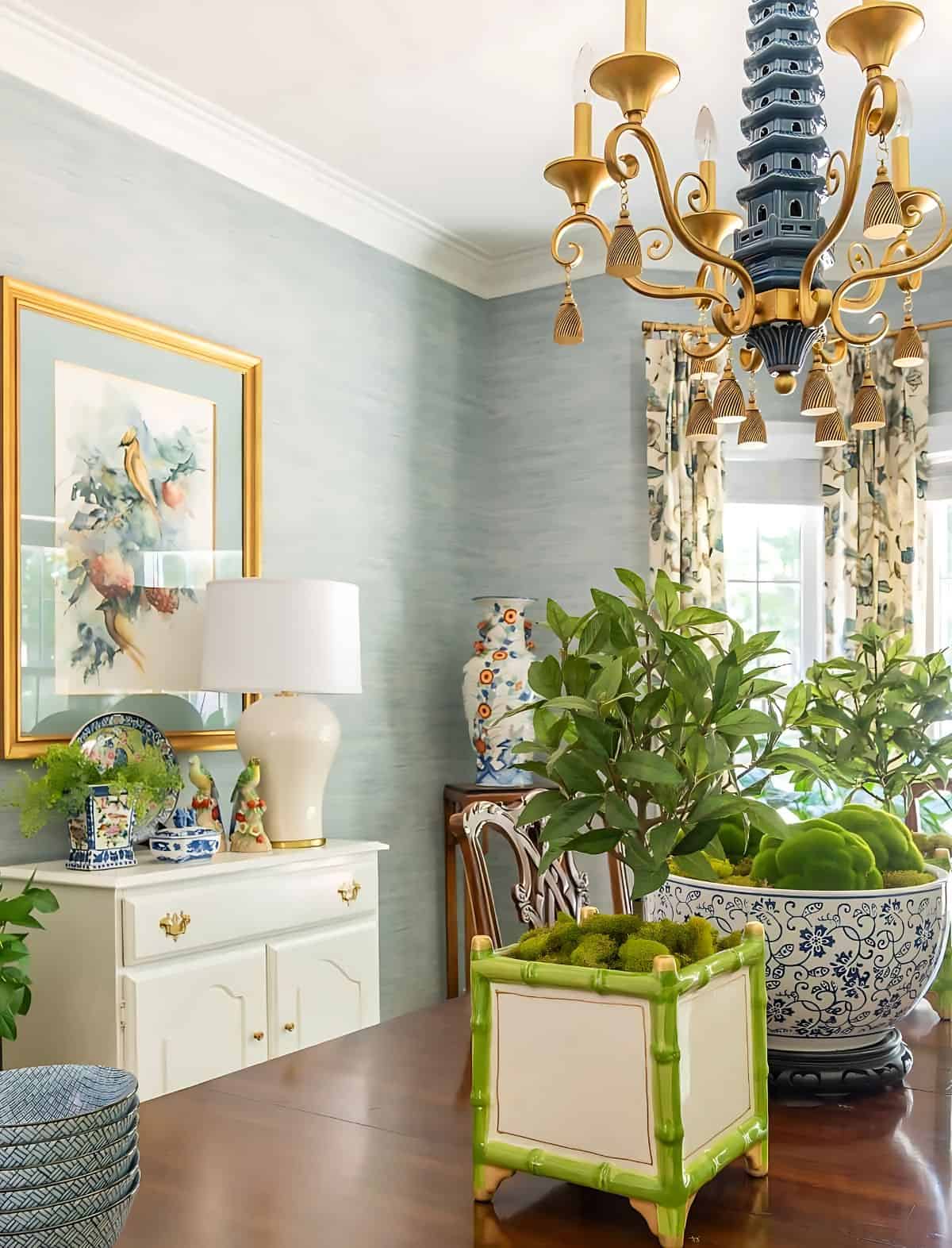
Swapping out a light fixture is a surefire way to change the look of a room. A new fixture helps set the room’s overall style – whether it’s classic, modern, or somewhere in between.
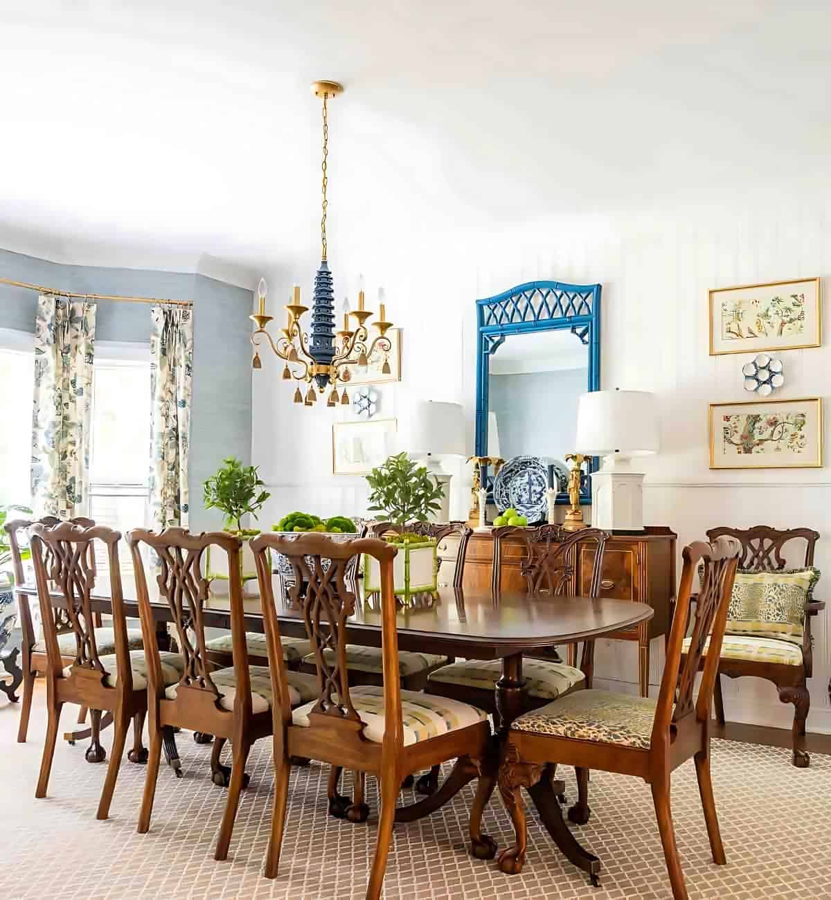
Here’s a before (in the lower right corner) and after look at my breakfast room when it was in the very beginning stages of me giving it a makeover.
I was experimenting with different curtains at the beginning, but the chandelier was the first permanent change that I made.
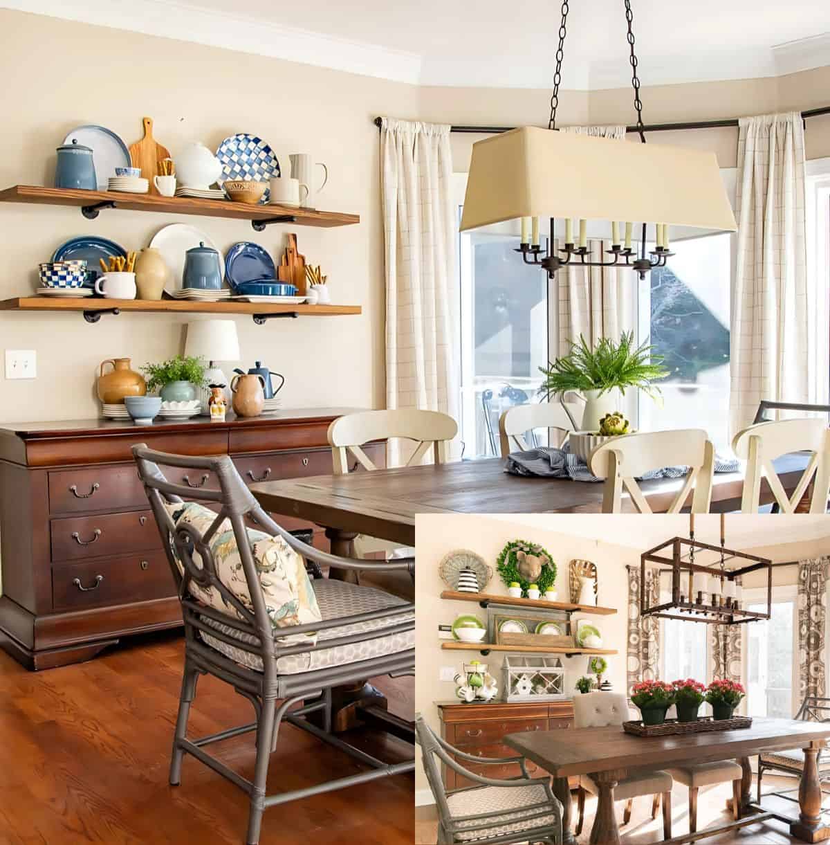
Above is a before (in the lower right corner) and after of my breakfast roomOut with the industrial/farmhouse look. In with a classic style light fixture that will stand the test of time and serve me for years to come.
Paint Your Fireplace
A fresh coat of white paint on a red brick fireplace will instantly brighten a room and gives it a fresh, clean look.
The ‘before’ of my fireplace is in the small inset image in the lower right corner.
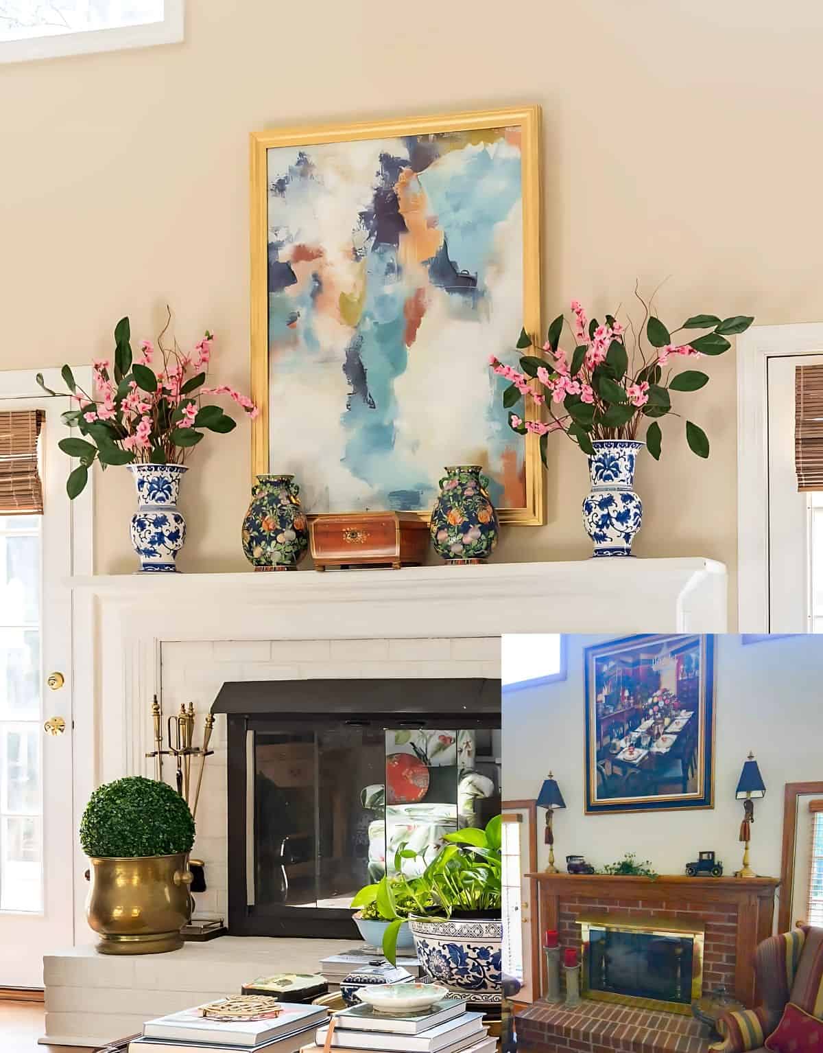
It’s a simple process, but proper prep is key. Clean the brick thoroughly, allow to completely dry, then use a high-quality primer, followed by your favorite white paint in a semi-gloss sheen.
If the fireplace surround is the original wood, painting that white as well will create the most cohesive look, soften the contrast and allow the fireplace to blend seamlessly with the rest of the room.
The result is a fresh, updated focal point that makes the entire space feel lighter and more inviting.
Add Statement Art
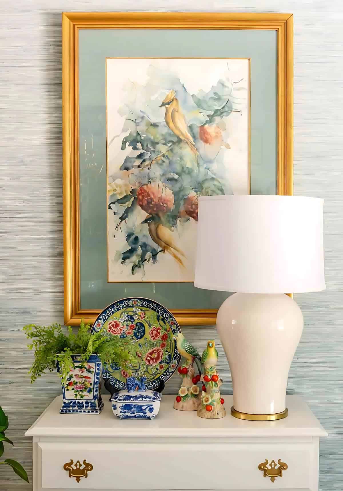
Want something that will instantly catch a person’s eye and change the entire vibe of a room? Statement art is the answer.
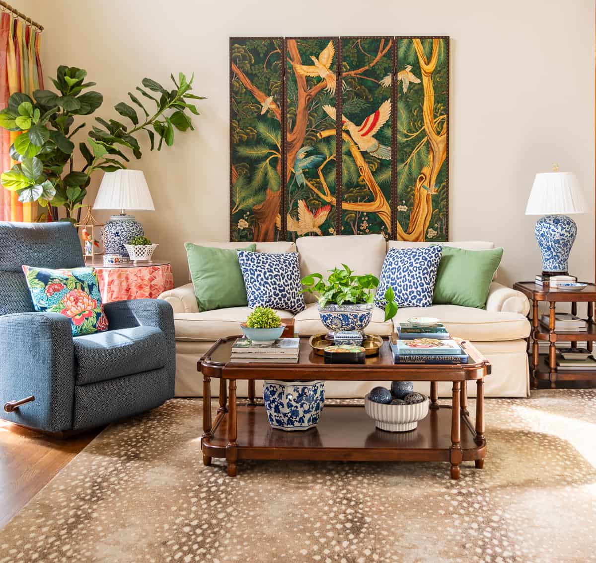
What do I mean by statement art? Statement art is at least one of three things:
- it’s oversized
- it’s colorful
- it’s bold.
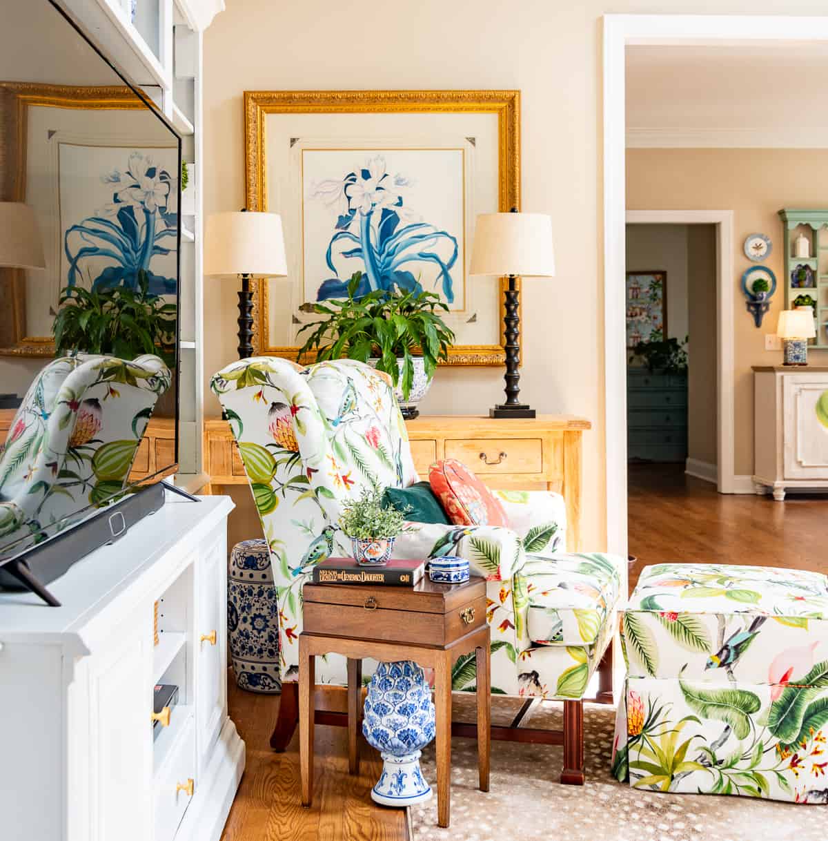
Even if you don’t particularly care for the art currently hanging above my sofa, you still have to admit that adding a piece of statement art has the power to totally change the look of a room.
Fresh Furniture With Paint
Painting wood furniture is a great way to refresh a room without buying new pieces.
It wasn’t in the budget to replace my entertainment center when I found myself moving away from farmhouse style to a fresh, updated traditional style.
Even though the wood could have worked perfectly fine, it didn’t fit with my definition of “fresh traditional”. Even with other changes in the room, it felt dark and dated.
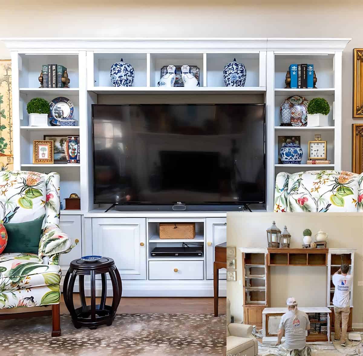
After much consideration, I opted to have it painted white and I’ve never looked back. It totally transformed the entire feel of my family room!
Add Color
Want to bring personality or freshen a room without making a permanent change?
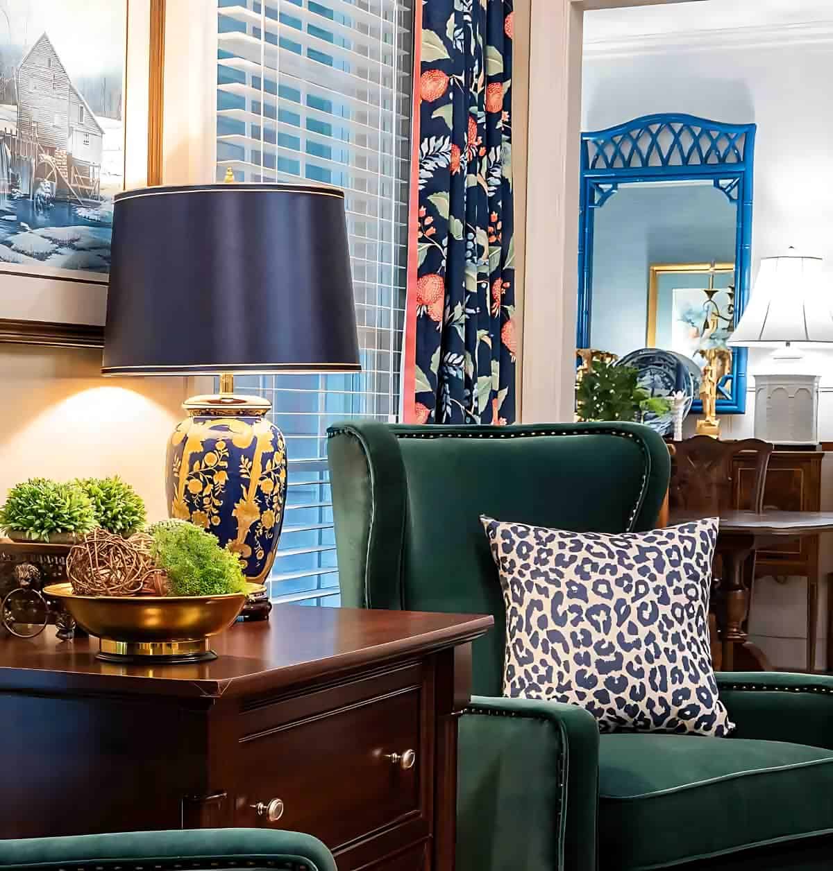
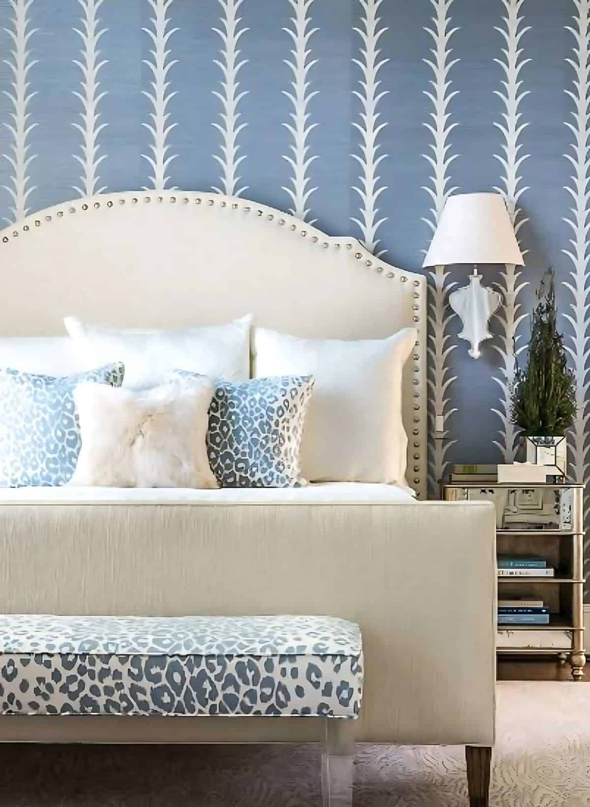
Then color is your best friend. If you’re a neutral lover, add it in small doses. If you’re already a color lover, then switch things up.
If the room feels too monochromatic, layering different shades of the same color creates depth without overwhelming the space.
As you can see, small changes can have a big impact when it comes to updating a room.
Whether it’s a new light fixture, or simply adding a pop of color, each of these no-fail ideas can help transform your space.
The best part? You can mix and match these updates to create a home that feels fresh, inviting, and perfectly suited to your style.
Your vignettes are always beautiful! You asked what to take away on your fireplace. I would leave the vignette on the right side of the hearth and remove the left side. As I like to play around with the look of the mantel, I was wondering how it would look to remove the shutters behind the lanterns. I think your beautiful arch would pop more and become more of a focal point. It’s always easier to see it in person, just a “try it and see” suggestion! Thx for sharing your pretty home!!
The wood back back drop and the basket is too much. A nice mirror with the removal of Yellow wall would be good. You could add a subtle gall floral arrangement in front of the mirror. The overall picture is too busy.
Somehow, what I previously submitted got somewhat distorted. It should have read “The wood backdrop and basket of flowers are too much. A nice mirror with the removal of “Hello Fall” would be good. You could add a subtle fall floral arrangement in front of the mirror. Overall the scheme is too busy.
I love the basket of fall foliage hanging but I don’t care for the wood board behind it. The rest of the decor on the mantel and hearth look great. Wish I had a mantel to decorate.
Yep, totally agree…remove board behind flowers to see arch/flowers more!
I agree remove barn wood behind hanging basket. The arch piece is so beautiful, its a shame to cover it up with the barn wood.
I think the wood board thing behind the basket of fall foliage, the twig wreath below it and the amber / brown bottle could be removed and the remainder of the mantel decor would be outstanding! Thanks for sharing all your beautiful vignettes with us!
Oh my, the mantle looks perfect just the way it is and I really don’t see anything that needs to be taken away. I guess if you have to take something away it could be the small sheaf of wheat? I love the way you decorate and I always get good ideas from you.
Linda
I love, love, love your bookcase! As for your mantle, I would take away the wood behind the hanging basket of fall flowers and maybe remove the wheat on the left side. Whatever you do, I’m sure it will look amazing!
Well after looking at your mantel about six times, I wonder if “editing” the grapevine wreath would better as there is plenty of texture in the big basket above? So glad the link was corrected..was driving me crazy!
This is what I’ve done when I couldn’t decide what to edit…Remove everything from the vignettes then add only 3 of those things back. After looking at it for 24 hours, add 2 more things. Then 24 hours later, add 1 more thing and continue adding 1 every 24 hours if necessary. I love vignettes but sometimes I need to see blank space again to rest my eyes and see the space differently. That’s just something that works for me. I think your rooms are beautiful by the way!
While I love that you brought color up high with the flowers, basket, etc, it seems awkward to me somehow. Maybe you could rework that idea keeping the color pop but making it less heavy.
I so admire your style and wouldn’t miss a post for anything!
Great tips Suzy. I agree with most in removing the wood board to expose the beautiful iron work and wall color. I would also remove the grapevine wreath and wheat. Let the hanging basket be the “star”.
Green advice. Thanks!
I love the sliding door you put on your bookcase! That’s probably my favorite thing you’ve shown – very out-of-the-box thinking!
All great tips! As far as your mantle…I’m more of a simple girl. I would remove the board behind the basket of florals…to see more of the iron work. And I would simplify each vignette on either side on the hearth. But, that’s me…simple. Your home always looks warm and welcoming! 😉
I wouldn’t change a thing! I think you are brilliant!
I always love to see what you do to something to give it a new look! I have stolen some of your ideas for sure!!
Your home is beautiful and your vignettes stunning. If there was anything I’d edit from your Fall vignette would be the rustic board that your floral basket is hanging from. The basket would look lovely hanging from that gorgeous iron gate (is that what it is?).
I would first remove the twig wreath and try that first, leaving a little empty space (I forget too that “white” space is important). To me the hearth looks too heavy. Left side crate and lantern are too similar in size and too tall. The right is too much wicker. Maybe less repetition of materials although your colors are good.
Your fireplace and mantel look amaaaaaazing!! I love the baskets! I agree with removing the board and would also remove the shutters.
Thanks for fixing the link. Love your style!
Ok, for what it is worth….;-) I would personally lose the wreath as it strikes me as being too close to your focal point hanging basket (which I LOVE, btw). Then I would take away the wheat & brown bottle as well I would then bring the lanterns and pumpkins in a little closer to the center point of the mantel and not center them directly in front of the shutters and see what it looks like at that time. You can always add the other stuff back if you don’t like it, right?
I really like all of your Fall decor and I know it would be hard for me to edit out anything that I really liked, too. Good luck with that.;-) Thank you so much for your advice and sharing ideas!!
I always look forward to your posts…I love your style! As for your fall mantle, I really couldn’t suggest much of an edit other than possibly switching the bottle and the wheat. I love the overall look! I’m going to search through your posts in case you don’t see this but did you paint your mantle AND the brick. I still have the blah oak mantle and brick fireplace that I’ve had for 17 years and really want to paint it like yours but have to admit I’m terrified and have no idea what paint to use lol!